Supporting carbon literacy at Plymouth University

Carbon Visuals was invited to provide a set of images to illustrate the daily and annual carbon footprint of greenhouse gas emissions from selected buildings on the University of Plymouth campus.

The purpose of the project was to support carbon and energy-reduction activities by staff from the Estates Department. In addition the University is planning research to determine the effectiveness of this kind of communication with students, academics and staff.

The carbon footprint of one hour's TV production

CLIENT

BBC

PURPOSE

To illustrate the emissions resulting from TV production for an industry conference at White City.

DESCRIPTION

Animation that shows the real-time emissions associated with making one hour of broadcast ready production, and image set.

The television industry is taking steps towards addressing sustainability issues associated with TV productions. A key tool, created by the BBC and made available through a partnership with BAFTA, is Albert - a bespoke carbon calculator.

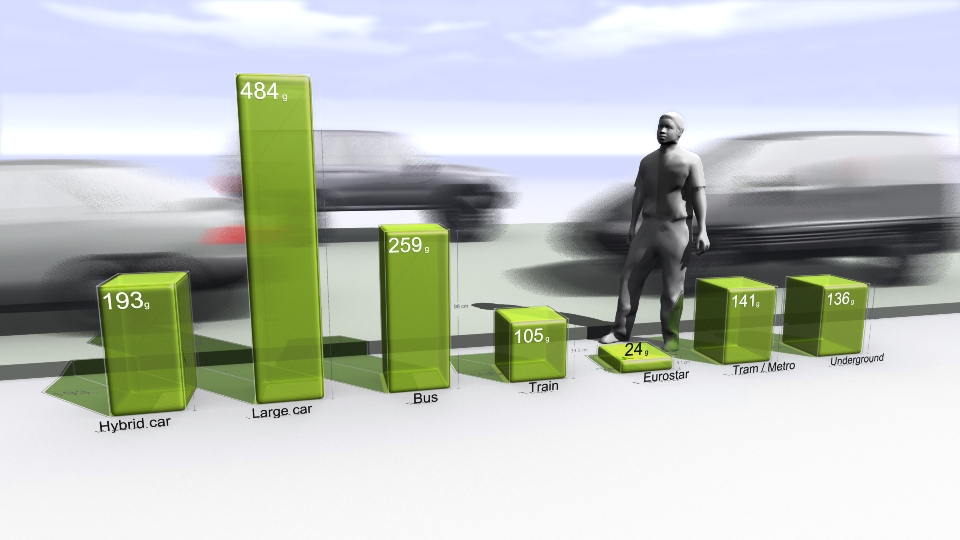
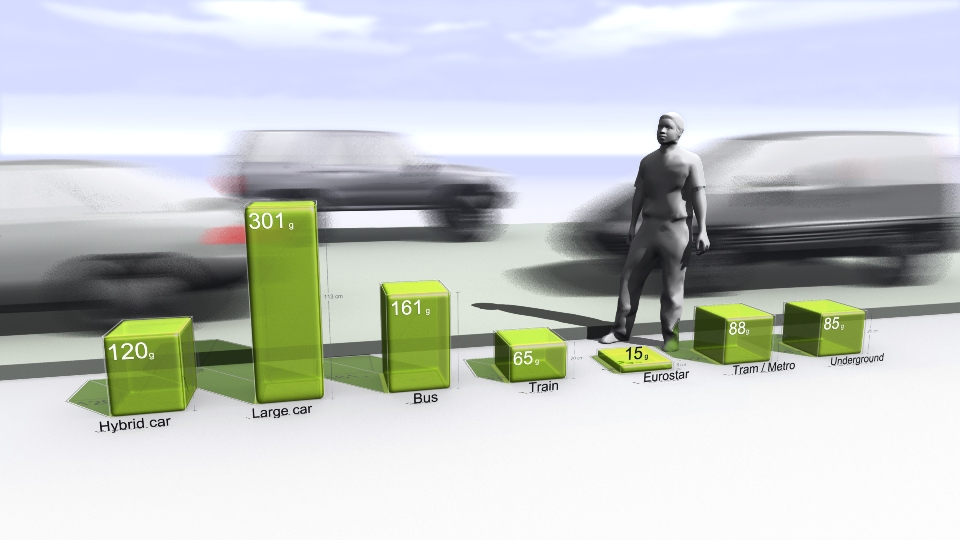
Carbon Visuals was commissioned by the BBC to produce a set of images and a real-time animation showing the emissions resulting from one hour of TV programming. The data was provided by about 80 productions that were the first to use the Albert calculator at the BBC.

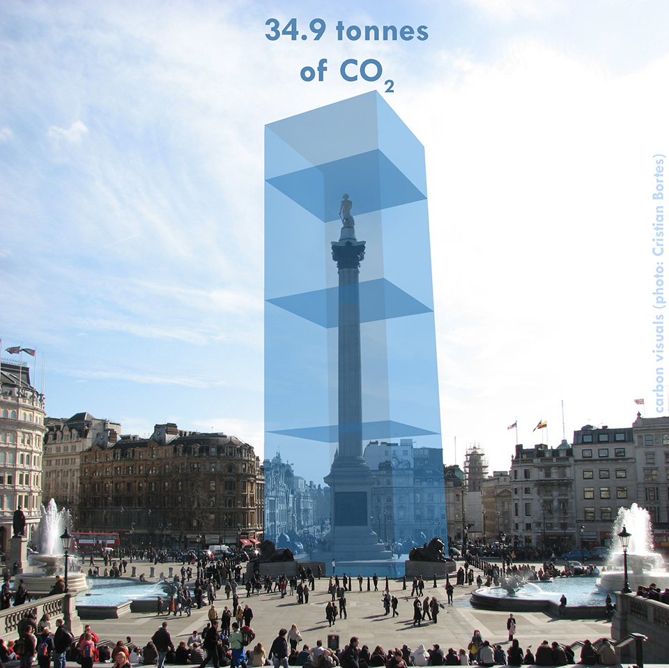
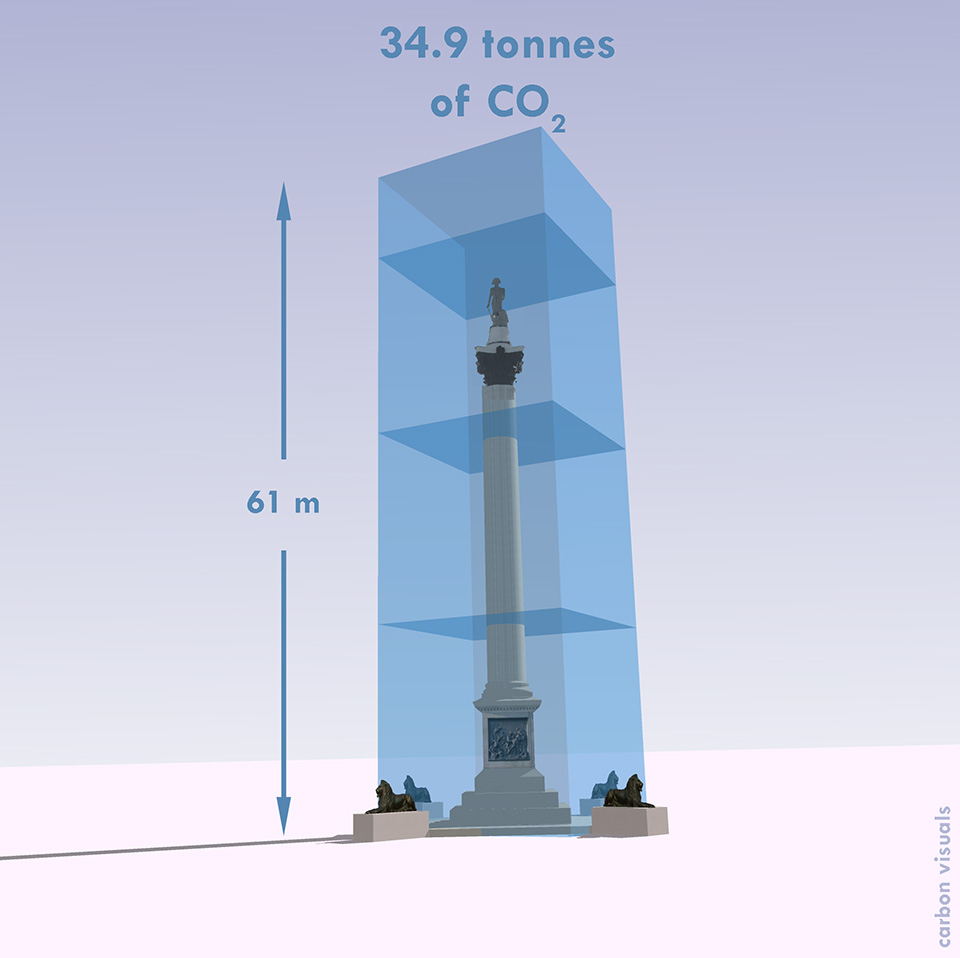
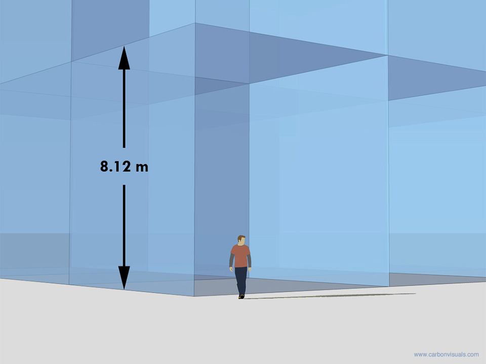
This animation was created for the BBC and shows the real-time emissions associated with making one hour of broadcast ready production - equivalent to about 8.2 tonnes of carbon dioxide.

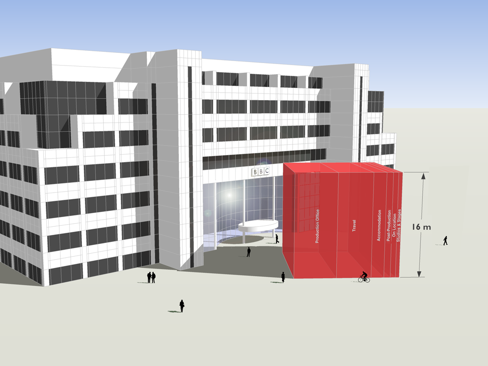
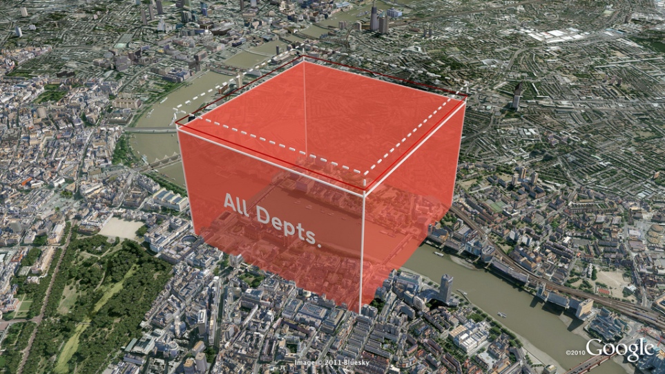
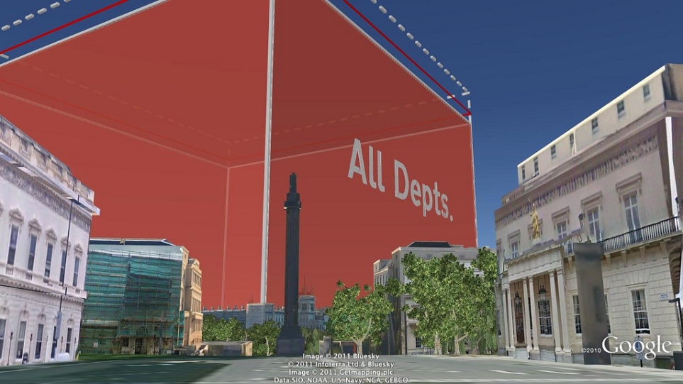
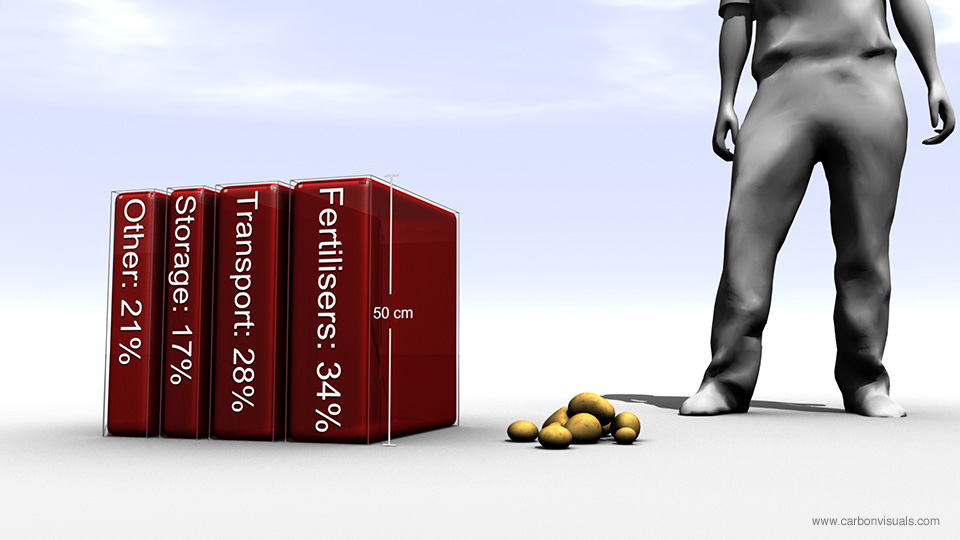
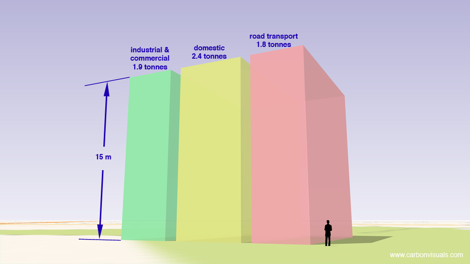
Average emissions associated with the major stages of a production are here shown in order of size and as a whole, depicted in front of the BBC White City building.

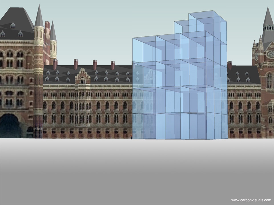
These visuals were first shown at an industry conference, which took place in the iconic BBC White City building that is depicted here, on 3rd November 2011.

The PDF illustrates the emissions of different parts of the production process.

Albert was developed & trialed within the BBC in 2011, with production managers and coordinators providing data on about 80 programmes. While there were considerable variations between productions, the average (mean) rate - about 8.2 tonnes of carbon dioxide per hour - provides a first attempt at establishing a figure against which programme makers will be able to gauge progress in future.

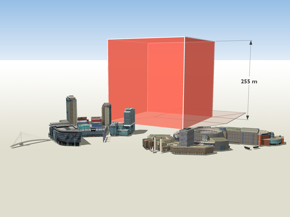
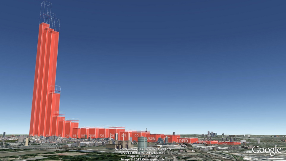
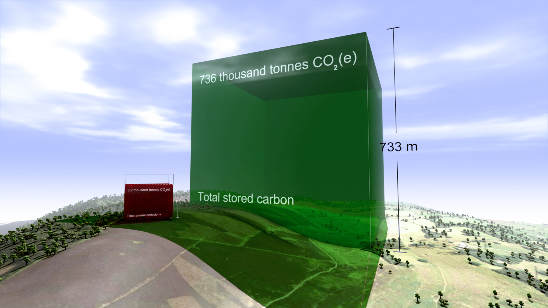
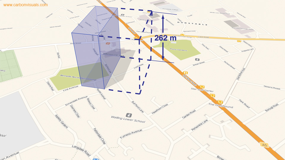
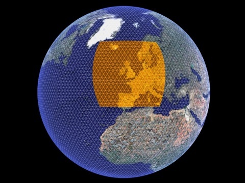
Annually within the BBC, about 3,800 hours of TV are produced in-house. An annual volume of emissions, based on the average rate per production hour for programme emissions calculated using Albert, is here shown with familiar BBC buildings in Salford and London for scale.

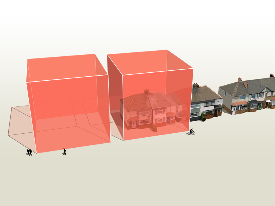
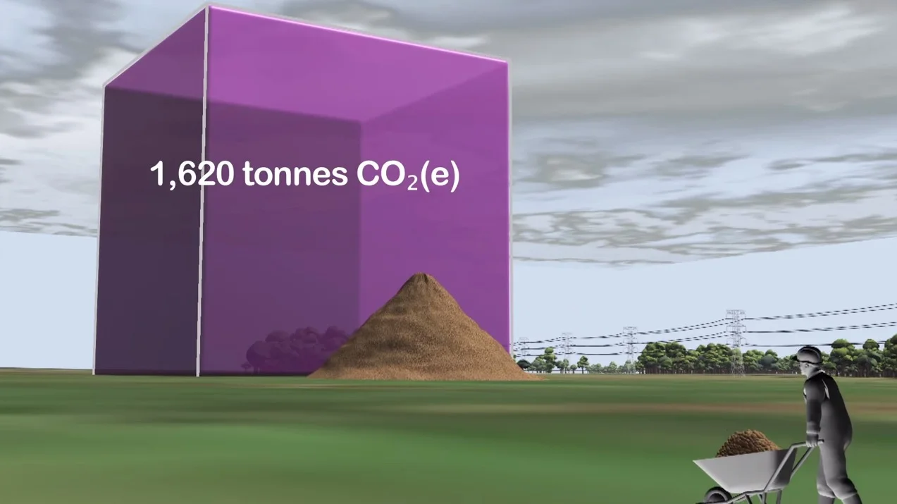
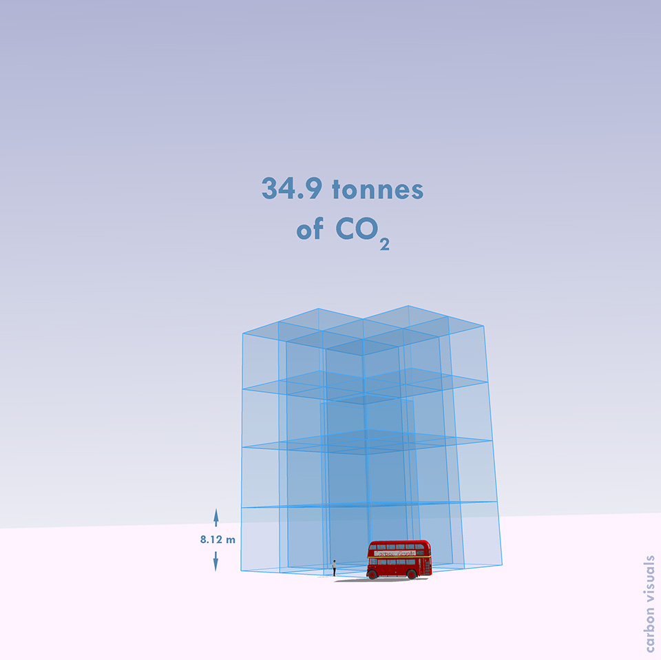
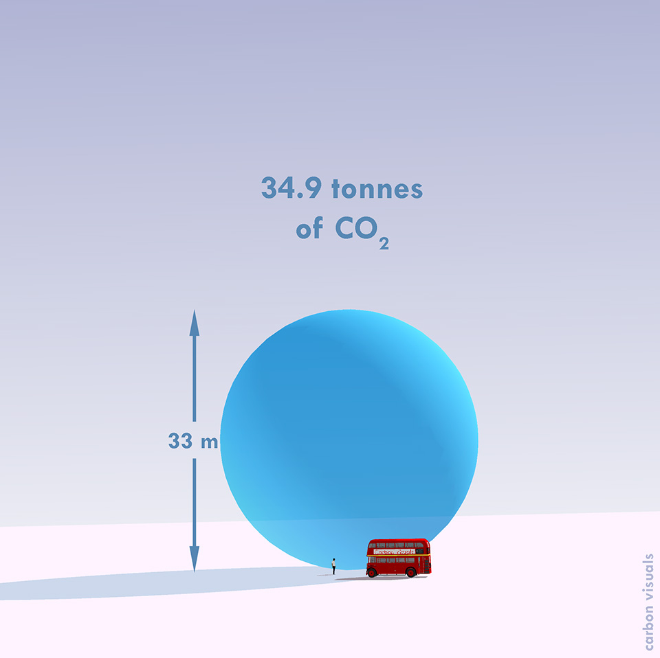
The average (mean) rate of emissions associated with TV production, based on data from about 80 programmes, is about 8.2 tonnes of carbon dioxide per hour.

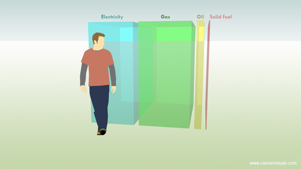
This is roughly equivalent to the annual emissions associated with space heating, heating and lighting for a pair of semi-detached houses (figures provided by the BBC).

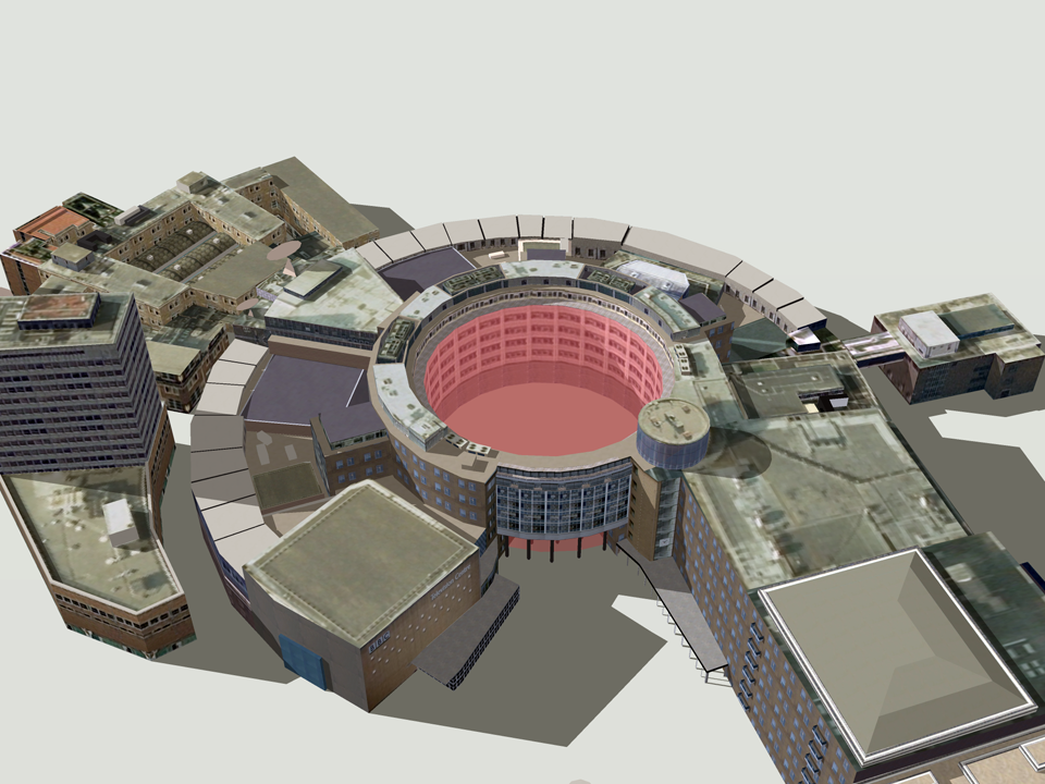
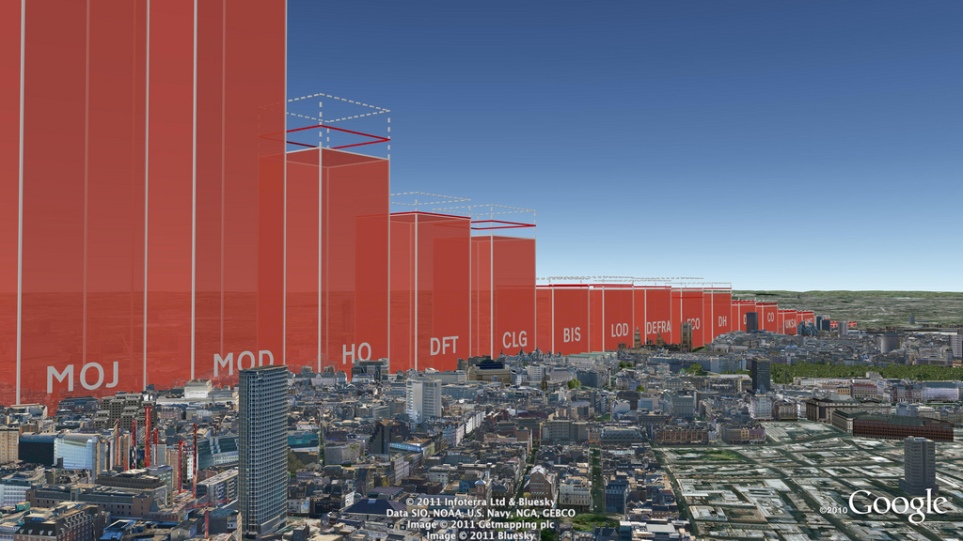
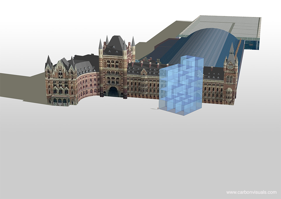
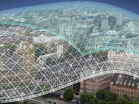
Based on the average rate per production hour for programme emissions, 11 hours of production time would fill the void in the centre of the BBC Television Centre in London - a space that is well-known to production teams.

Illustrating carbon reduction potential for South Kensington 1851 Estate

CLIENT

Natural History Museum, Science Museum, V&A, Imperial College and Royal Albert Hall

PURPOSE

To illustrate the carbon reduction potential for the South Kensington 1851 Estate.

DESCRIPTION

Striking image set, to illustrate the Carbon Reduction Masterplan launched by the Minister of State for Energy and Climate Change.

Carbon Visuals has created a set of striking images to illustrate the carbon reduction potential for the South Kensington 1851 Estate. Organisations involved include the Natural History Museum, the Science Museum, the Victoria and Albert Museum, Imperial College, the Royal Albert Hall, the Royal College of Music and the Royal College of Arts.

These prestigious institutions came together in 2005 to embark on an inspirational long-term carbon reduction plan. Phase One involved laying the foundations and creating a realistic strategy. The Masterplan, launched in November 2011, marks the conclusion of that phase and the commencement of its realisation.

Carbon Visuals aided communication amongst the parties and with external stakeholders by creating striking imagese at various stages of the project.

Creating a computer generated model of the Estate enabled a wide range of different images to be created - wide angle, close-up, aerial and ground level.

To see the context in which the images were used feel free to download the PDF of the overview brochure.

Carbon footprint of 40,000 UK public buildings


Carbon visuals specialises in providing a ‘feel’ for carbon data. Initially we focused on single statistics and small data-sets. Now we can use the same techniques to provide a sense of scale for tens of thousands of carbon footprints at the same time.

With a grant from the UK’s Technology Strategy Board we have been exploring real-time visualisation and the visualisation of large data-sets. One of the results is an interactive visualisation of the carbon footprint of every public building in England and Wales – 40 thousand of them!

http://uk-energy-ratings.carbonvisuals.com/ The visualisation works in any browser that can run the Google Earth plugin but because the dataset is large, the plugin may perform sluggishly on slow computers.

Or open in desktop version of Google Earth: http://uk-energy-ratings.carbonvisuals.com/kml/uk-emissions.kml

The visualisation uses a database of UK Display Energy Certificates – the energy ratings that all public buildings must display. Once we had geocoded these we displayed the buildings’ carbon footprint in 3D in Google Earth as actual volumes of carbon dioxide gas at the location of the building itself.

We can display the daily footprint as well as the annual footprint because a day’s emissions are sometimes easier to relate to activity. We can also display the footprint with reference to the floor-area of the building itself. Wide short footprints indicate buildings with smaller emissions per square metre than narrow tall footprints.

This application uses data obtained from the Department for Communities and Local Government by the Centre for Sustainable Energy.www.cse.org.uk/pages/resources/open-data

The visualisation works in a number of ways. It allows comparison with other comparable buildings at the same time as providing a sense of scale of emissions from buildings as a whole. Most importantly, it uses the world itself as part of its own explanation. Our familiarity with the real world – with buildings we work in and cities we travel through – is an underused resource in data visualisation. With Google Earth we can put that experience to work.

We can use the same techniques for any geocoded emissions data and create visualisations that can be explored interactively in Google Earth on the desktop or the web. We can also create stand-alone fly-through animations that present the data efficiently to any non-technical audience.

Bird's eye view of Westminster

The carbon footprint of the UK potato

CLIENT

ADAS

PURPOSE

To illustrate their capability to help farmers manage and reduce emissions.

DESCRIPTION

Film that combines live action and animation to explore the carbon footprint of the UK potato at personal and farm scales.

ADAS, the land and farming consultancy, wanted to compliment the earlier film that we made to illustrate emissions, sequestration & stored carbon on upland farms in the Peak District National Park. This time they were keen to illustrate their capabilities in helping mainstream farmers manage and reduce their carbon emissions.

The film explores the carbon footprint of the UK potato at the personal scale, as well as carbon saving potential at the farm scale.

More info from ADAS Carbon Management Team

To see all our work for ADAS, click here.

Carbon Visuals is keen to explore the use of film for helping everyone better understand carbon emissions from everyday activities. Please contact us if you have ideas.


Supporting BP's interactive carbon calculator for motorists


CLIENT

BP

PURPOSE

To encourage motorists reduce emissions from driving.

DESCRIPTION

Consultancy and visuals for a web calculator showing actual volumes of CO2 which change in size as reduction actions are chosen, with image set and methodology.

Carbon Visuals helped newly re-launched BP Target Neutral project by providing consultancy for the web calculator designed to help motorists reduce, replace and offset carbon dioxide from driving. The calculator, aimed at the general public, is the first in the world to show actual volumes of CO2 which change in size as different reduction actions are chosen. In addition carbon spheres can be compared against averages for other countries as well as the UK 'target' reduction for 2050.

We also provided a number of bespoke images to highlight transport emissions in the UK, emissions of different transport types as well as transport emissions per capita for different countries.

Our Creative Director, Dr Adam Nieman also provided an overview of the importance of carbon visualisation

The first visual image uses Spaghetti Junction on the M6 near Birmingham as this basic ground. The familiar image from the British road network makes the immediate point that this is about roads, but then uses the recognisable scale to locate a cube-like shape showing the volume of carbon our cars, lorries and buses put into the atmosphere every day.

The cube presents this visually, while the simple captions fill in the specific details. This, the image is saying, is what 90,000 tonnes of carbon dioxide look like, and that’s what we’re pumping into the atmosphere every day. Suddenly the daily figure is something real and dramatic.

The BP Target Neutral Methodology PDF outlines the data, calculations and assumptions in the image set.


UK Government departments exceed their 10% CO2 reduction targets


Carbon Visuals was commissioned by DECC to produce a set of high-resolution Google Earth images to illustrate Government department carbon footprints and reduction targets. The total carbon dioxide emissions between May 2010 and May 2011 amounted to 646,231 tonnes, which is 13.8% less than the previous year. This is what that looks like.

The actual volume of carbon dioxide gas emitted by the UK Government in 2010/11 (red volume). The saving on 2009/10 - the gas that didn't enter the atmosphere - is shown as the dashed volume. The target is shown as a red band.

See the Government press release here:www.decc.gov.uk/en/content/cms/news/pn11059/pn11059.aspx

Download the PDF with more info

Bringing the Royal College of Music carbon management plan to life


The Royal College of Music worked with the Carbon Trust to develop a Carbon Management Plan, which was published in July 2010. The Plan highlighted a number of actions that could be taken to reduce emissions by 25% by 2013/14.

A key part of the Plan was to get students and staff engaged in the issues, so Carbon Visuals were invited to find innovative ways to communicate the carbon footprint and emissions reduction targets.

It was a very worth while project and has been a well recieved way of getting this difficult message across

Matthew Nicholl, Building Project Manager, Royal College of Music

To turn abstract numbers into quantities that viewers could relate to physically, we used a depiction of the College building. We also proposed a way for musicians in particular to gauge a 25% reduction – it’s like losing nearly two octaves from a piano.

Some of these images are being used for posters, leaflets and presentations to help staff and students have a better understanding of their carbon footprint and create ‘ownership’ of reduction plans and targets.


Emissions, sequestration & stored carbon on upland farms

Carbon Visuals have created this short animation film to show the emissions, sequestration & stored carbon on ten upland farms in the Peak District National Park. The farms extend over 1,500 hectares and comprise part moorland, part pasture.

The data was taken from ADAS Report Environmental Quality Mark (EQM) Farm Carbon Footprint and Water Audit Pilot Project.

The core message from the film is that these farms are not only producing food and preserving the landscape. They are performing an important role as guardians of a huge carbon store that is best kept in soils and vegetation.

We believe that this is a 'world first' for this type of medium. Created for the consultancy ADAS, the film demonstrates the potential for moving animation to communicate complex carbon stories.

The film is being used to engage a variety of stakeholders including ADAS staff, farm managers and agricultural policymakers.

To see all our work for ADAS, click here.

If you like this approach, and feel that it would suit your particular carbon communication challenge, then please contact us.


Making sense of a BBC programme's carbon footprint


The One Planet radio programme on the BBC's World Service came to Carbon Visuals with simple question: "what does our carbon footprint look like?"

One Planet was carefully accounting for emissions arising from the making of the programme and had arrived at a figure of about 34.9 tonnes per year. But what does that mean?

Measuring carbon dioxide in terms of mass (tonnes) makes sense from an accounting point of view but doesn't give us a sense of scale we can relate to. We examined a variety of alternative ways of representing One Planet's footprint.

We have shown the programme's annual emissions by volume in a recognisable location and in relation to an iconic feature - Trafalgar Square and Nelson's Column. These provide a sense of scale that enable the viewer to relate to the volume.

You can hear a discussion about this project, first broadcast on Thursday 8 April 2010, by visiting the One Planet website.


Showcasing ADAS carbon consultancy capability

ADAS provides environmental solutions, rural development services and policy advice. The company is leading projects on GHG methodologies and mitigation measures for food production and agriculture in the UK.

For both simple and complex foods, the key is to understand the production processes of crops and animals in intensive, extensive and organic production systems.

The company asked Carbon Visuals to provide a series of images to showcase their carbon management consulting capability to the food and agriculture sector.

We created images depicting the carbon footprint of potatoes in relation to the production of school meals in the UK. In addition we provided an animated film showing the emissions, sequestration and stored carbon on ten Peak District farms.

Finally we produced a set of images to show the company's own carbon footprint and their reduction target. This included a comparison with the total emissions from UK agriculture - which they are able to influence through their consultancy practices.


Engaging employees at the Guardian News and Media Group

The Guardian News and Media Group turned to Carbon Visuals to get employees involved in reducing the company’s carbon footprint. On an average day between April 2007 and March 2008, GNM emitted 39 tonnes: 20 tonnes from two print sites, 14 tonnes from offices and five tonnes from business travel.

The Guardian offices are near St Pancras Station - a landmark that employees can relate to physically. Viewers can see the picture and know what such a pile of one tonne cubes would be ‘like’.

Guardian News and Media's daily carbon dioxide emissions. On an average day between April 2007 and March 2008, GNM emitted 39 tonnes: 20 tonnes from 2 print sites,14 tonnes from the old offices and 5 tonnes from business travel. One tonne of carbon dioxide gas would fill a cube of 8.12 metres high. Viewing the pile of 1-tonne cubes from eye-level can give a viewer a better sense of the height.


Helping local government involve all staff in emissions reduction

Central Bedfordshire Council needed a way to involve key stakeholders and staff in meeting targets for emissions reduction. We produced volumetric visualisations that make reference to landmarks and areas that these audiences can relate to.

We also produced animations that bring the figures to life by showing the emissions from different council activities in real-time. The Council used the visualisations in a stakeholder conference but they also found them useful for new employees, strategy documents, and the Council’s website.

These visualisations are a huge breakthrough and will enable people to clearly see the impact our carbon emissions are having on the environment and the level of responsibility that falls on each one of us to assess and change our activities.

Councillor Richard Stay, Deputy Leader, Central Bedfordshire Council

The Carbon Quilt - a global engagement tool

Instead of trying to communicate the complexities of climate change, we believe that a simple understanding of how we are changing the atmosphere of the planet could transform society’s view of the need for a low-carbon future.

Every day we wrap the planet in a paper-thick layer of carbon dioxide!

We’ve done the maths and it’s true. The 80 million tonnes of CO2 we release to the atmosphere every day by burning fossil fuels would be 80 microns thick if it were a single, uninterrupted layer at 100% concentration over our heads. Over the course of a year, that amounts to 31mm, or over an inch.

We call this imagined layer the Carbon Quilt – since pre-industrial times its thickness has increased from 2.3 metres to 3.2 metres.

In 2010, with support from The Tedworth Charitable Trust, we 'soft-launched' our Carbon Quilt web-tool that enables people to ‘see’ any carbon footprint – from a short car journey to the footprint of a country or continent. Any carbon footprint can be seen in proportion to any other, and in proportion to the global whole. It can also be positioned in a location that has meaning and provides a sense of scale for the person viewing it.

Carbon Visuals has ambitious plans to develop this technical prototype tool on Google Earth to bring the abstract concept of 'carbon footprints' to life for over a billion people worldwide.

We are now actively seeking funding and/or sponsors to help us to develop this project. Please contact us if you have funding ideas, contacts or expertise that could help advance this project.

BITC Mayday Network businesses' carbon footprint (and reduction)

BITC Mayday Network businesses' carbon footprint (and reduction)

To the left is a picture for the BITC (Business in the Community) Mayday Annual Report 2010.

Each year humans release enough carbon dioxide to cover the entire planet in a layer 37 mm thick. The proportion of this 'quilt' that reporting Mayday Network businesses are responsible for is the green 'patch'.

Total reported emissions in 2010 (green patch) is 5.6 million tonnes of CO2(e). Emission reduction in previous 12 months is shown as the dotted area.

It represents a saving of 400 thousand tonnes of CO2(e).

Global CO2 emissions in real time

How can you give people some sense of the rate at which we are adding emissions to the atmosphere?

Using 2010 data, we calculated that at standard pressure and 15oC the mean rate of emissions for that year would fill a volume the size of the UN Secretariat Building roughly seven times every four seconds. Working with our associate Lucy Blackwell we created a simple experimental low resolution animation which we have shown to live audiences on numerous occasions.

Some people find it “breath-taking”.