
Campaign / NGO
Our work has been used in a variety of campaigns from cleaner air in New York City to showing historic global emissions, from low carbon farming to reaching young people on Twitter. Sometimes a striking image or animation can cut through the noise, expand an audience, engender a call to action or spark a new level of engagement and deepen understanding.
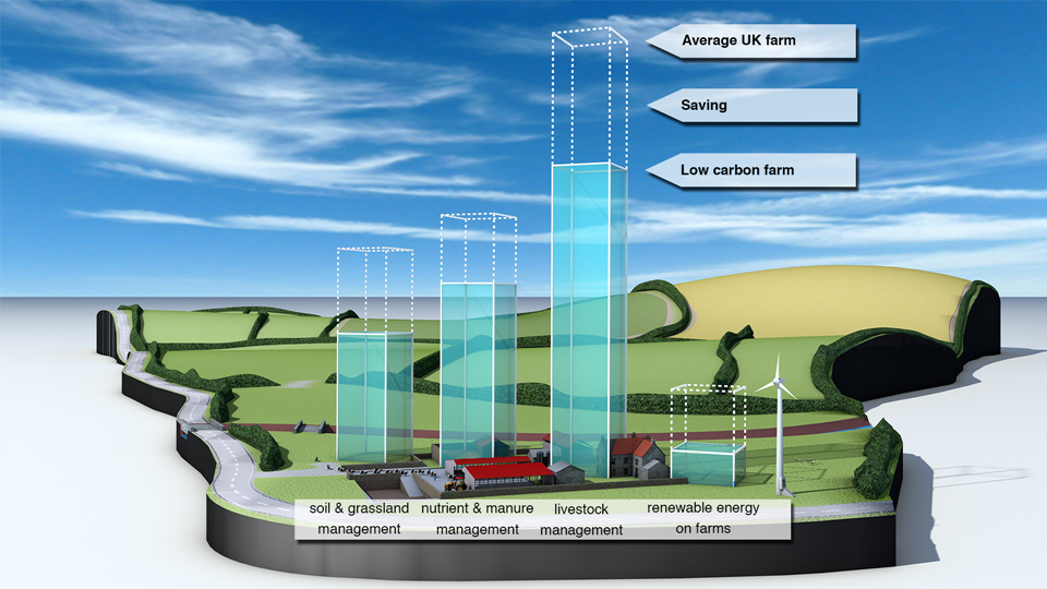
Carbon Visuals was asked by the Soil Association to provide a set of simple 3D image ‘sketches’ to show the carbon saving that can be achieved by using low carbon farming practices. The sketches are being used to help UK farmers have a better understanding of what would otherwise be meaningless numbers.
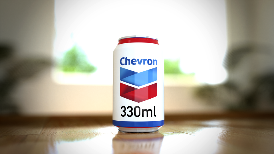
The Carbon Majors report, launched November 2013, is accompanied by striking graphics from Carbon Visuals which show the extent to which corporations are responsible for the cumulative emissions causing climate change.
Key information from a huge array of data has been conveyed by Carbon Visuals in both conventional and novel ways to give a feel for the scale of the cumulative emissions involved.
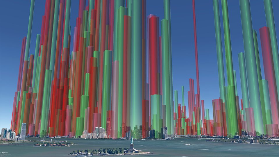
Visual images created by Carbon Visuals are being used to help New York property managers, building co-op boards and community groups reduce local air pollution from their buildings.
Around 8,000 buildings in New York City have been burning heavy heating oil. These contribute more soot pollution than all cars and trucks on the City’s roads. The NYC Clean Heat program seeks to improve air quality and save lives in New York by eliminating heavy oil use and accelerating the adoption of cleaner fuels
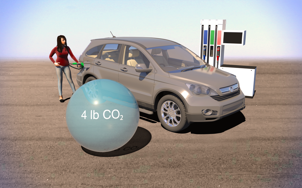
The Environmental Defense Fund asked us to explain the difference between gasoline from tar-sands and regular gasoline in terms everyone can relate to. We compared them in terms of a single gallon of gas and a typical car's annual emissions.
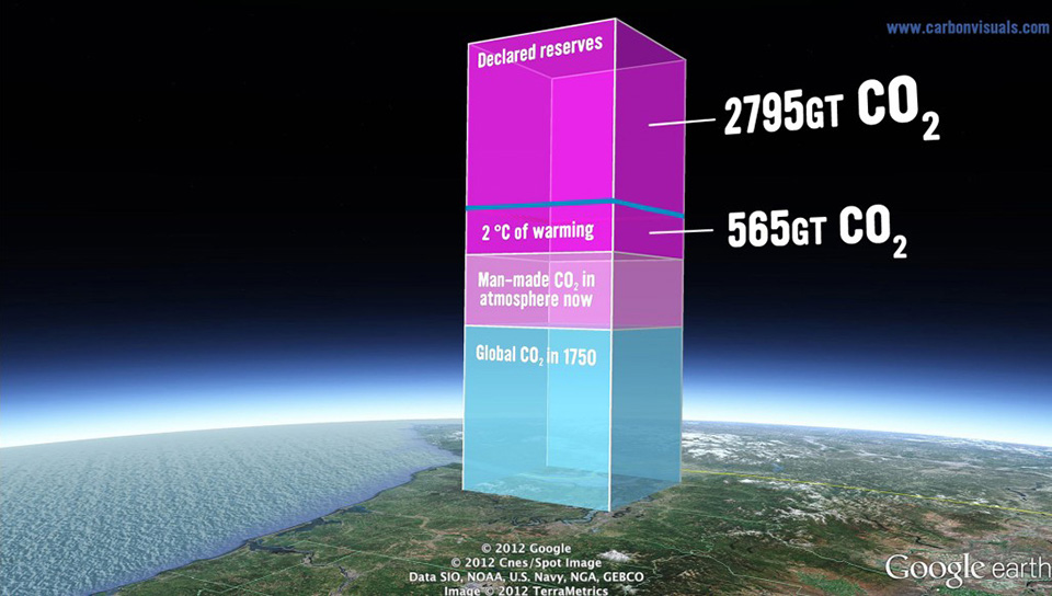
In November and December 2012, Bill McKibben and 350.org's Do the Math Tour was a massive success, with sold out shows across the United States.
Carbon Visuals supported the tour by making the numerical argument visual - showing the actual volume of carbon dioxide gas represented by the numbers in the 'Do the math' argument.

In 2010 New York City added 54 million metric tons of carbon dioxide to the atmosphere, but that number means little to most people because few of us have a sense of scale for atmospheric pollution.
Carbon Visuals, supported by Environmental Defense Fund, have created a film that makes those emissions feel more real - the total emissions and the rate of emission. Designed to engage the ‘person on the street’, this version is exploratory and still work in progress.
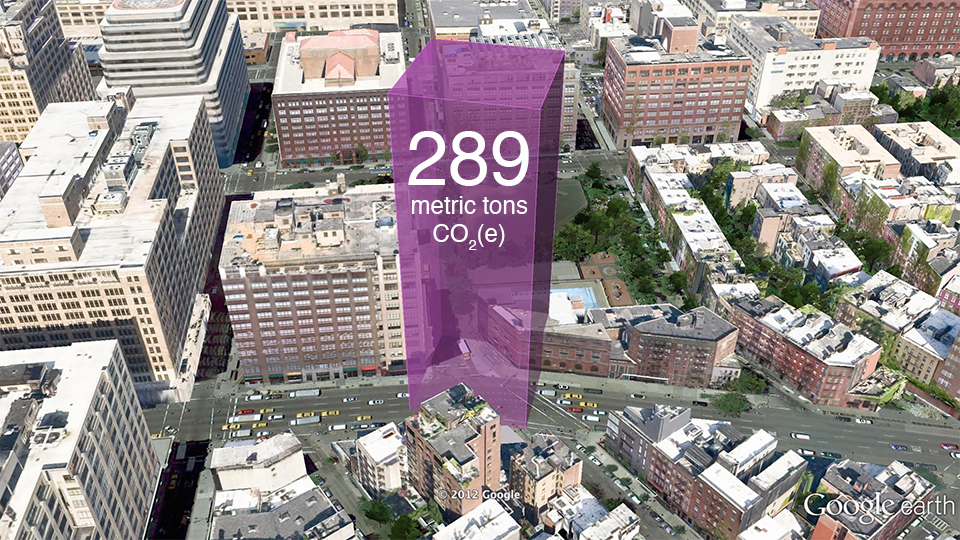
Seventy five percent of New York City's greenhouse gas emissions come from the energy used by buildings. Reducing this energy is a goal of both building managers and the City of New York itself.
This visualisation takes data about the carbon emissions of municipal buildings in New York City and transforms it into a 3D map of the actual volume of carbon dioxide added to the atmosphere. It co-opts the city itself to serve as its own data visualisation.
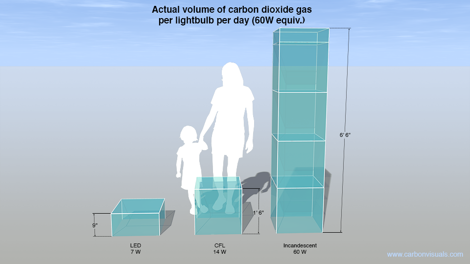
A set of simple images was created to give context to other visualisation projects we were carrying out for US-based Environmental Defense Fund.
Using a model of a typical US house, combined with US metrics - tons, gallons etc. - helps make the images more real for Americans.

Nine minute overview of the importance of making greenhouse gases visible. Presentation from Carbon Visuals CEO Antony Turner at TEDx event in Exeter, UK, April 2012.
The competence and skill you have in handling large data sets is absolutely fantastic.
And you still delivered a wonderful set of visuals for us that we can continue to use for a long time to come.
Craig White Chairman, Wood for Good