Animation

Communicating vital scientific services

CLIENT

ECMWF (European Centre for Medium-Range Weather Forecasts)

PURPOSE

Create a set of short films that explain the Copernicus Climate Change and Atmosphere Monitoring Services that ECMWF carries out on behalf of the European Commission.

DESCRIPTION

Carbon Visuals created a film that shows the overall Copernicus services, as well as separate films for each service.  These films highlight our ability to help communicate complex services for the scientific community in ways that are not only true to the science but also make sense to a general, non-scientific audience.  In addition we designed a set of PowerPoint slides for ECMWF scientists to use at key events.

Copernicus is the European Union's (EU) flagship programme on monitoring the Earth’s environment using satellite and in-situ observations. Copernicus delivers operational data and information services on a range of topical areas. 

See more at: http://climate.copernicus.eu/ / http://atmosphere.copernicus.eu/

Ozone campaign meets climate change

CLIENT

United Nations Environment Programme (UNEP)

PURPOSE

To communicate and celebrate 30 years of international effort in protecting the ozone layer.

DESCRIPTION

An animation that shows the global warming potential of ozone depleting substances - very much greater than carbon dioxide.  The film also shows just how much greenhouse gas - 135 billion tonnes of carbon dioxide equivalent - the Vienna Convention has kept out of the atmosphere.  It turns out to be more than the Kyoto Protocol.

This animation is the final asset created for the digital campaign for UNEP.  The project included the design and production of:


PRECIOUS OZONE - THE SIZE OF IT

A short animation and a set of still images give viewers a sense of scale for how much air there is in the atmosphere and how much of it is ozone.  More details here


OZONE GLOBE

An interactive / self-running globe that displays current ozone distribution and also celebrates each country’s ratification of the Vienna Convention. More details here


2D AIR MAP

This interactive 2D map of the atmosphere allows users to explore the distribution of ozone for themselves. More details here

3D AIR MAP

This 3D map of the ozone layer shows a 20 km x 20 km area of land (centered over the peak of Mount Everest) and all the air above it extending to an altitude of 100 km (the edge of space). More details here


THE OZONE SONG

A playful musical animation showing phytoplankton celebrating the 30th anniversary of the Vienna Convention with an underwater birthday party. More details here

SYNTHESIS REPORT DESIGN

An additional part of the campaign package was the graphic design and layout of the 2014 Synthesis Report. Download the report here.


The report was VERY well received. We got a lot of compliments not only on the content but also on the layout and readability. Thanks a million for your excellent work.

Professor A.R. Ravishankara, Report Lead Author
Departments of Chemistry and Atmospheric Science
Colorado State University


GLASS SCULPTURE MEMENTOES

We designed and supplied original sculptures depicting the ozone layer in the atmosphere for the chair, co-chair and hosts of the Meeting of the Parties 2-4th November in Dubai.

 
Photo credit: IISD

Photo credit: IISD


POSTERS, LOGO & SUPPORT

In addition to the films and interactives Carbon Visuals provided posters and logos in six languages as well as outreach support and evaluation.


All images are available under Creative Commons licence to download on our Flickr page.

UN Precious Ozone webpage: http://ozone.unep.org/en/precious-ozone

The Ozone Song

CLIENT

United Nations Environment Programme

PURPOSE

To communicate and celebrate 30 years of international effort in protecting the ozone layer.

DESCRIPTION

A playful musical animation showing phytoplankton celebrating the 30th anniversary of the Vienna Convention with an underwater birthday party. 

It is really NICE!  Thanks to the team.

Tina Birmpili, Executive Secretary, Ozone Secretariat, UNEP

Carbon Visuals is known for accurate scientific imagery of invisible gases and environmental challenges.  Providing a suite of material for the UN Ozone communications campaign gave us an opportunity to do something a little different.  

So we decided to commission a choral piece from science song composer David Haines.  And we created a simple animation and education pack to help schools and children around the world take advantage of this useful learning resource.  The education pack contains the lyrics for the song, a note from the composer and an explanation of some of the terms used.

Composer David Haines rehearsing the Ozone Song with children from Ford Primary School in Plymouth. They will be performing the song in front of the giant fish tanks at the National Marine Aquarium on International Ozone Day (16/09/2015).

BBC filming performance of Ozone Song at National Aquarium with children from Ford Primary School, Plymouth and choir from South Devon Singers.

BBC filming performance of Ozone Song at National Aquarium with children from Ford Primary School, Plymouth and choir from South Devon Singers.

I liked the idea of an underwater party of tiny creatures celebrating the success of the Montreal Protocol.  Why should planetary healing just be celebrated by humans?

Antony Turner, CEO, Carbon Visuals

You can download the sheet music here: with piano or melody line only. If you are involved with a performance of the song, we'd love to see, so please upload your videos to our facebook page!

As an artist-in-residence in numerous schools and colleges both in the UK and USA, I have run many hundreds of collaborative songwriting sessions over the last twenty-five years. Since 2007, the greater part of my work of this nature has been in Cambridge, Massachusetts - as songwriter- in-residence with MIT’s Science Festival. Over the last four or five years, nearly all of the songs have been based upon the students’ science curriculum.

David Haines

The Ozone Song is also available with Spanish subtitles.

UN ozone celebrations

CLIENT

United Nations Environment Programme

PURPOSE

To communicate and celebrate 30 years of international effort in protecting the ozone layer.

DESCRIPTION

A campaign that includes a series of animations, visual images, print and online communication tools to help communicate what the ozone layer is, where it is in the atmosphere and what has been achieved under the ozone protection regime.

Thirty years ago the first images of the ozone hole created a media storm and helped lead to the Vienna Convention for the Protection of the Ozone Layer and the Montreal Protocol.

People only had to look at a picture to physically see atmospheric chemistry. It didn’t take much persuasion to convince the policy makers to take action. 

Pawan Bhartia, NASA atmospheric scientist

Carbon Visuals was honoured to be asked to create a digital campaign to communicate and celebrate the 30th anniversary of this event.  We did not want to ‘re-invent the wheel’ so we started by researching what we felt was missing from ozone communications to date.  

Our view was that few people have an intuitive sense of what the ozone hole is like, where it is, how much ozone there is, or how deep the atmosphere is.  So we have created a selection of visual images, animations and web-tools that help everyone from policymakers to children better understand these things.

Over the coming months different elements will be releasedalongside key events within the UNEP calendar.  This week, July 20-23, we are releasing two elements.

Precious ozone - the size of it

A short animation and a set of still images give viewers a sense of scale for how much air there is in the atmosphere and how much of it is ozone.  

Click here to view on Youtube.

Ozone Globe

An interactive / self-running globe that displays current ozone distribution and also celebrates each country’s ratification of the Vienna Convention.

Click here to visit the interactive


All images are available under Creative Commons licence to download on our Flickr page

UN Ozone website: http://ozone.unep.org/en/infomaterials.php

Resource efficiency in Asia Pacific

CLIENT

United Nations Environment Programme

PURPOSE

To convey the scale and complexity of resource use in the Asia Pacific region at a conference of Environment Ministers and subsequently to other audiences.

DESCRIPTION

A high impact video and interactive web-tools to introduce and enable easy exploration of a database covering 26 Asia Pacific countries, 157 indicators and 40 years.

How much natural resources are used to earn one dollar in developing countries in the Asia Pacific region? How do you effectively show water, metal and biomass usage rates across 26 Asian countries - and make it personal and real? What is the best way to visualise a range of environmental resource indicators ‘per GDP’ across countries?

These were some of the challenges set for us by the United Nations Environment Programme (UNEP) in a project undertaken in conjunction with our not-for-profit partner CarbonSense Foundation.

This video has taken our communications to a higher level, and improved our ability to cut across a crowded policy landscape to really help decision makers reflect on resource efficiency.

Janet Salem, UNEP, Bangkok

The brief from the UNEP Bangkok office was to design and create a short, high impact video to convey the scale and complexity of resource use in the Asia Pacific region. In addition a set of interactive web-tools is being provided to complement the film and allow easy exploration of the data.

The film is supporting a database of resource efficiency data covering 26 Asia Pacific countries, 157 indicators and 40 years (1970-2010). The indicators are designed to inform policy development in the region based on the principles of circular economy, sustainable consumption and production principles.*

Resource efficiency is crucial for sustainability but how do you make it real and meaningful at a national and a personal level? To bring such a huge subject up front and personal, we combined live action film introducing very real piles of materials on a table-top with national and regional resource use and impacts made tangible with CGI graphics. And uniquely this project allowed us to explore ways that our creative techniques could be combined with economic data.

Because of the complexity of data and fast-track time schedule the project was carried out in a highly collaborative way, with UNEP staff in Bangkok supporting our creative team throughout the scoping, design and production phases.

The film was used to launch the UNEP Report at a conference on 19th May 2015 attended by Achim Steiner, Executive Director of UNEP, and Environment Ministers and policy makers from the Asia Pacific region.

See the UNEP webpage on project here

Finally - a very special thanks to Janet Salem of UNEP, Bangkok and our film presenter / narrator Patchari Raksawong.

*The database has been developed as a result of a three-year science-based consultative process mandated by countries in the region and coordinated by UNEP, the CSIRO and the Asia-Pacific Roundtable on Sustainable Consumption and Production (APRSCP), with support from the European Union's SWITCH-Asia Programme.

An important part of this project was the creation of an interactive web-tool (see above) allowing policymakers to explore the database in detail in an intuitive way. We created a 'heat map' that allows comparison between a wide range of economic indicators for different countries. Mousing over the countries reveals the actual data.

Carbon Visuals has shown us different techniques to visualize data in a way that can resonate on a meaningful human level, while still giving us creative space for collaboration. We had a lot of fun with the team and it's been a really wonderful partnership.

Janet Salem, UNEP, Bangkok

Ireland's carbon footprint

CLIENT

Environmental Protection Agency

PURPOSE

To help the EPA inform a range of audiences, from policymakers to the general public, about Ireland’s greenhouse gas emissions.

DESCRIPTION

A short animation showing Ireland’s daily emissions as a large pile of one tonne carbon dioxide bubbles beside the Poolbeg towers in Dublin bay.

How do you show the carbon footprint of a country? That was the task set by Ireland's Environmental Protection Agency (EPA). The EPA compiles Ireland's annual greenhouse gas emission inventories and projections, which allows the Government to assess progress against key targets, report to the European Commission and UNFCCC and informs policy development and mitigation measures. The EPA also aims to provide up-to-date scientific information to a wide range of audiences, from policymakers to the general public. A simple visual would help to get more people engaged in the issue.

Carbon Visuals created a short animation showing the daily emissions as a large pile of one tonne carbon dioxide bubbles - sitting next to the Poolbeg towers in Dublin bay.

See the EPA webpage here.

TECHNICAL NOTE

The data source for this visualisation is the EPA’s Greenhouse Gas Inventory for 2012 which calculates annual emissions from Agriculture, Energy, Transport, Industry and commercial, Residential and Waste sectors, and was released in 2014.

Each sphere represents one tonne of greenhouse gas as carbon dioxide equivalent - Co2(e). Greenhouse gases other than CO2 (i.e. methane, nitrous oxide and so-called F-gases) may be converted to CO2 equivalent using their global warming potentials.

For 2012, Ireland’s total national greenhouse gas emissions are estimated to be 58,531,238 tonnes or 160,359 tonnes per day.

Carbon dioxide gas at 15 °C and standard pressure has a density of 1.87 kg/m3. At standard pressure and 15 °C a metric ton of carbon dioxide gas would fill a sphere approximately 10 metres across.  The video shows a pile of 160,359 spheres 10 metres in diameter located near the Poolbeg Towers in Dublin Bay, with the city behind.

University of Plymouth - The Carbon Footprint

CLIENT

University of Plymouth

PURPOSE

To engage students, academics and staff, show emissions are real and that the University is endeavouring to achieve reductions.

DESCRIPTION

Animation showing the footprint using the campus itself for scale and including a success story where emissions have been reduced.

The University of Plymouth adds 11 thousand tonnes of carbon dioxide to the atmosphere every year. But what does that look like?

This animated film illustrates this footprint using the campus itself for scale and shows a ‘success’ story’ where emissions have been reduced.

The purpose of the video was to engage otherwise uninterested students, academics and staff, get them to realise that carbon emissions are real and show that the university is endeavouring to achieve measurable reductions. The intention is then to invite them to explore more detail through web-based energy and carbon dashboard.

The annual carbon reduction savings of 213,890 KgCO2e were achieved at the Babbage building after lighting and IT upgrade, installing voltage optimisation and connection to the Combined Heat & Power (CHP) plant. These savings are expected to equate to the annual emissions of the new Marine Building.


FURTHER INFORMATION

University of Plymouth Carbon Management Plan 2010 - 2015 here.

Sustainability pages for Plymouth University here.


Visualising water use for AGM

CLIENT

South West Water

PURPOSE


Film to provide shareholders with an engaging view of the business, highlight the challenge of managing a finite resource, and demonstrate the company's competence.

DESCRIPTION

Animation showing the volume of the world's drinking water and real-time water use by the business. Also, images showing UK water use per head, comparison with other countries and the breakdown of how 137 litres per person is used.

South West Water, a utility business supplying drinking water and waste water services in the south west of England, wanted a short film for the 2014 Annual General Meeting (AGM) of their parent company Pennon Group Plc.

The aim was to provide shareholders who attended the meeting with a different and engaging view of the business, highlighting the challenge of managing a finite resource, and demonstrating the company's competence.

We created a short animation showing the volume of the world's drinking water, and a view of the actual water use of the business in real-time. In addition we created several still images showing UK water use per head compared to other countries, and the breakdown of how the 137 litres per person is used.

Finally we incorporated some video footage from the Space Station as well as some of the client's own photos into the film as a backdrop for key messages.

See Creative Director Adam Nieman's blog on visualising water here.

UK 80% reduction target – in Piccadilly Circus

CLIENT

UK Department of Energy & Climate Change (DECC)

PURPOSE

Use social media to get young people interested in a 70 page report.

DESCRIPTION

An animated drama set in Piccadilly Circus – a popular and iconic gathering place for young and all. The scene is transformed into a memorable moving picture that shows the UK Government’s 2050 target on the scale of one person.

We are very happy with the film, and particularly thrilled that it was our first Vine and had 5000 loops in 5 days.

David Armstrong, Head of eCommunication & Digital Media, DECC

How do you create a stir on Twitter and other social media to get interest in a 70 page Report?

That was the task facing the UK Department of Energy & Climate Change (DECC) who wanted to commission a compelling image set and short animation to draw attention to a new Report - Paris 2015: Securing Our Prosperity Through a Global Climate Change Agreement.

A fast turn-round meant an immediate focus on a key compelling message that could be visualised. Fortunately the UK government has a particularly positive message on carbon - with an 80% reduction target for 2050 enshrined in law. So we set about clarifying the data and thinking through visualisation ideas.

The result: a visual drama set in Piccadilly Circus – a popular gathering place for young and all and itself a unique and iconic location. With captions and messaging appearing as adverts, this immediately recognisable scene is transformed into an eye-catching and memorable moving picture that shows the target on the scale of one person.

See Number 10 Storify page for these images in use.

See video on YouTube. See VINE version

Technical Notes

Raw numbers:

UK Population 1990: 57,237,500

UK Population 2050 (projection): 77,000,000

GHG Emissions 1990: 777.6 MtCO2e

Derived values:

2050 target emissions (80% reduction): 155.52 MtCO2e

Per capita emissions 1990: 13,586 kg

Per capita emissions target 2050: 2,020 kg

Per capita saving target (1990 to 2050): 11,566 kg

Population figures and projections come from Office for National Statistics (ONS); GHG emissions from DECC.

The case for Carbon Capture & Storage

CLIENT

World Business Council for Sustainable Development

PURPOSE

To engage world leaders, industry experts, campaigners and scientists at the UN Climate Summit, New York, September 2014 and to catalyse and inform conversations about reducing carbon emissions.

DESCRIPTION

Film showing actual quantities of global fossil fuel consumption and carbon emissions, and the part that carbon capture and storage can play in limiting global climate change to 2 degrees.

Among all of the documents, reports and images being released around the UN summit, we hope that this film will stand out and benefit all participants, as well as anyone who watches it around the world.

Peter Bakker President, WBCSD

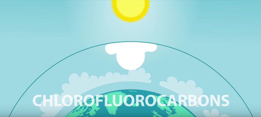
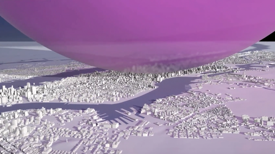
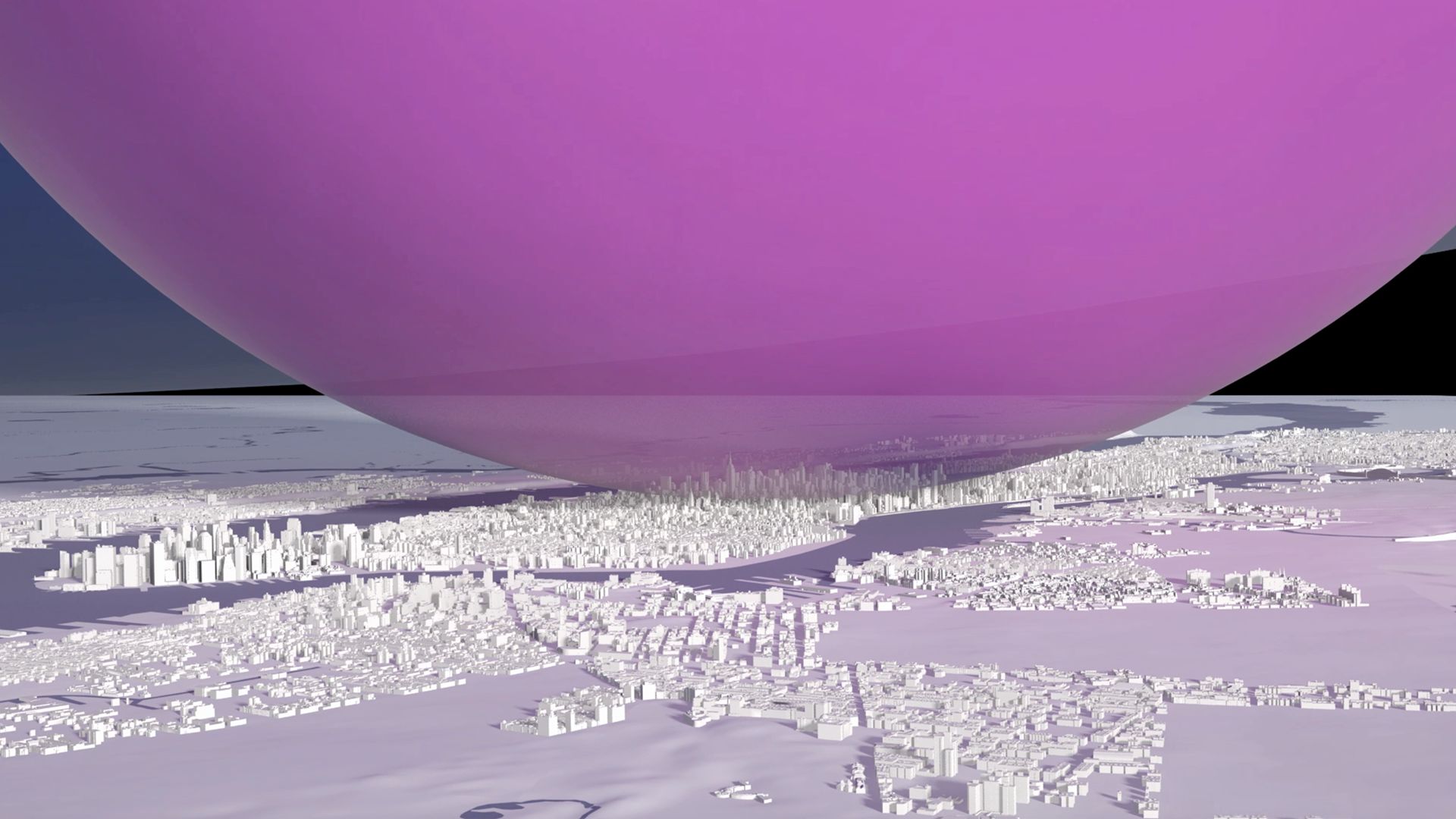
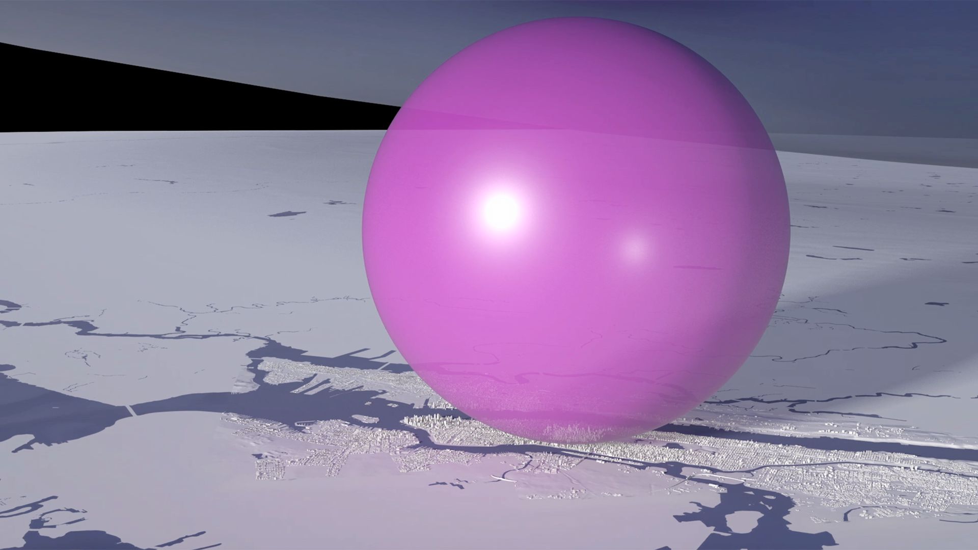
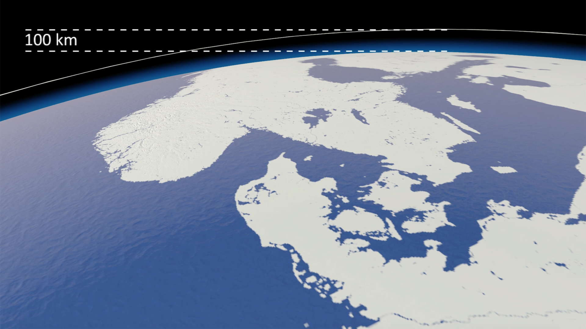
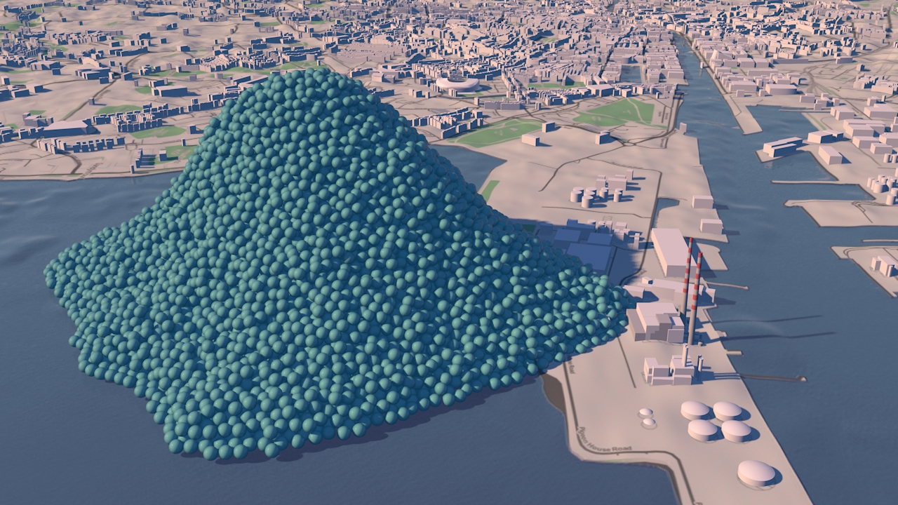
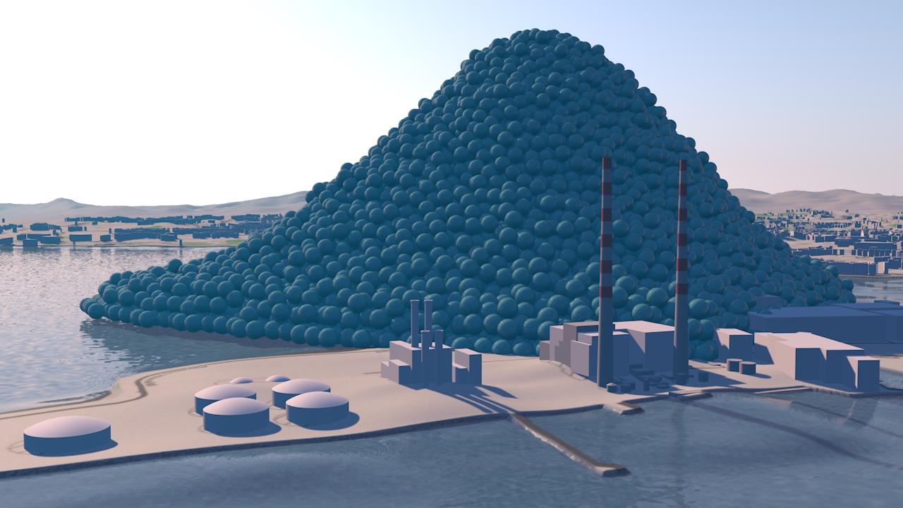
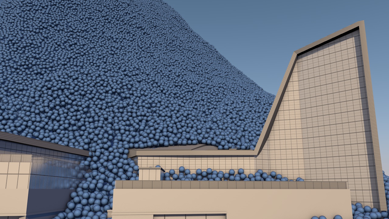
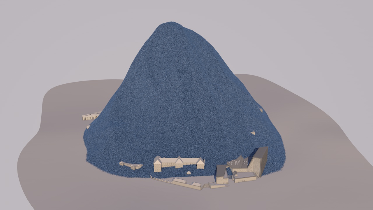
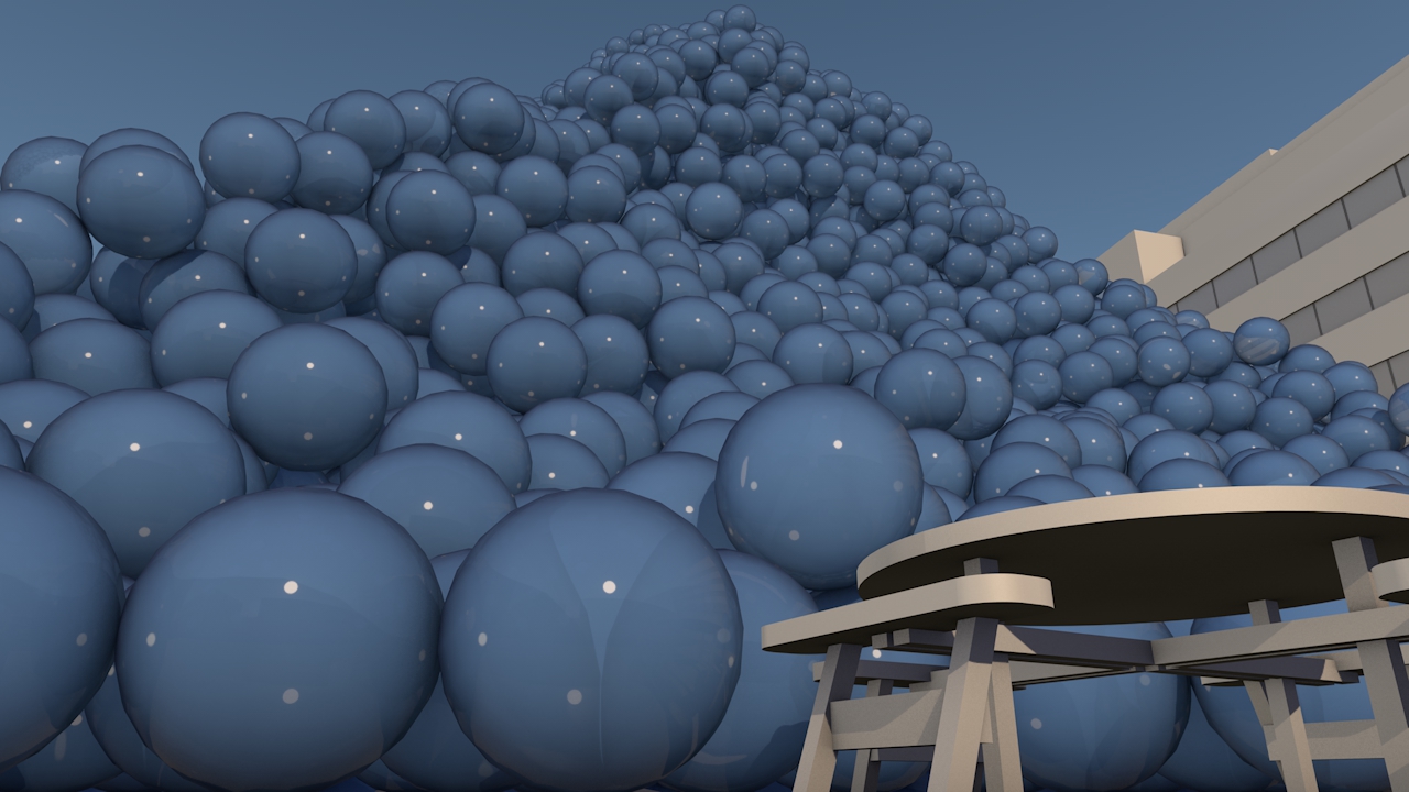
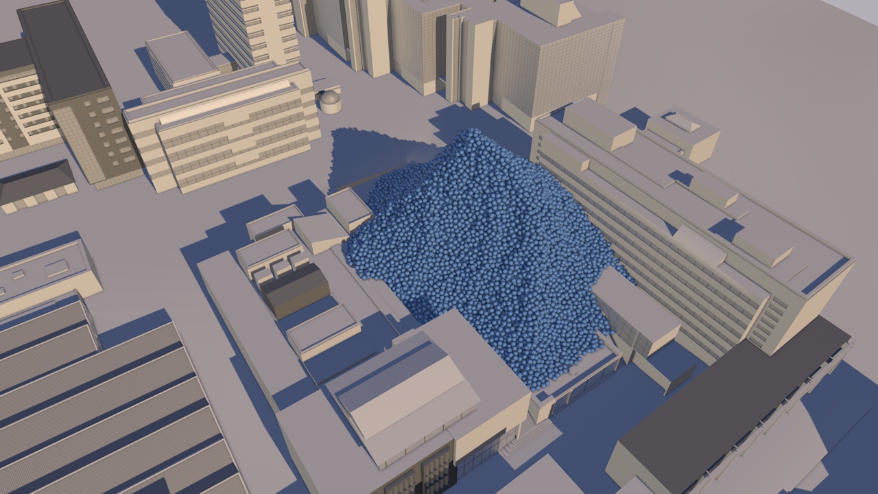
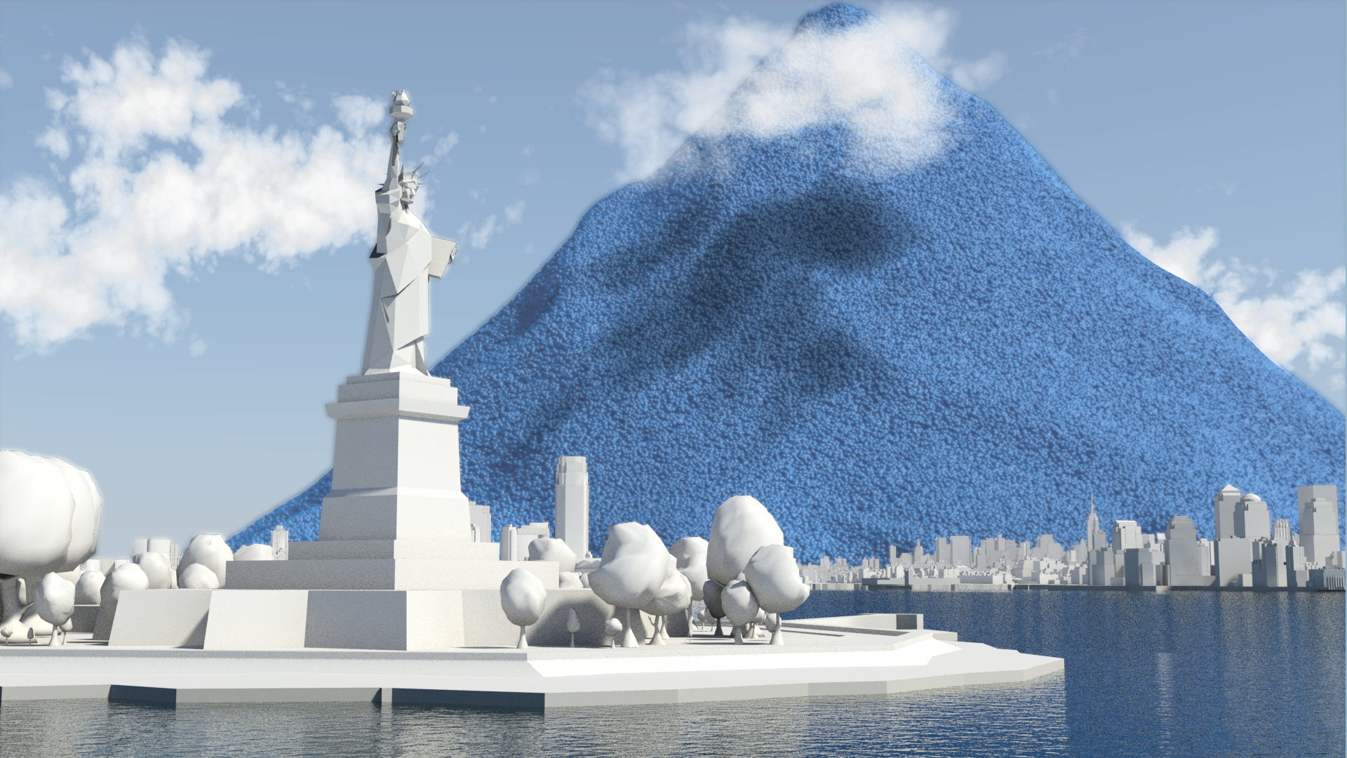
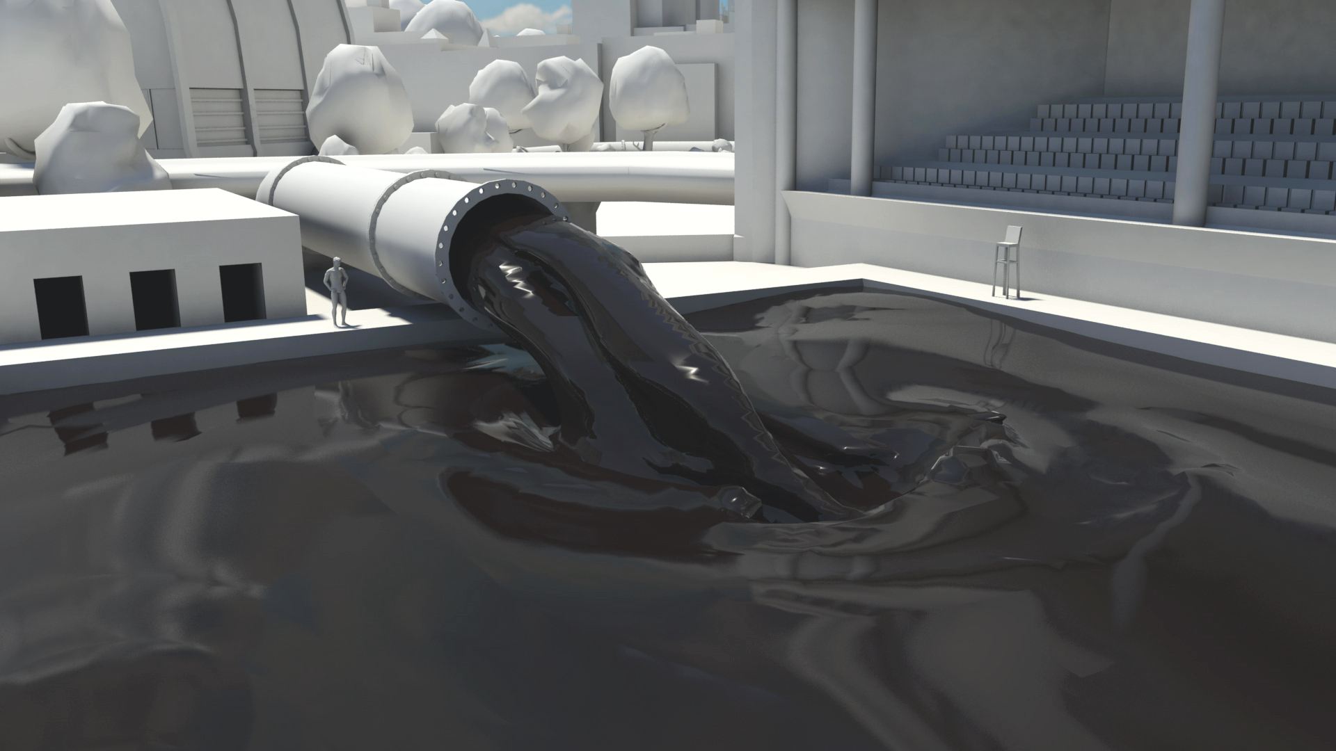
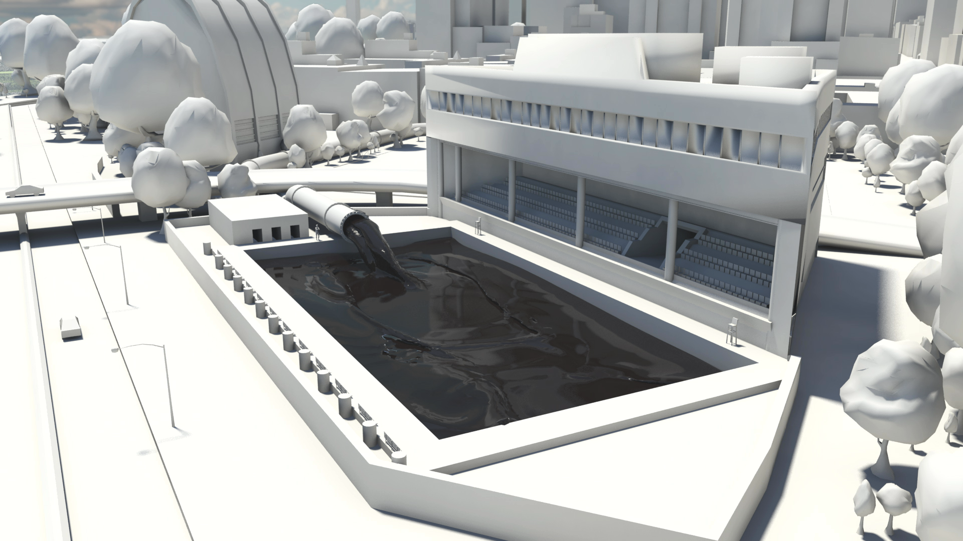
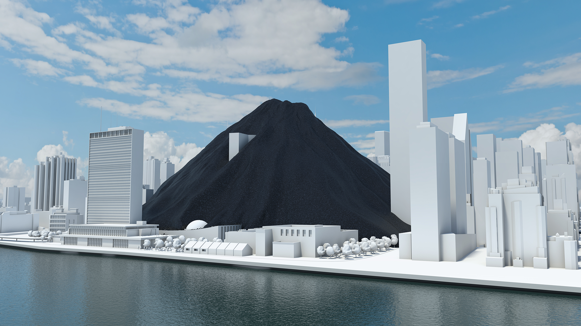
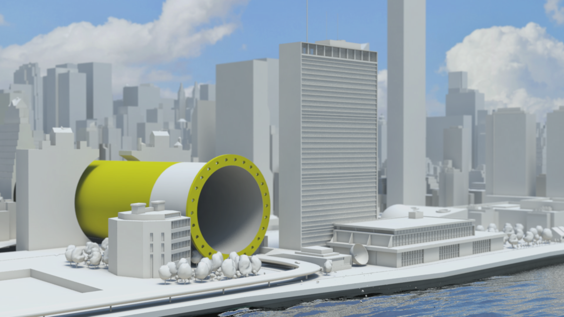
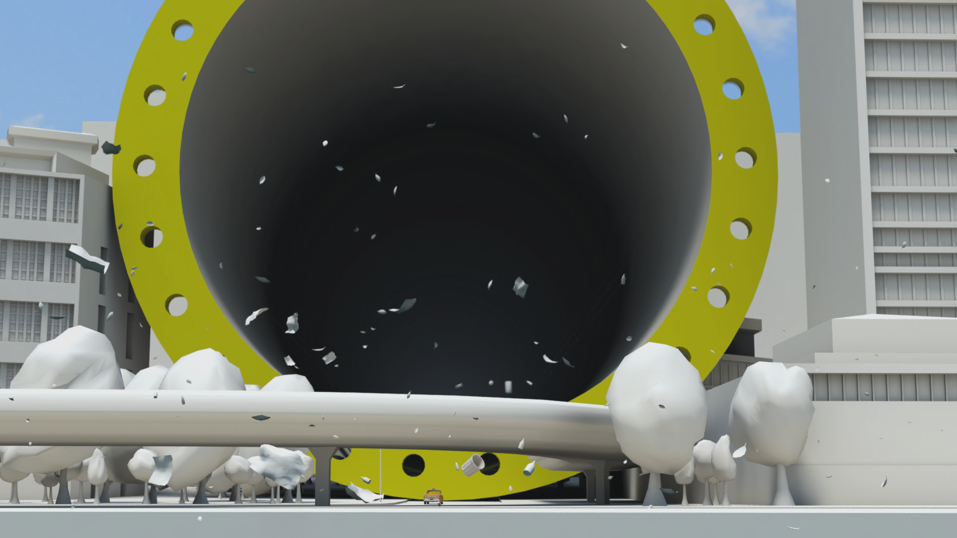
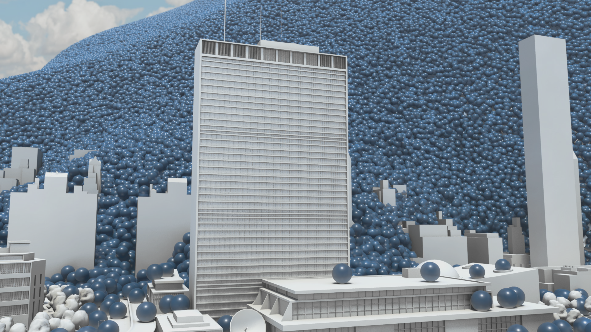
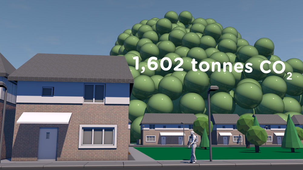
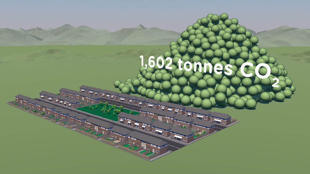
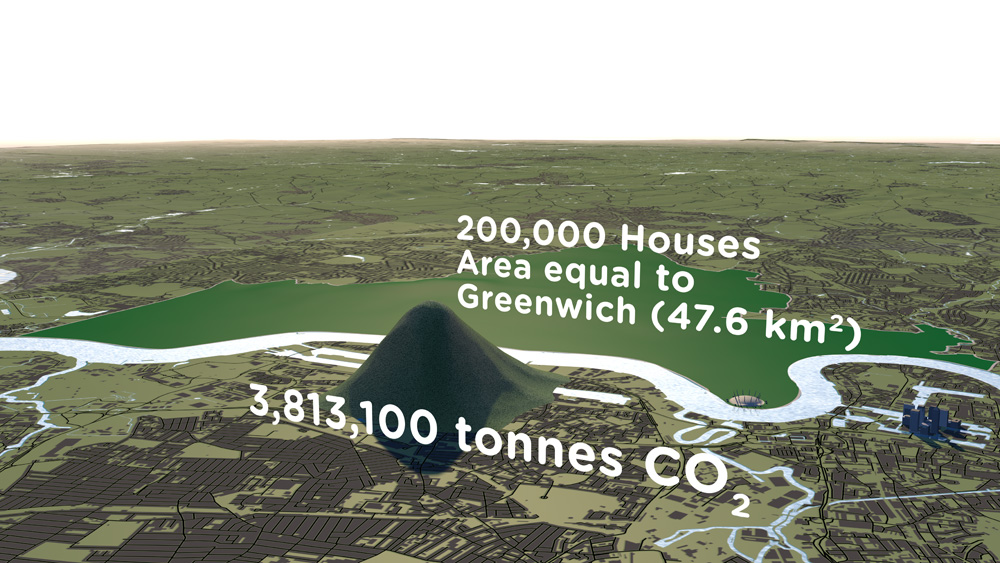
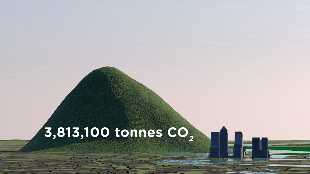
A coal pile buries the UN General Assembly, gas races down 42nd Street and then New York is lost under a blue mountain. These dramatic CGI scenes, depicting actual quantities, create an immersive journey that brings home the scale of global carbon emissions and fossil fuel consumption.

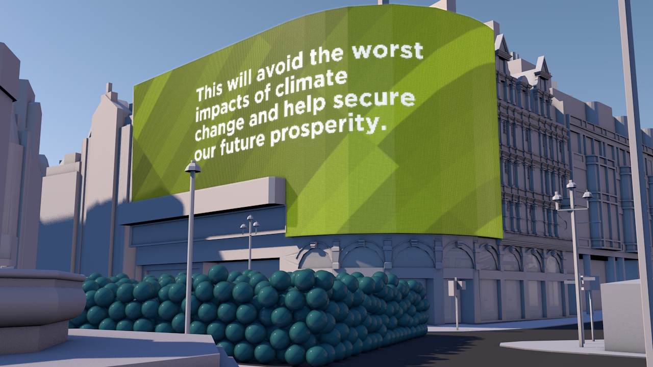
This dynamic four-minute film, being launched at the UN Climate Change Summit in New York September 2014, shows the part that carbon capture and storage can play in limiting global climate change to 2 degrees.

Commissioned by WBCSD and produced by Carbon Visuals, the animation is being shown to world leaders, industry experts, campaigners and scientists at the Summit to help catalyse and inform conversations about reducing carbon emissions.


Key messages of the film:

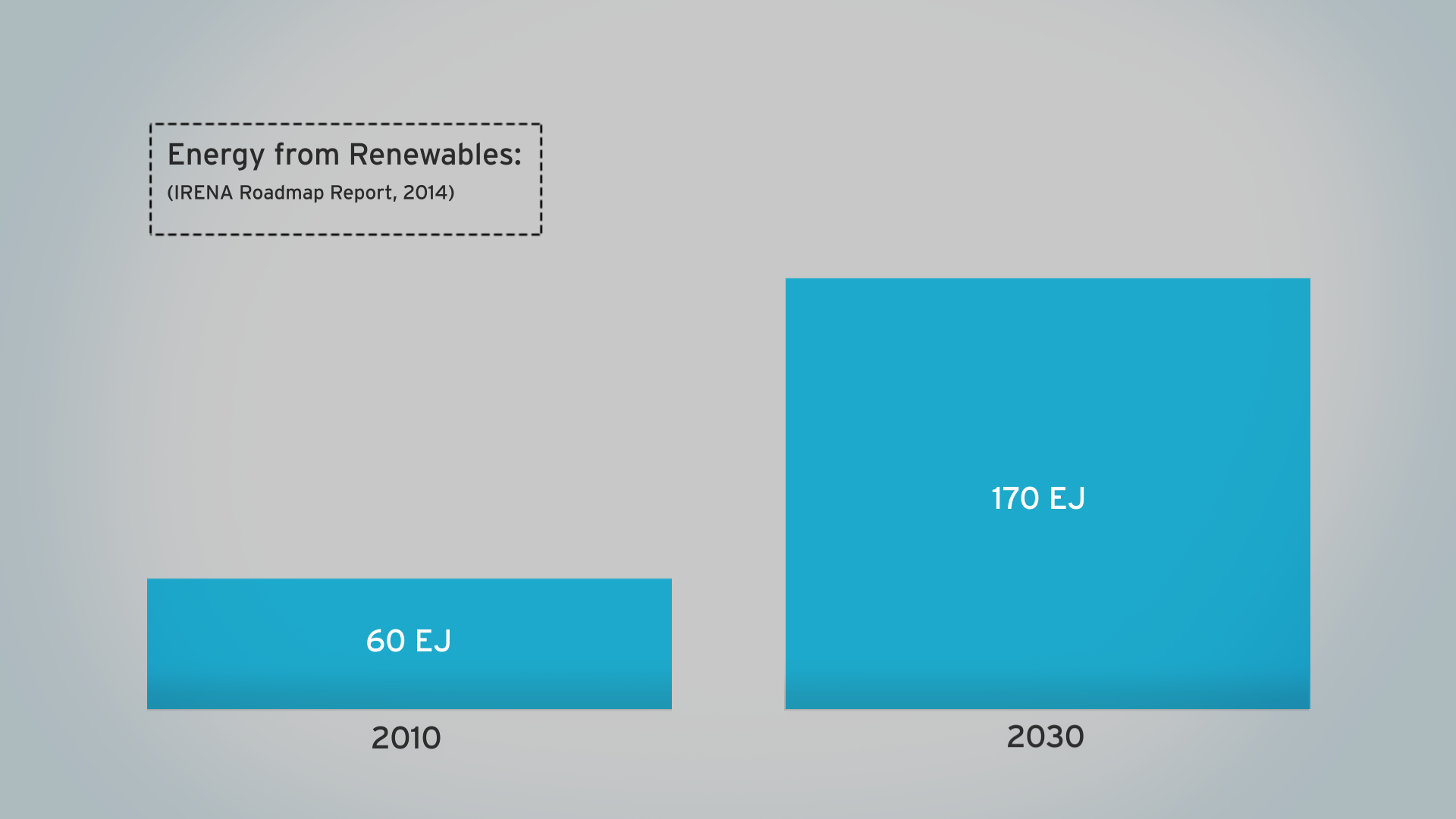
  • use of renewables is increasing
  • but energy use is rising faster
  • fossil fuel use is increasing not decreasing
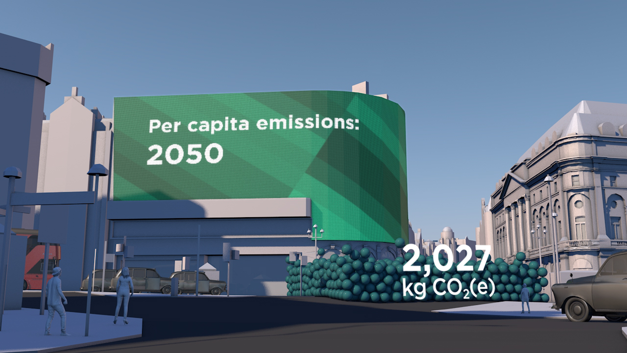
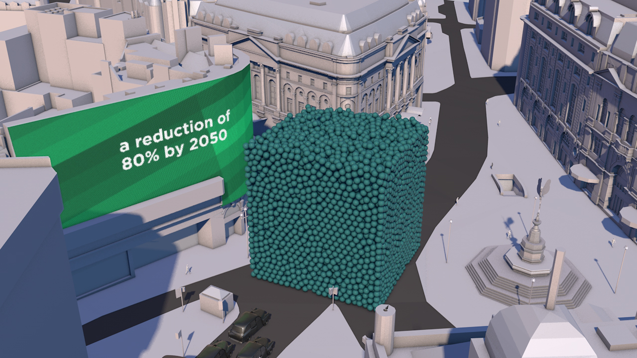
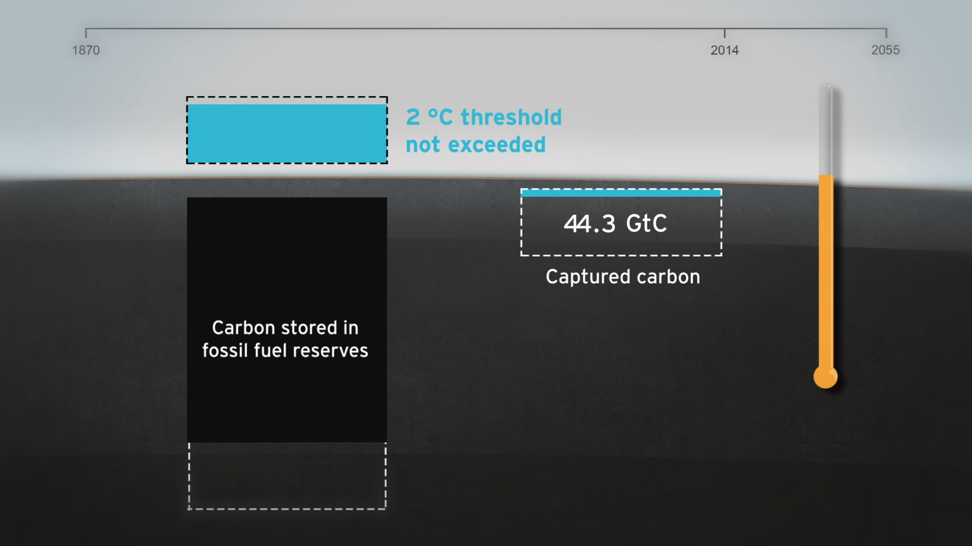
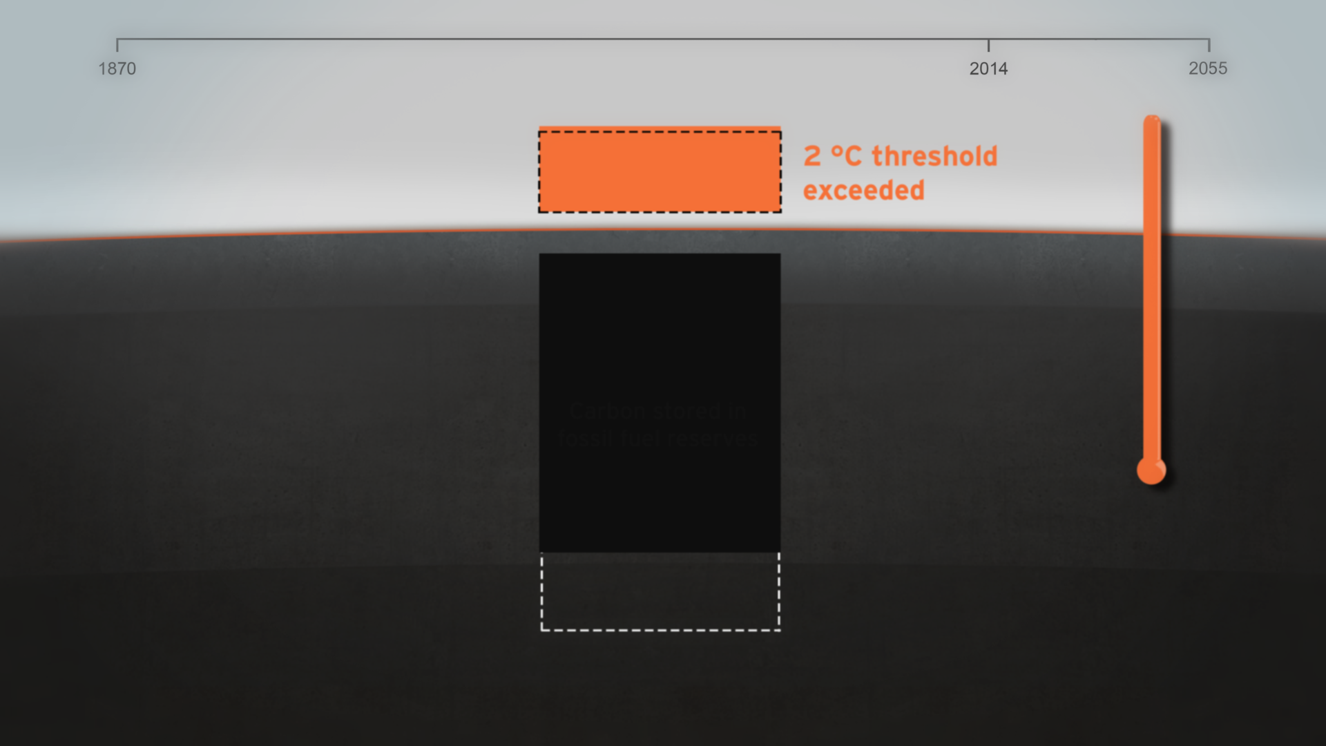
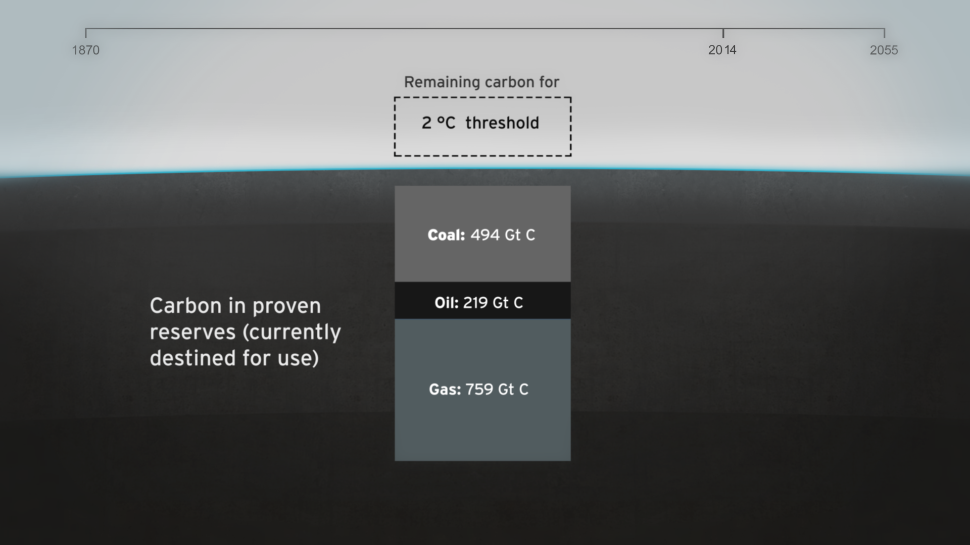
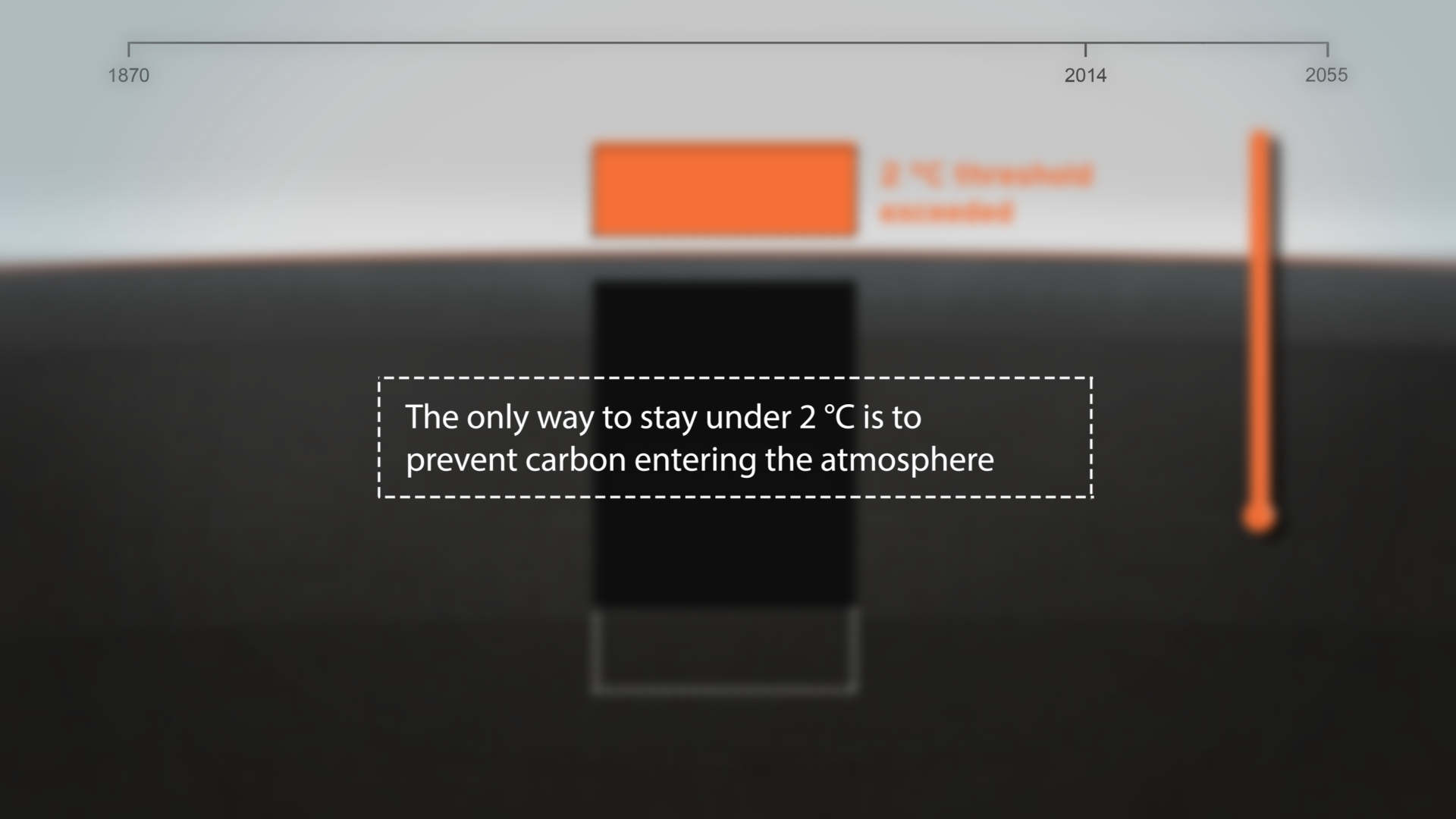
  • if carbon stored in fossil fuel reserves is burnt we exceed 2 degrees warming by 2055
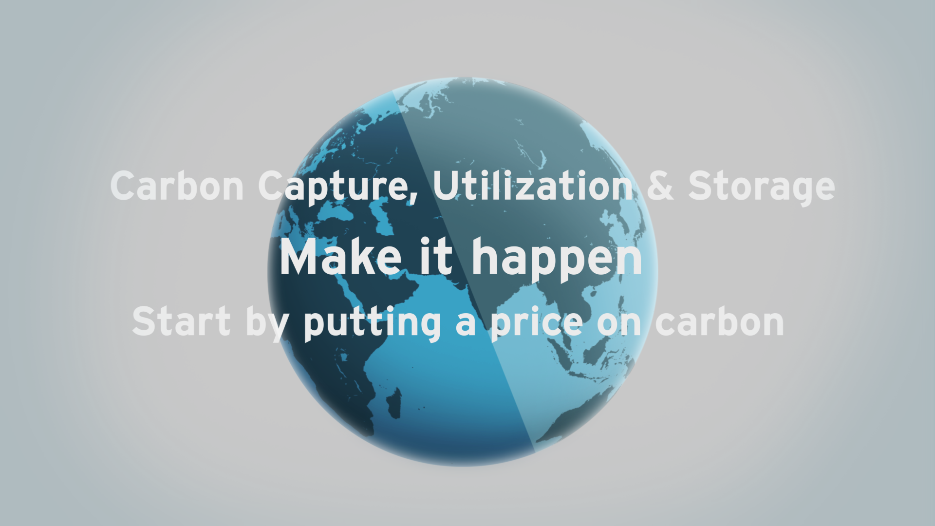
  • carbon capture & storage (CCS) is an essential part of the 2 degrees solution

Technical note
The volumes of coal, oil, gas and CO2 shown in the film are accurate volumes based on best available data. A detailed Technical Data Methodology document has been produced to accompany the film. This shows all data sources, assumptions on future global renewable and non-renewable energy requirements and the potential of carbon capture and storage technology.

See the Methodology Document for more details

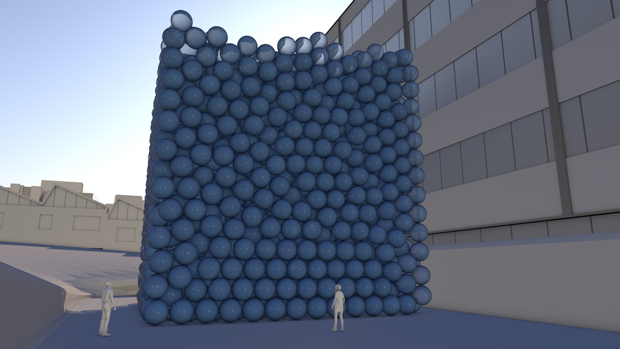
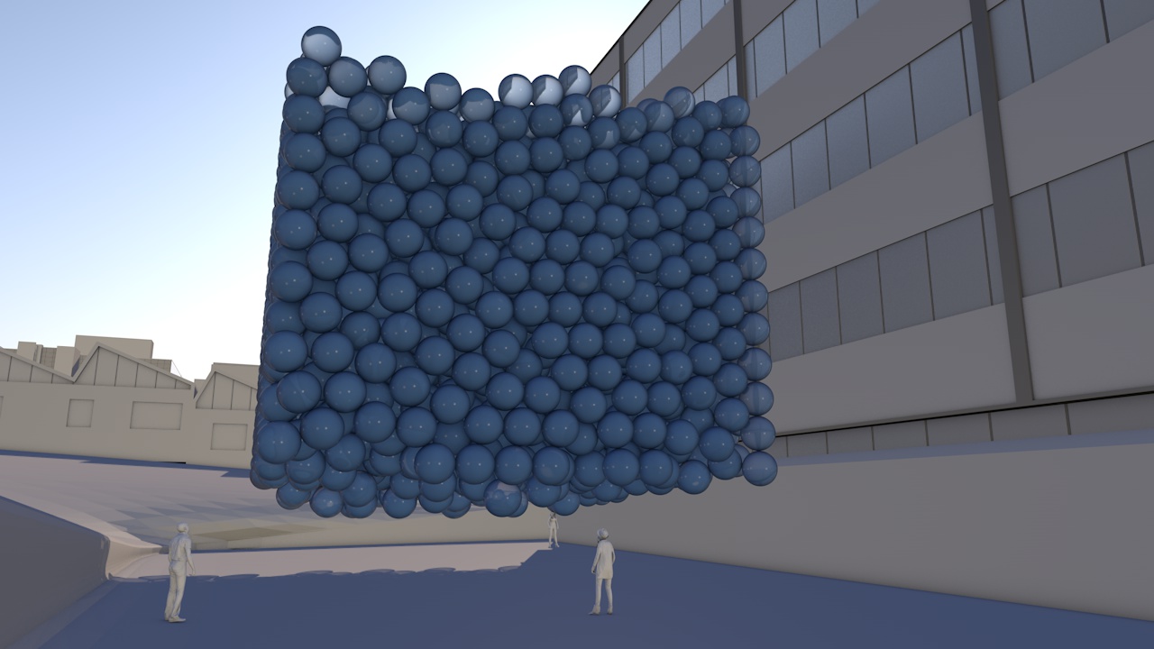
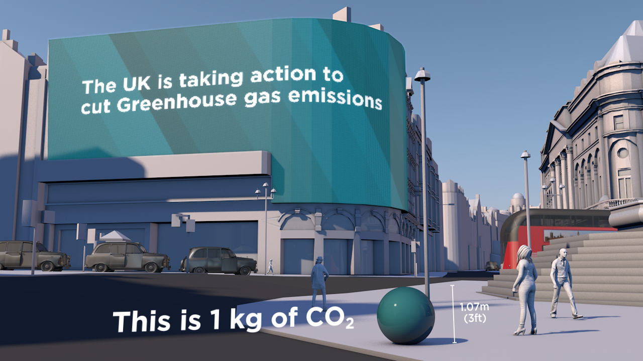
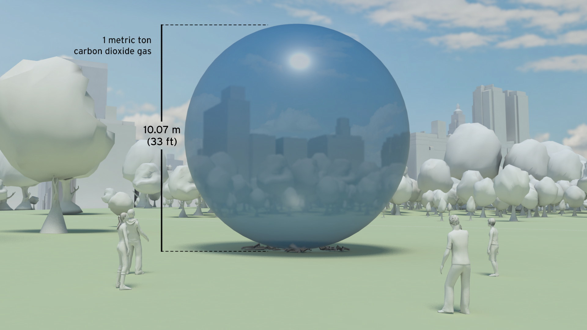
In 2012 we added over 39 billion metric tons of carbon dioxide to the atmosphere. That’s 1,237 metric tons a second. 

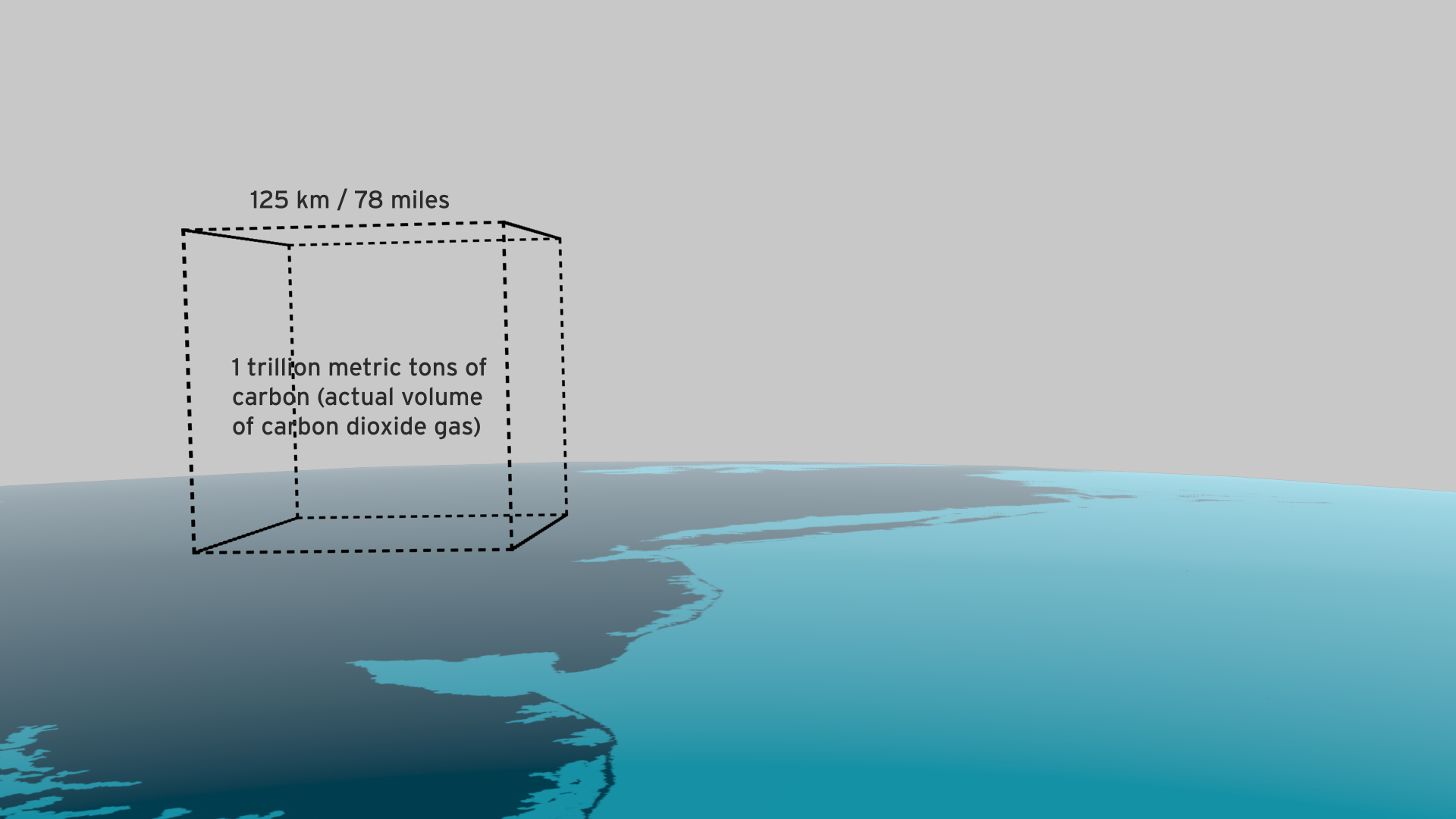
It is like a ‘bubble’ of carbon dioxide gas 108 metres across entering the atmosphere every second of every day. We could fill a volume the size of the UN Secretariat Building with our carbon dioxide emissions in less than half a second. We could fill it 133 times a minute.

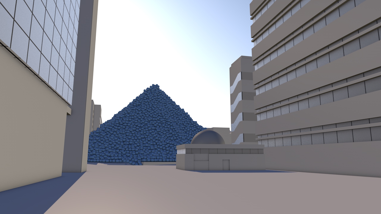
The pile of one metric ton spheres in the film, which represents one day’s emissions, is 3.7 km high (2.3 miles) and 7.4 km across (4.6 miles).

The world gets through a lot of fossil fuels:

  • 7,896.4 million metric tons of coal a year (21.6 million metric tons per day, 250 metric tons per second)

  • 91,330,895 barrels of oil per day (168 m3 per second)

  • 3,347.63 billion m3 of natural gas per year (9.2 km3 per day, 106,082 m3 per second)

This film tries to make those numbers physically meaningful – to make the quantities real; more than ‘just numbers’.

The coal we use each day would form a pile 192 metres high and 546 metres across. We could fill a volume the size of the UN Secretariat Building with coal every 17 minutes.   At the rate we use oil, we could fill an Olympic swimming pool every 15 seconds.

This would fill a volume the size of the UN Secretariat Building with oil every 30 minutes.

The rate at which we use natural gas is equivalent to gas travelling along a pipe with an internal diameter of 60 metres at hurricane speeds (135 km/h / 84 mph). We could fill a volume the size of the UN Secretariat Building with natural gas in under 3 seconds.

We use a cubic kilometre of gas every 2 hours 37 minutes and a cubic mile of the stuff every 10 hours 54 minutes.

A set of shorter clips has also been released, featuring some of the most impactful scenes of the main film. These are intended for use by everyone, from industry through to educators and campaigners. Get in touch if you would like hi-res versions.

Main film and extract films can be viewed on YouTube:

Whole film

Fossil Fuels Extract

Carbon Dioxide Extract

Natural Gas Extract

Oil Extract

Coal Extract

All images are available under Creative Commons licence to download on our Flickr page

See blog background story.

Making sense of carbon, trees and timber

CLIENT

Wood for Good

PURPOSE

To find a new way to communicate the carbon benefits of using wood and timber in the UK construction sector.

DESCRIPTION

A series of short animated films and case study images using Wood for Good’s data to reach construction professionals, policy makers and the public.

The competence and skill you have in handling large data sets is absolutely fantastic. And you still delivered a wonderful set of visuals for us that we can continue to use for a long time to come.

Craig White Chairman, Wood for Good

How much carbon is stored in a tree? How does that translate into cut timber and wood products? And how much carbon can be ‘banked’ by using timber for building houses in the UK?

These questions are raised and answered in a communication project that includes a series of short animated films and set of case study images created by Carbon Visuals for Wood for Good, the UK's wood promotion campaign.

The aim was to find a new way to communicate the positive carbon benefits of using wood and timber in the UK construction sector not just to construction professionals but also policy makers and the public.

Given the wide nature of the brief we agreed with the client to start the project with a scoping phase. During this, it was decided to split the film into three separate sections that could each work as short stand-alone films, rather than only as one single complex narrative. In addition we agreed to create a set of case study best practice images showing the carbon ‘banked’ in high profile buildings and timber products.

It has been very satisfying to shape and create a project which has both a business focus and important educational potential. I would like to see us working with more trade bodies and campaigns that have an important carbon message to get across.

Antony Turner, CEO Carbon Visuals

By liaising closely with the client in this initial phase we were able to spend time working up a communications plan, sourcing and examining appropriate data and creating draft film storyboards. This established a sound basis for the production schedule, culminating in all visual materials being ready for the campaign launch.

Data Sheet with methodology, data and references available here.

See Wood for Good website page here.

See our post-production video (giving insight from our clients on the project) here.

Illustrating the world’s first Carbon Neutral Engine Oil

CLIENT

Castrol Professional

PURPOSE

To help their dealers understand that although the amount of CO2 offset for a single one litre pack of engine oil might be small (2 kg), it adds up. Particularly when seen from the point of view of a whole country, or indeed world sales.

DESCRIPTION

An animated film for the European dealer launch at CERN in Switzerland of ‘the world’s first CO2 Neutral Engine Oil’.

A resounding success - thank you for turning this round so quickly. We are very happy with the final product and it was well received last week at CERN.

Adrian Pask, Global OEM Offer Development Manager Castrol Professional

How do you visualise carbon offsetting? This is, after all, carbon removed from the air to mitigate actual emissions. That was the challenge facing us when asked by Castrol Professional to create an animated film for the European dealer launch at CERN in Switzerland of ‘the world’s first CONeutral Engine Oil’.

Castrol wanted a way to help their dealers understand that although the amount of CO2 offset for a single one litre pack of engine oil might be small (2 kg), it adds up. Particularly when seen from the point of view of a whole country, or indeed world sales.

Rather than showing the CO2 emitted in the manufacture of a consumer product, our role was to show that Castrol ‘neutralised’ those emissions. We set about writing and developing a story-board that could be animated in record time (we had less than a month to complete the project).


Background

Castrol Professional products have become the first CO2 neutral engine oils in Europe. EDGE Professional, MAGNATEC Professional and GTX Professional have all been certified CO2 neutral according to BSI PAS2060, a standard for measuring and managing the CO2 footprint of a product’s life cycle.

The company underpins its CO2 neutral claims with good science including reduction in the manufacturing process. It offsets the remaining CO2 by investing in a portfolio of emission reduction projects such as reforestation in Kenya, clean electricity generation in China and wind farms in New Caledonia.

In 2014, 200,000 tonnes of CO2 are likely to be neutralised globally by Castrol Professional. This figure is expected to grow to nearly half a million tonnes annually the following year.


More on Castrol Professional

More on CO2 reduction projects being supported by Castrol Professional

Tackling CO2 emissions is a major issue for the automotive industry globally and Castrol Professional has made this a central part of our working relationship with manufacturers and dealers, as we develop ever-more sophisticated engine oil formulations.
This is a practical step towards a longer commitment to innovate sustainably through continued technological and scientific advancement.

John Ward-Zinski, Global Brand Director Castrol Professional

To cover so many visualisations in 90 seconds with a strong product focus was potentially a tall order. Looping our narrative through a virtual world within the pack itself encourages viewers to explore and re-explore this complex story.

Dave Forman, Project Manager / Designer Carbon Visuals

The brevity and directness of this film gives staff, dealers and consumers an easy and quick feel for the product and emissions saved on a range of scales from a litre to half a million tonnes.

Antony Turner, CEO Carbon Visuals

Visualising a 90% carbon reduction

CLIENT

Interface

PURPOSE

To show the 90% carbon reduction achieved since 1996 at the European manufacturing facility in the Netherlands.

DESCRIPTION

Short animation that can be used on social media together with before and after images showing the Scherpenzeel factory and surroundings with the dramatic reduction in emissions.

In the past three years we have taken huge strides towards our Mission Zero goal.
To put it in context, we are now operating our European factories with a 90% reduction in greenhouse gas emissions compared to 1996 while the EU Commission has set an EU carbon reduction target of 40% by 2030.

Rob Boogaard, CEO Interface Europe

Carbon Visuals has helped Interface, the carpet tile manufacturer and pioneer in corporate sustainability, show the impressive 90% carbon reduction achieved since 1996 at its European manufacturing facility in the Netherlands.

We created a 3D model of the Scherpenzeel factory and surrounding area and populated it with our trademark ‘carbon bubbles’. Deliverables included volumetrically accurate ‘before’ and ‘after’ images as well as a short animation that can be used on social media or as part of a longer video.

See this animation on YouTube

Interface info on achieving 90 carbon reduction

Infographic illustrating how the emissions reduction has been achieved.

Video: A better way - Interface Europe achieves 90% CO2 reduction

Animating the world's cars

A short animated film from Carbon Visuals is being used to engage managers around the world about the fundamentals of sustainability, how sustainability is relevant to their role and its importance to business success.Created for the University of Cambridge Institute for Sustainability Leadership (CISL), the film shows the current and expected resource use and parking space of all the world’s cars, as well as the CO2 emissions of cars today.

Carbon Visuals brings radical emissions data to life

The Carbon Majors report, launched November 2013, is accompanied by striking graphics from Carbon Visuals which show the extent to which corporations are responsible for the cumulative emissions causing climate change.

Key information from a huge array of data has been conveyed by Carbon Visuals in both conventional and novel ways to give a feel for the scale of the cumulative emissions involved.

What the EPA reduction plan looks like

Under President Obama’s Climate Action Plan, the Environmental Protection Agency (EPA) proposes a 30% reduction in carbon pollution from power plants by 2030. By any account this is a significant announcement. Inevitably with plans like this there is complex data behind the rationale. And the numbers are big.

A 30 percent reduction by 2030 amounts to about 730 million metric tons of carbon dioxide per year. Such a huge number can seem completely abstract to members of the public - so we wondered if we could show the actual volume of CO2 saved in a way that would be more meaningful for everyone.

The Plan puts our nation on track to cut carbon pollution from the power sector by 30 percent by 2030 - that’s about 730 million metric tons... 

U.S. Environmental Protection Agency (EPA)

It turns out that if you divide 730 million tons by the number of US households (132 million) you get almost 14,000 lbs. As 1lb bubbles of pure carbon dioxide, this would be a pile about 53 feet high. And what better place to illustrate this pile size than the White House, home to the most well-known US household.

We’re not saying this is the answer to the communication challenge. But we hope it helps the conversation.

Download images from Flickr here

EPA Fact Sheet here

Full EPA Proposal is here.

Household numbers from US Census Bureau here


It's important that people realize that the EPA plan relates to real ‘stuff’ – not just numbers.

Antony Turner CEO, Carbon Visuals

New York's carbon emissions - in real time

In 2010 New York City added 54 million metric tons of carbon dioxide to the atmosphere, but that number means little to most people because few of us have a sense of scale for atmospheric pollution.

Carbon Visuals, supported by Environmental Defense Fund, have created a film that makes those emissions feel more real - the total emissions and the rate of emission. Designed to engage the ‘person on the street’, this version is exploratory and still work in progress.

Barts NHS Trust Estates Strategy

Barts Health NHS Trust was formed in 2012. It is the largest in the country with multiple sites and major projects planned and underway. For presentation of the Estate Strategy we created 3D models and a map=based animation that showed, in simplified form, development and other planned changes over a five-year period, together with data for water, gas and electricity usage.

We also provided a set of images for use in other presentation formats and media.

Visualising the greenhouse gas emissions for London’s Strategic Health Authority

Carbon Visuals was commissioned by UCLH (University College London Hospital), to create a set of images and a short animated film depicting the carbon footprint of all London's hospitals and NHS Trusts.

The visuals are used in conferences and workshops where facilities and energy personnel, as well as a wide range of other stakeholders, can get a better understanding of actual emissions, emissions reductions and the differences between different hospitals.

Real-time Energy & Carbon Displays for Devon Visitor Centre

Carbon Visuals has created real-time energy and carbon visualisation displays for a new Visitor Centre at Occombe Farm, a working organic farm that includes an award-winning farm shop, a cafe featuring local food and drink, a nature trail, an education centre and cookery workshops.