Image Set

Get Positive

CLIENT

Kingfisher plc

PURPOSE

To encourage staff interest in environmental impacts and corporate goals.

DESCRIPTION

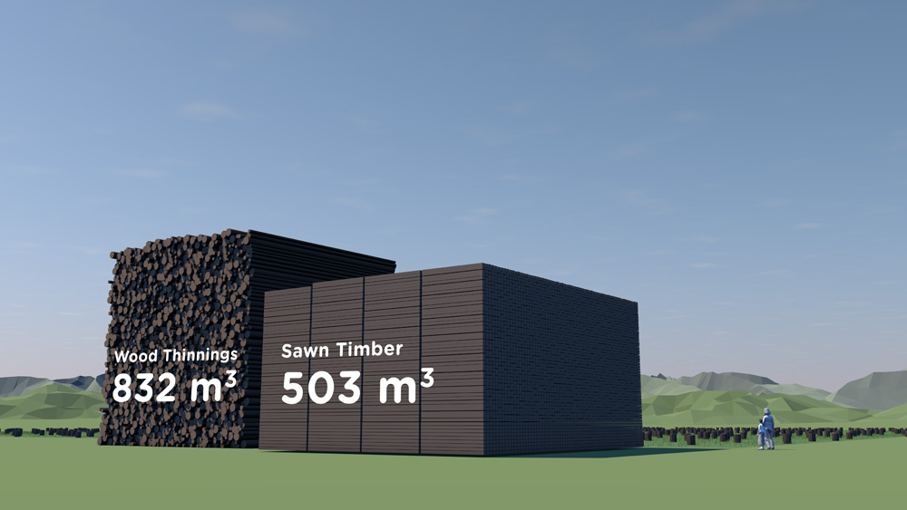
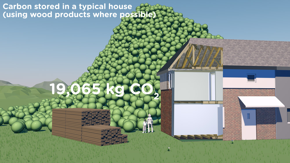
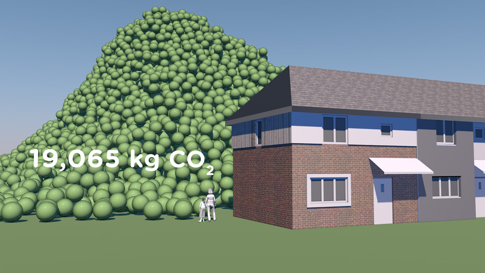
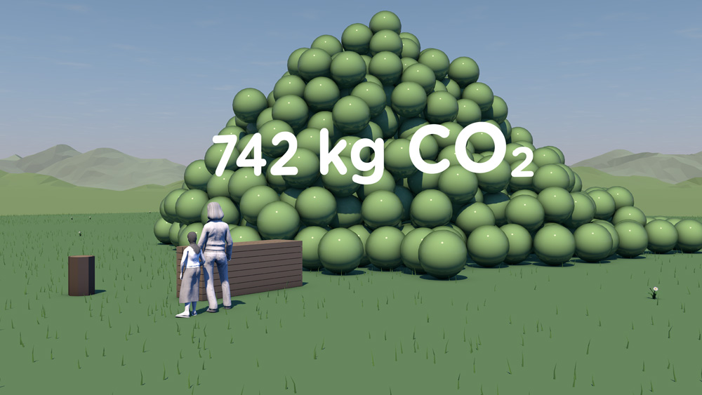
Animation, stills and physical objects using volumes, displays and fun to make emissions and paper use more tangible.

Feedback from the launch has been very positive with people really taking to the visualisation of a tricky issue.

Sinead Conway, Net Positive Delivery Manager, Kingfisher plc

International retail group Kingfisher has developed a forward-looking approach to sustainability with a long-term Net Positive goal. This involves all employees including those based in the corporate centre.

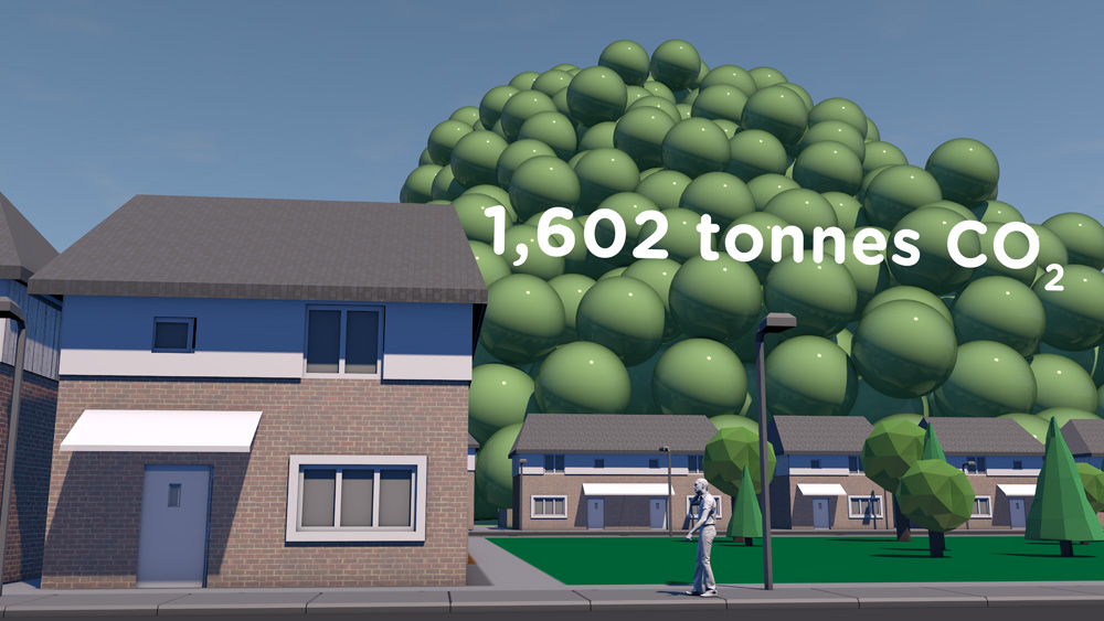
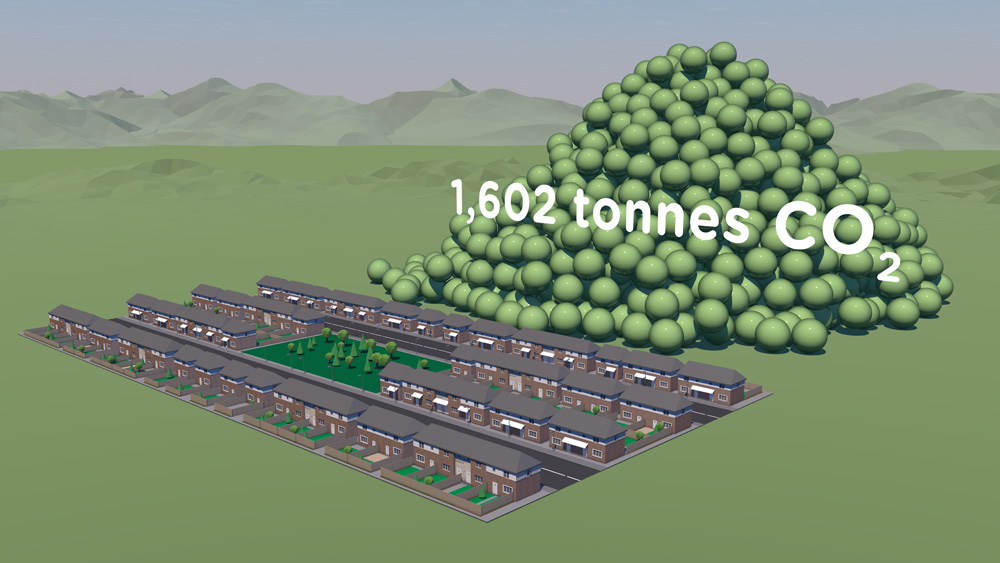
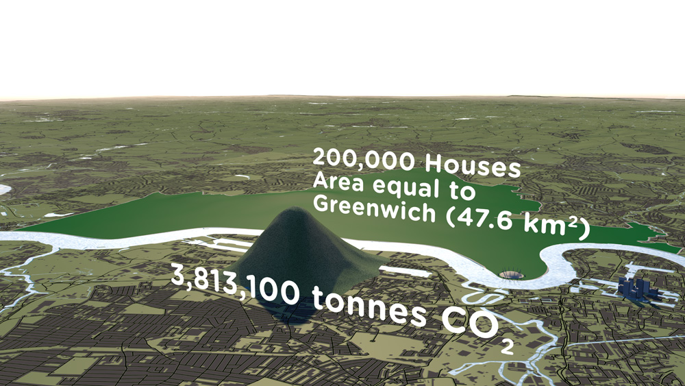
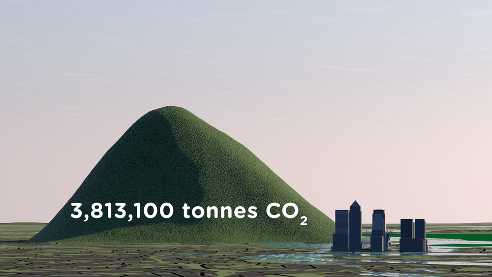
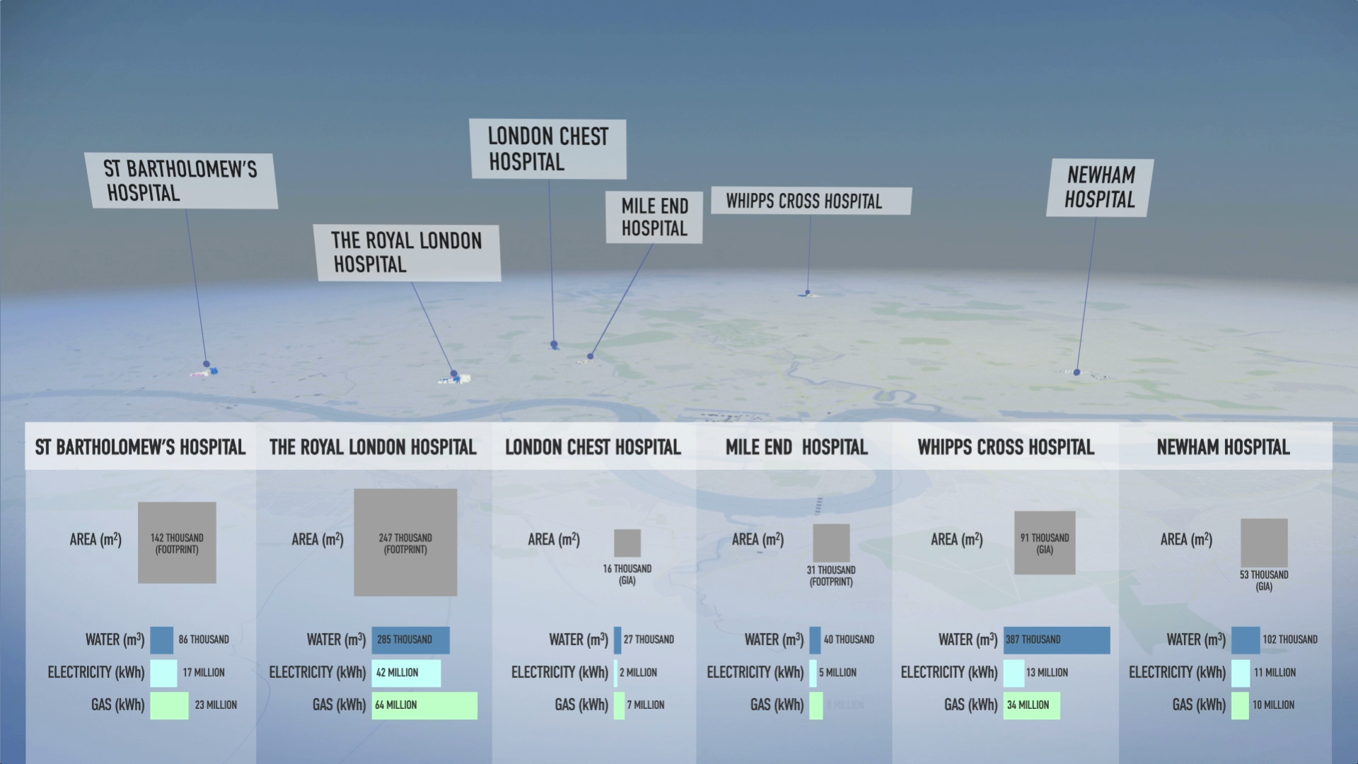
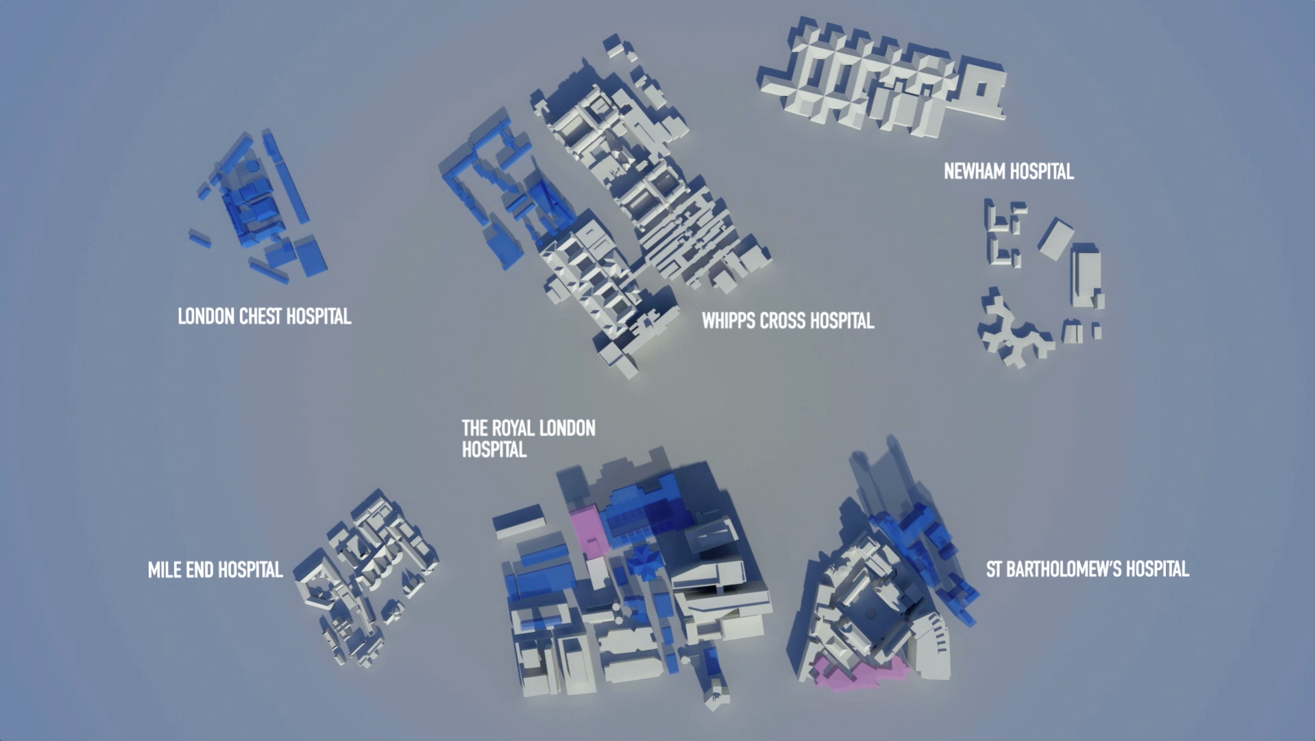
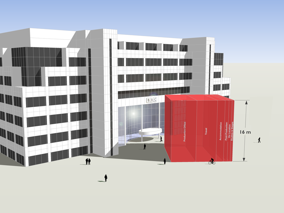
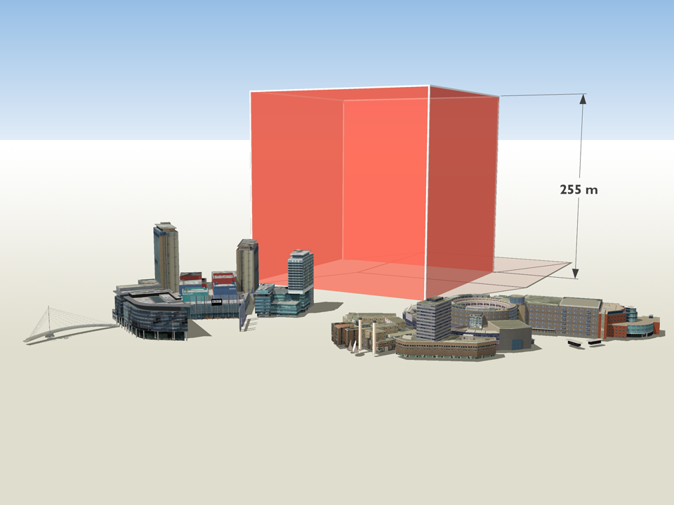
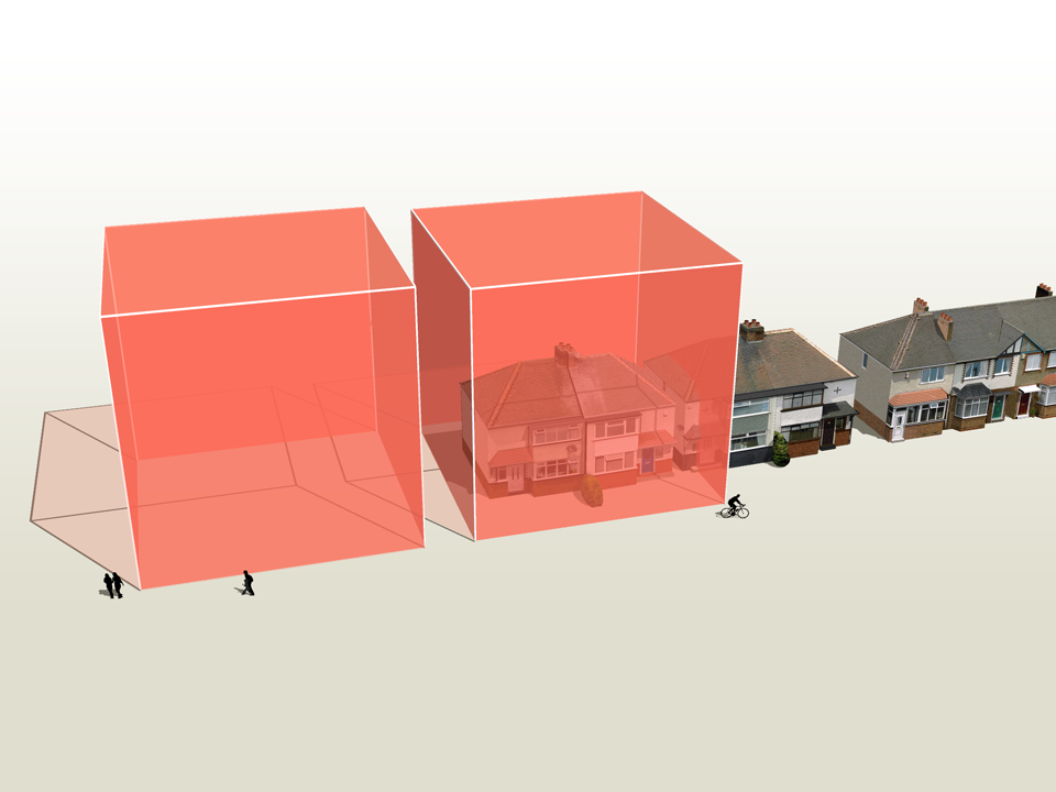
We advised on presenting key data on emissions and paper use in fun, encouraging and engaging ways to spark interest at an internal launch event.

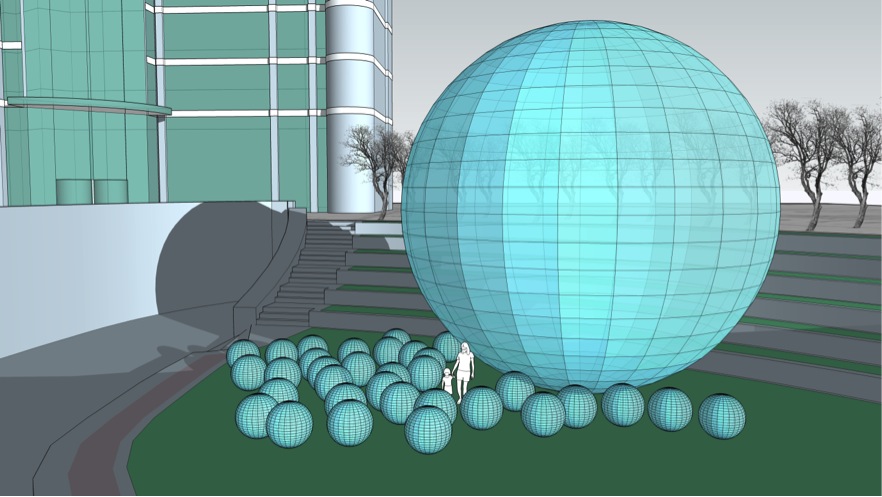
We provided a short volumetric animation set in a scene familiar to staff, and a set of cubes equivalent in size to one gram of carbon dioxide at 15°C and standard pressure. We also supplied one hour’s worth of brightly coloured balls sized to equate to emissions per person per minute and co-designed a striking display of current paper use.

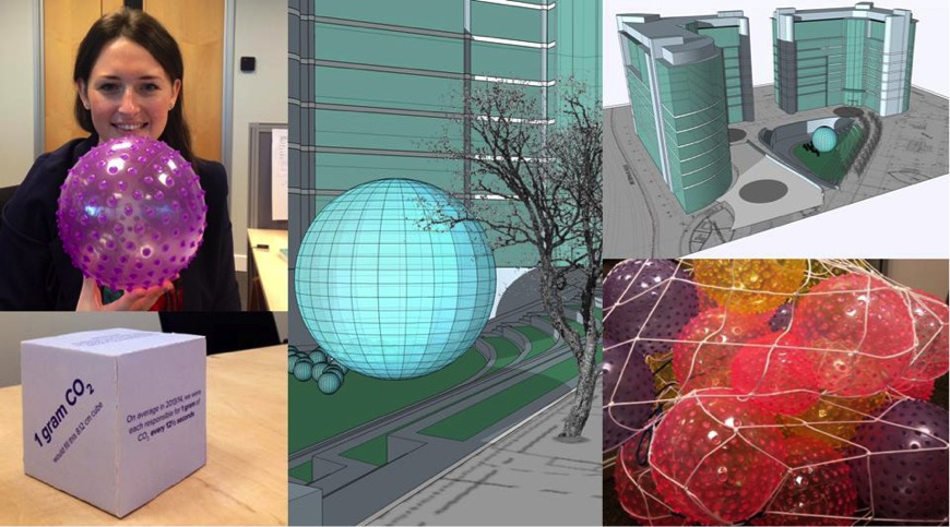
Staff really responded positively to the personal element, seeing data broken down by person and in relation to familiar spaces.

Hannah Judge-Brown, Interim Programme Advisor - Net Positive, Kingfisher plc

Past, present and future - Oundle School

Water used in one minute

Water used in one minute

CLIENT

Oundle School

PURPOSE

To assist the environmental engagement of staff, pupils and others.

DESCRIPTION

Package including a report and 17 sketches.

Oundle School dates back to 1556 when Lord Mayor of London Sir William Laxton endowed and re-founded the original Oundle Grammar School, of which he was a former pupil.

Early in the 20th century, Oundle gained a reputation for science and engineering which has continued to this day with the development of SciTec, a major new science complex. As new and growing 21st century issues increasingly come to the fore, we were delighted to receive an enquiry about whether we could help with the engagement of staff, pupils and others to reduce environmental impacts and, potentially, utility bills too. This provided us with an opportunity to test how we could offer real value within the bounds of a limited budget.

Working with just five annual figures from the School – gas, electricity and water use, waste to landfill and the School population, we were able to provide a bespoke package. Our illustrated report Ways of seeing Oundle’s impact sets out calculations, reference sources, coefficients and assumptions, a compendium of facts, some surprising and memorable examples of energy equivalence and answers to a set of FAQs. Seventeen accurate volumetric sketches show emissions and water use over periods from a second to a year.

We got boarding house consumption of electricity down by 21% in March, and I am sure that a large part of that was through the visualisation, report and sketches.

Ian Clark, Oundle School

The materials have been used in a variety of ways in outreach, training for service providers, posters and in classes with changes in behaviour starting to be noticed straight away and helping Oundle School move forward on the path towards environmental sustainability.

Making sense of carbon, trees and timber

CLIENT

Wood for Good

PURPOSE

To find a new way to communicate the carbon benefits of using wood and timber in the UK construction sector.

DESCRIPTION

A series of short animated films and case study images using Wood for Good’s data to reach construction professionals, policy makers and the public.

The competence and skill you have in handling large data sets is absolutely fantastic. And you still delivered a wonderful set of visuals for us that we can continue to use for a long time to come.

Craig White Chairman, Wood for Good

How much carbon is stored in a tree? How does that translate into cut timber and wood products? And how much carbon can be ‘banked’ by using timber for building houses in the UK?

These questions are raised and answered in a communication project that includes a series of short animated films and set of case study images created by Carbon Visuals for Wood for Good, the UK's wood promotion campaign.

The aim was to find a new way to communicate the positive carbon benefits of using wood and timber in the UK construction sector not just to construction professionals but also policy makers and the public.

Given the wide nature of the brief we agreed with the client to start the project with a scoping phase. During this, it was decided to split the film into three separate sections that could each work as short stand-alone films, rather than only as one single complex narrative. In addition we agreed to create a set of case study best practice images showing the carbon ‘banked’ in high profile buildings and timber products.

It has been very satisfying to shape and create a project which has both a business focus and important educational potential. I would like to see us working with more trade bodies and campaigns that have an important carbon message to get across.

Antony Turner, CEO Carbon Visuals

By liaising closely with the client in this initial phase we were able to spend time working up a communications plan, sourcing and examining appropriate data and creating draft film storyboards. This established a sound basis for the production schedule, culminating in all visual materials being ready for the campaign launch.

Data Sheet with methodology, data and references available here.

See Wood for Good website page here.

See our post-production video (giving insight from our clients on the project) here.

Illustrating low carbon farming

Carbon Visuals was asked by the Soil Association to provide a set of simple 3D image ‘sketches’ to show the carbon saving that can be achieved by using low carbon farming practices. The sketches are being used to help UK farmers have a better understanding of what would otherwise be meaningless numbers.

Carbon Visuals brings radical emissions data to life

The Carbon Majors report, launched November 2013, is accompanied by striking graphics from Carbon Visuals which show the extent to which corporations are responsible for the cumulative emissions causing climate change.

Key information from a huge array of data has been conveyed by Carbon Visuals in both conventional and novel ways to give a feel for the scale of the cumulative emissions involved.

Mapping local air pollution in New York

Visual images created by Carbon Visuals are being used to help New York property managers, building co-op boards and community groups reduce local air pollution from their buildings.

Around 8,000 buildings in New York City have been burning heavy heating oil. These contribute more soot pollution than all cars and trucks on the City’s roads. The NYC Clean Heat program seeks to improve air quality and save lives in New York by eliminating heavy oil use and accelerating the adoption of cleaner fuels

Gasoline from tar sands is different

The Environmental Defense Fund asked us to explain the difference between gasoline from tar-sands and regular gasoline in terms everyone can relate to. We compared them in terms of a single gallon of gas and a typical car's annual emissions. 

Emissions saving of Coati House at Paignton Zoo

Carbon Visuals has created an image to illustrate the energy saving of the highly insulated Coati House at Paignton Zoo. The sustainable building uses recycled plastic, green oak sleepers, FSC timber and 150mm thick black mountain sheep wool insulation so that heating is not required.

Without this insulation the zoo would have installed a 4kW electric heater. The image shows the actual volume of CO₂ that would have been emitted every day or every hour by such a heater.

Paignton Zoo Environmental Park, is a combined zoo and botanic garden in the South West of England that welcomes over half a million visitors a year.

Do The Math - supporting a 350.org tour

In November and December 2012, Bill McKibben and 350.org's Do the Math Tour was a massive success, with sold out shows across the United States.

Carbon Visuals supported the tour by making the numerical argument visual - showing the actual volume of carbon dioxide gas represented by the numbers in the 'Do the math' argument.

The carbon canyons of New York

Seventy five percent of New York City's greenhouse gas emissions come from the energy used by buildings. Reducing this energy is a goal of both building managers and the City of New York itself.

This visualisation takes data about the carbon emissions of municipal buildings in New York City and transforms it into a 3D map of the actual volume of carbon dioxide added to the atmosphere. It co-opts the city itself to serve as its own data visualisation.

Visualising the carbon footprint of all US power stations

We are keen to find existing carbon emission data sets that would benefit from the Carbon Visuals treatment. So when CEO Antony Turner was invited to participate in an “Energy Data Jam” at Google's New York offices in July 2012 he was quick to accept as the aim of the event was to “…brainstorm how publicly available US datasets might be put to use in the continuing transition to a clean energy future.”

One set that we thought would benefit from ‘becoming visible’ was the eGRID data collated by the US EPA. This gives annual generation and environmental characteristics of all large electric power generators in the US.

By using our Google Earth Visualiser tool we are able to create images for any location in the US that show nearby power stations and associated data.

If you would like to explore this data using Google Earth you can download the KMZ file here.

Showing the emissions of power stations in this way is experimental, and a first step. We would welcome ideas and proposals on how this could be developed.

If you have collaboration or funding ideas please contact Carbon Visuals CEO Antony Turner.

USA specific image set

A set of simple images was created to give context to other visualisation projects we were carrying out for US-based Environmental Defense Fund.

Using a model of a typical US house, combined with US metrics - tons, gallons etc. - helps make the images more real for Americans.

Sequestered carbon in innovative building panels

ModCell is a novel and innovative building system that brings the benefit of straw bale construction - exceptional levels of insulation - into the mainstream of the construction industry. Carbon Visuals was asked to provide images to show the sequestered carbon dioxide in panels and in a recently completed project - a school science centre in Bath.

Building Confidence

The Building Confidence Project emerged from an energy 'data-jam' at the Google offices in New York to which Carbon Visuals was invited. It was organised by the White House to generate new approaches to energy efficiency.

The project idea, facilitated by Honest Buildings, was to create a database of energy efficiency projects that can inspire and facilitate similar initiatives elsewhere. Carbon Visuals' role was to consider the role data-graphics could play in reaching wider audiences.

Barts NHS Trust Estates Strategy

Barts Health NHS Trust was formed in 2012. It is the largest in the country with multiple sites and major projects planned and underway. For presentation of the Estate Strategy we created 3D models and a map=based animation that showed, in simplified form, development and other planned changes over a five-year period, together with data for water, gas and electricity usage.

We also provided a set of images for use in other presentation formats and media.

Telling the story of a city's emissions

Adam Nieman has created a series of images as part of a residency at the Create Centre, Bristol, April-June 2012. The exhibition coincided with Bristol's Big Green Week, an annual event that engages the public in green issues and actions.

Supporting carbon literacy at Plymouth University

Carbon Visuals was invited to provide a set of images to illustrate the daily and annual carbon footprint of greenhouse gas emissions from selected buildings on the University of Plymouth campus.

The purpose of the project was to support carbon and energy-reduction activities by staff from the Estates Department. In addition the University is planning research to determine the effectiveness of this kind of communication with students, academics and staff.

The carbon footprint of one hour's TV production

CLIENT

BBC

PURPOSE

To illustrate the emissions resulting from TV production for an industry conference at White City.

DESCRIPTION

Animation that shows the real-time emissions associated with making one hour of broadcast ready production, and image set.

The television industry is taking steps towards addressing sustainability issues associated with TV productions. A key tool, created by the BBC and made available through a partnership with BAFTA, is Albert - a bespoke carbon calculator.

Carbon Visuals was commissioned by the BBC to produce a set of images and a real-time animation showing the emissions resulting from one hour of TV programming. The data was provided by about 80 productions that were the first to use the Albert calculator at the BBC.

This animation was created for the BBC and shows the real-time emissions associated with making one hour of broadcast ready production - equivalent to about 8.2 tonnes of carbon dioxide.

Average emissions associated with the major stages of a production are here shown in order of size and as a whole, depicted in front of the BBC White City building.

These visuals were first shown at an industry conference, which took place in the iconic BBC White City building that is depicted here, on 3rd November 2011.

The PDF illustrates the emissions of different parts of the production process.

Albert was developed & trialed within the BBC in 2011, with production managers and coordinators providing data on about 80 programmes. While there were considerable variations between productions, the average (mean) rate - about 8.2 tonnes of carbon dioxide per hour - provides a first attempt at establishing a figure against which programme makers will be able to gauge progress in future.

Annually within the BBC, about 3,800 hours of TV are produced in-house. An annual volume of emissions, based on the average rate per production hour for programme emissions calculated using Albert, is here shown with familiar BBC buildings in Salford and London for scale.

The average (mean) rate of emissions associated with TV production, based on data from about 80 programmes, is about 8.2 tonnes of carbon dioxide per hour.

This is roughly equivalent to the annual emissions associated with space heating, heating and lighting for a pair of semi-detached houses (figures provided by the BBC).

Based on the average rate per production hour for programme emissions, 11 hours of production time would fill the void in the centre of the BBC Television Centre in London - a space that is well-known to production teams.

Illustrating carbon reduction potential for South Kensington 1851 Estate

CLIENT

Natural History Museum, Science Museum, V&A, Imperial College and Royal Albert Hall

PURPOSE

To illustrate the carbon reduction potential for the South Kensington 1851 Estate.

DESCRIPTION

Striking image set, to illustrate the Carbon Reduction Masterplan launched by the Minister of State for Energy and Climate Change.

Carbon Visuals has created a set of striking images to illustrate the carbon reduction potential for the South Kensington 1851 Estate. Organisations involved include the Natural History Museum, the Science Museum, the Victoria and Albert Museum, Imperial College, the Royal Albert Hall, the Royal College of Music and the Royal College of Arts.

These prestigious institutions came together in 2005 to embark on an inspirational long-term carbon reduction plan. Phase One involved laying the foundations and creating a realistic strategy. The Masterplan, launched in November 2011, marks the conclusion of that phase and the commencement of its realisation.

Carbon Visuals aided communication amongst the parties and with external stakeholders by creating striking imagese at various stages of the project.

Creating a computer generated model of the Estate enabled a wide range of different images to be created - wide angle, close-up, aerial and ground level.

To see the context in which the images were used feel free to download the PDF of the overview brochure.