CLIENT
United Nations Environment Programme (UNEP)
PURPOSE
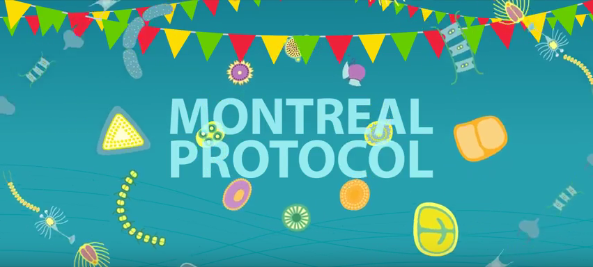
To communicate and celebrate 30 years of international effort in protecting the ozone layer.
DESCRIPTION
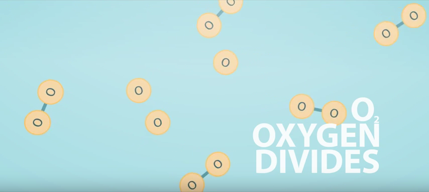
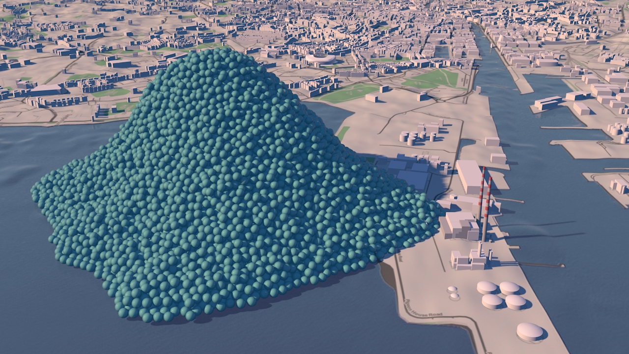
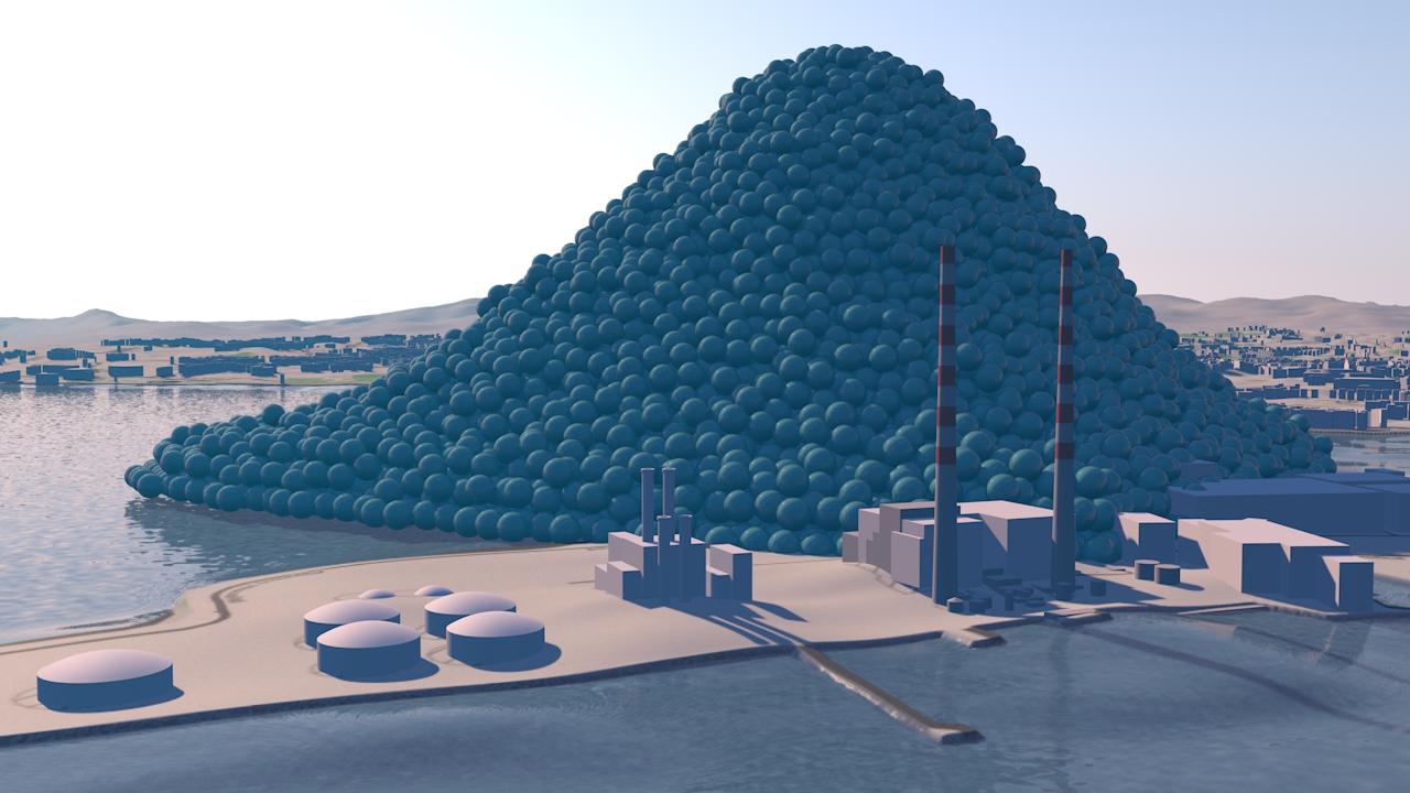
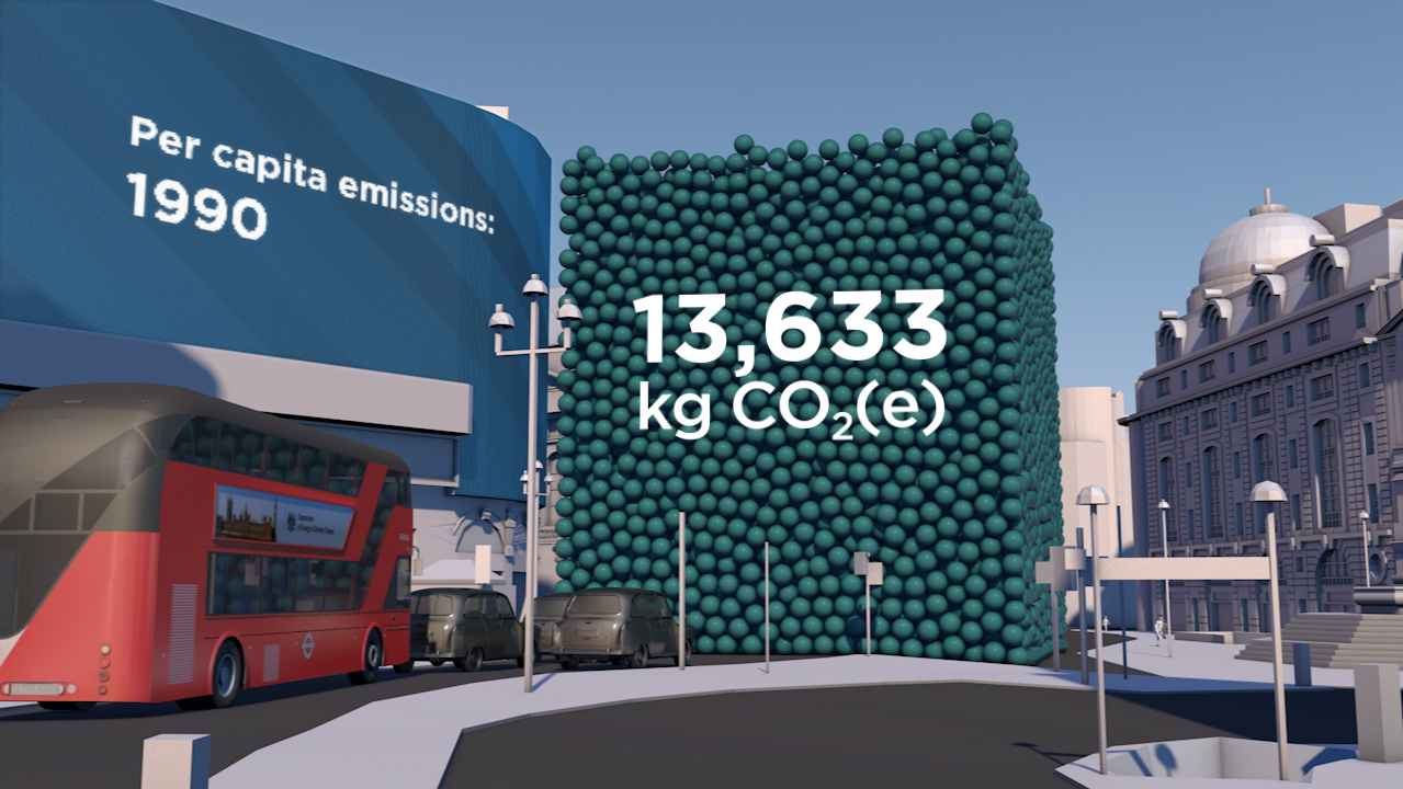
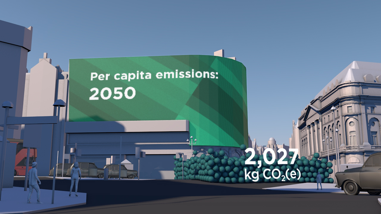
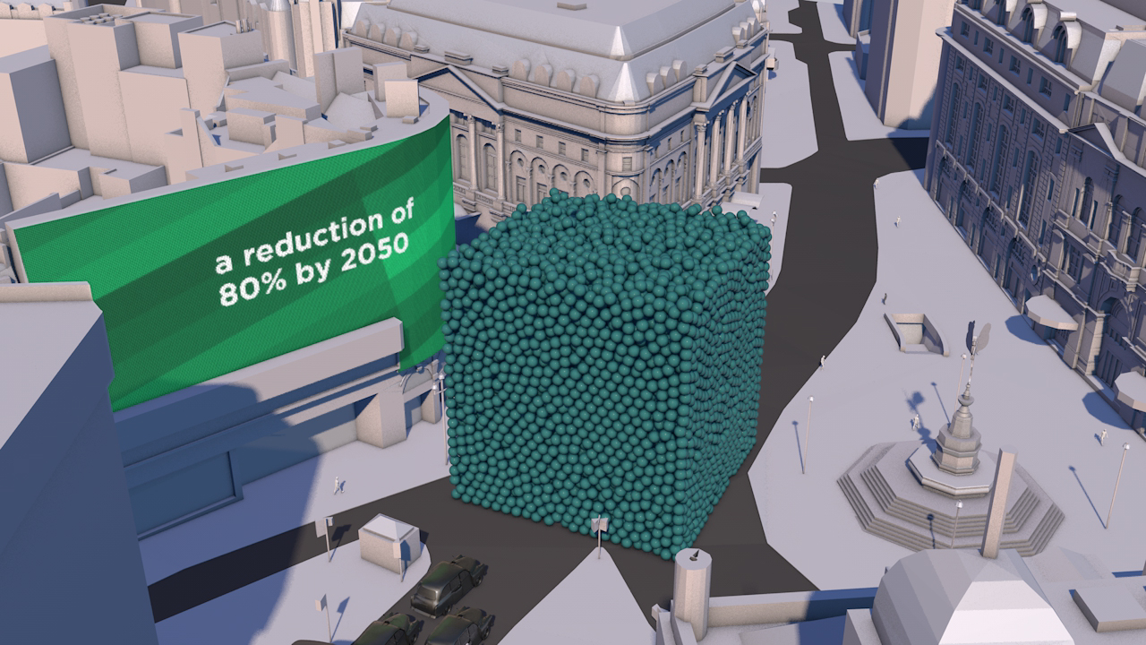
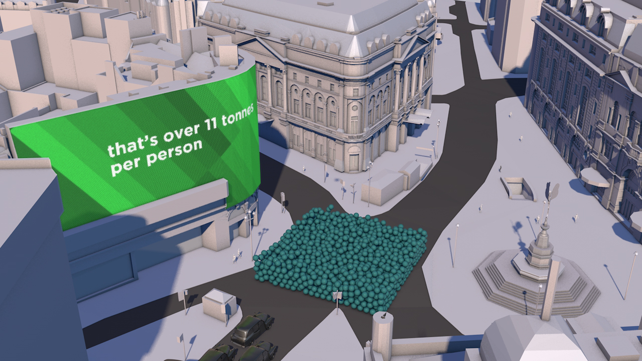
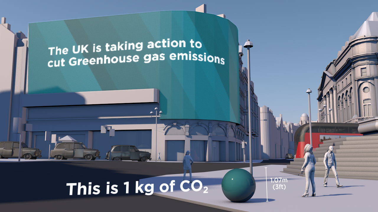
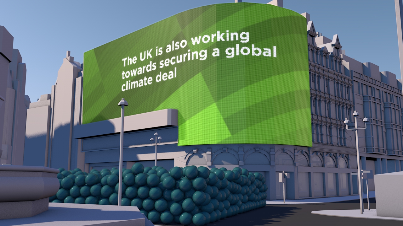
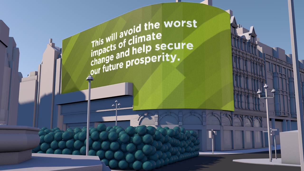
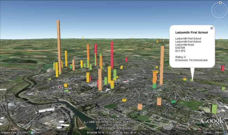
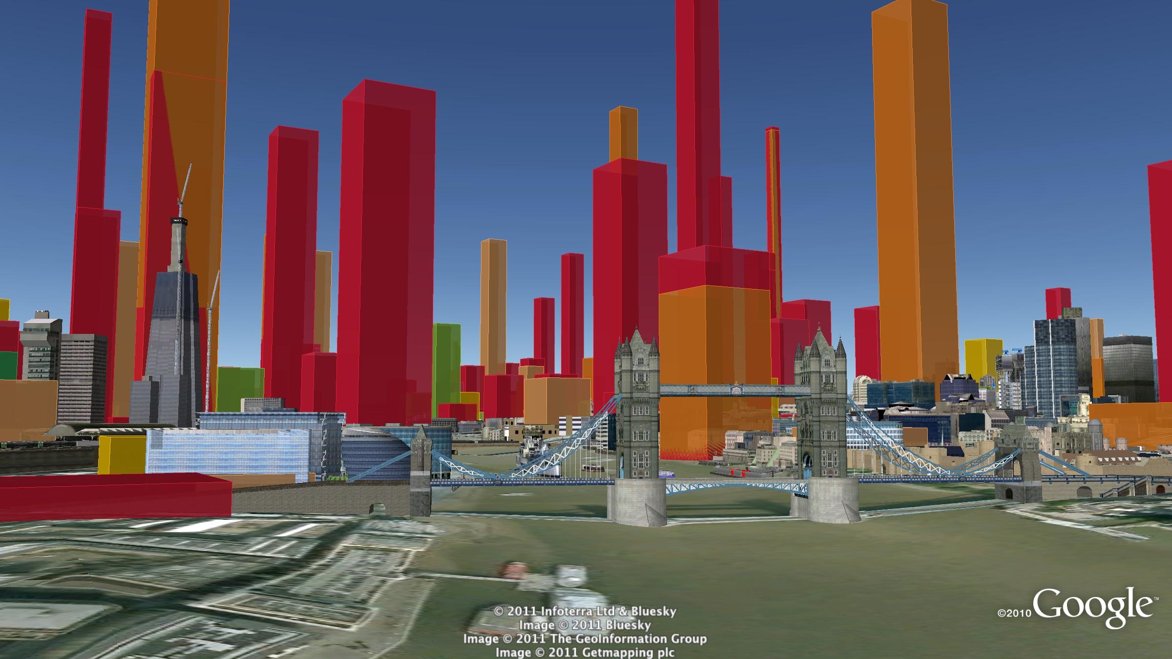
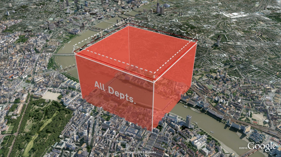
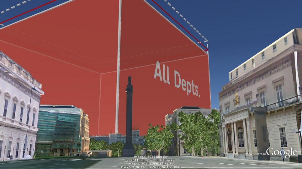
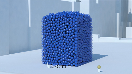
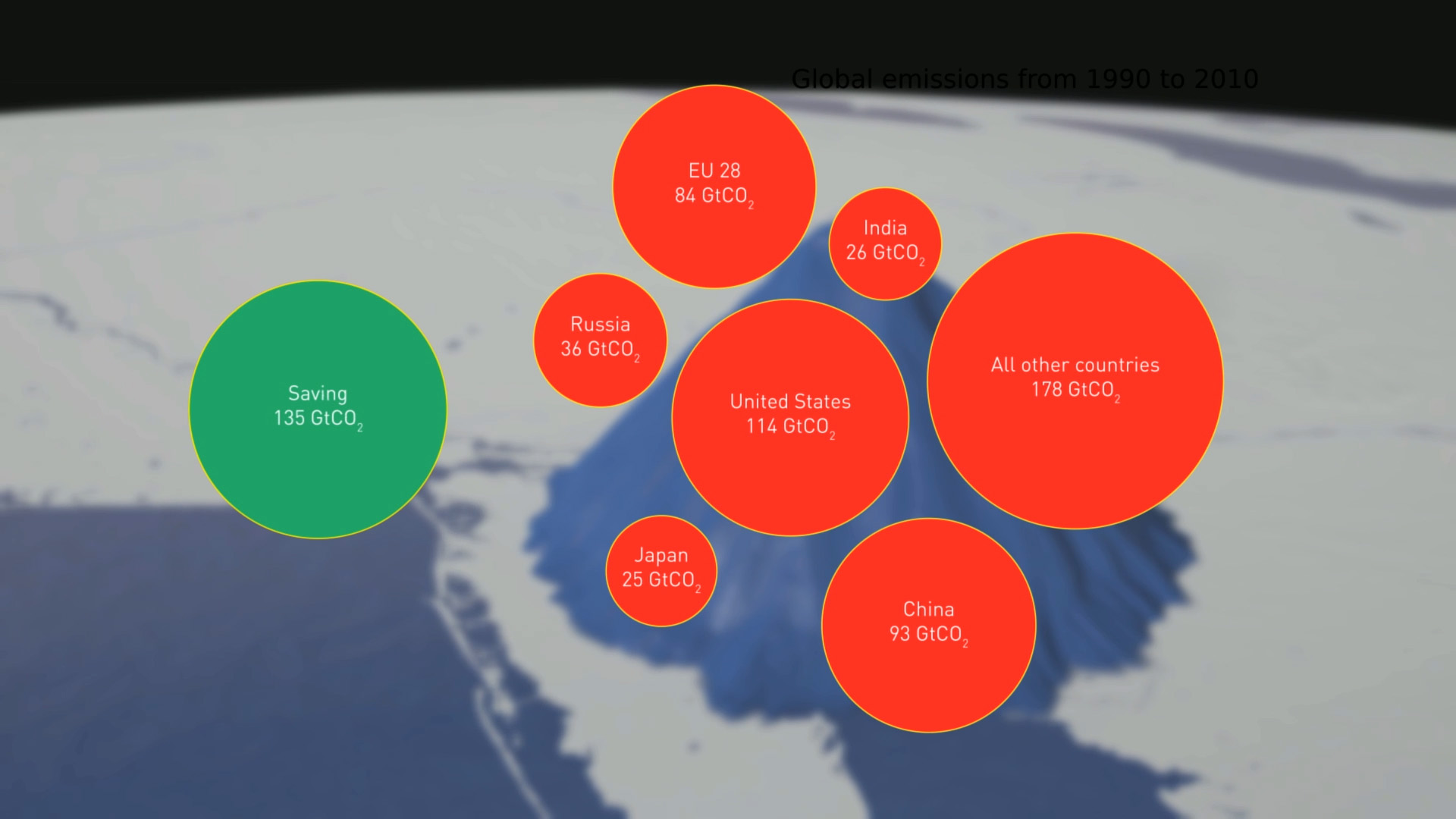
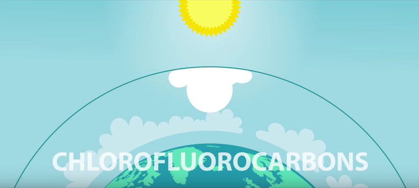
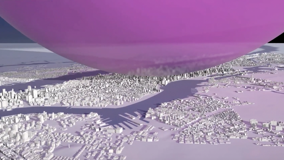
An animation that shows the global warming potential of ozone depleting substances - very much greater than carbon dioxide. The film also shows just how much greenhouse gas - 135 billion tonnes of carbon dioxide equivalent - the Vienna Convention has kept out of the atmosphere. It turns out to be more than the Kyoto Protocol.
This animation is the final asset created for the digital campaign for UNEP. The project included the design and production of:
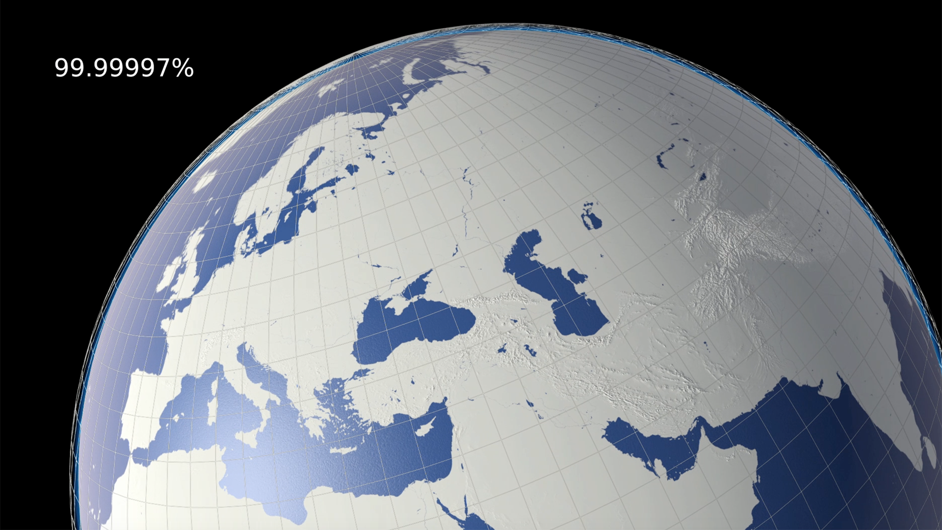
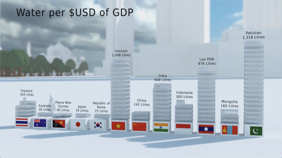
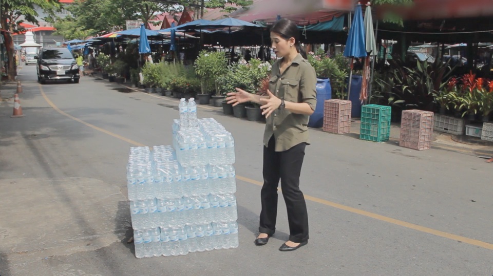
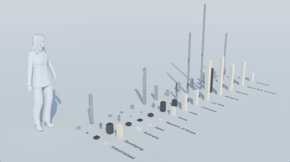
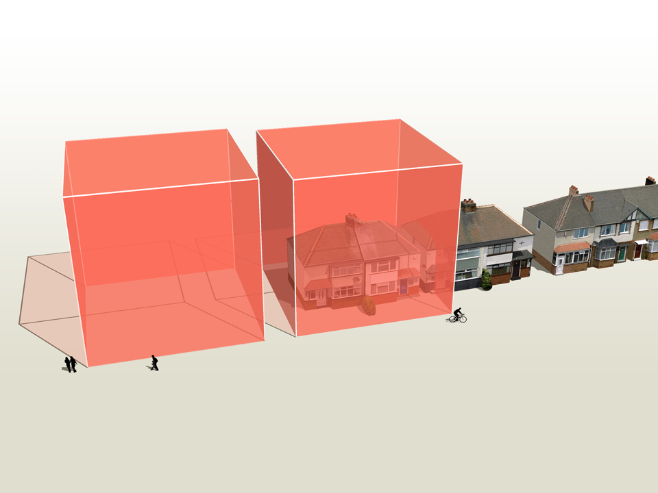
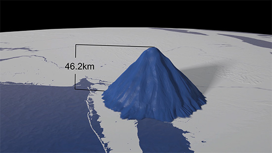
PRECIOUS OZONE - THE SIZE OF IT
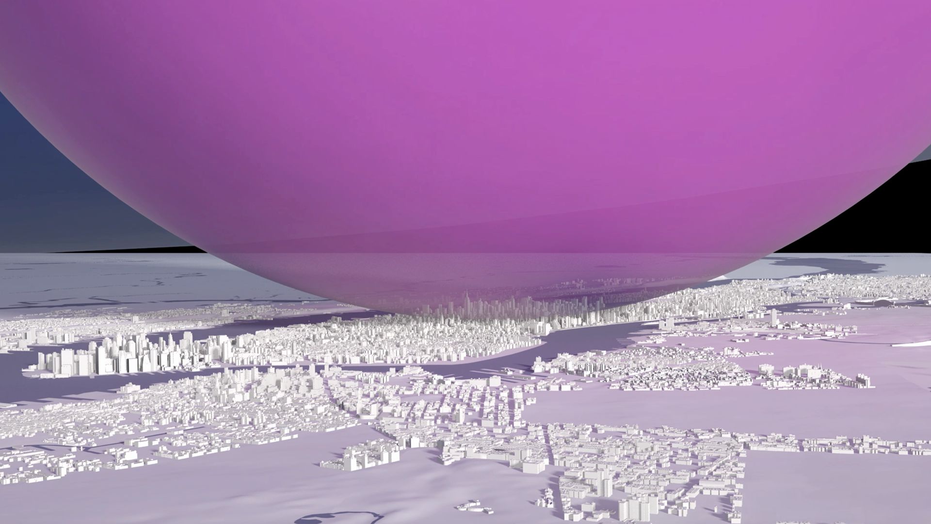
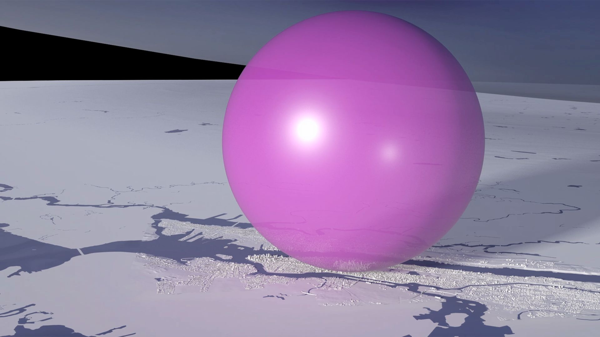
A short animation and a set of still images give viewers a sense of scale for how much air there is in the atmosphere and how much of it is ozone. More details here
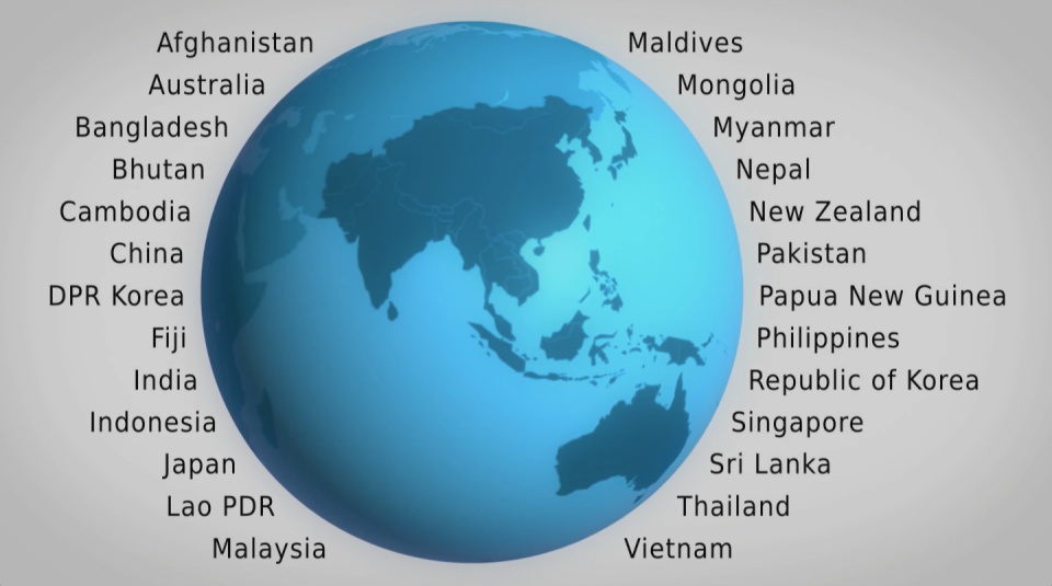
OZONE GLOBE
An interactive / self-running globe that displays current ozone distribution and also celebrates each country’s ratification of the Vienna Convention. More details here


2D AIR MAP
This interactive 2D map of the atmosphere allows users to explore the distribution of ozone for themselves. More details here
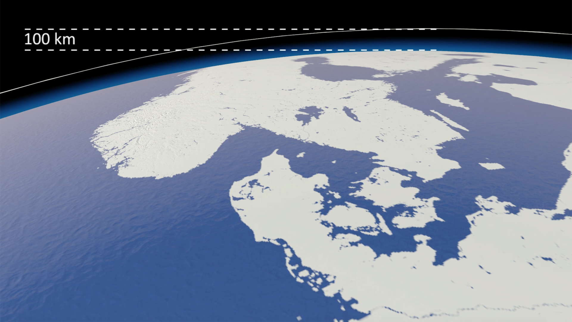
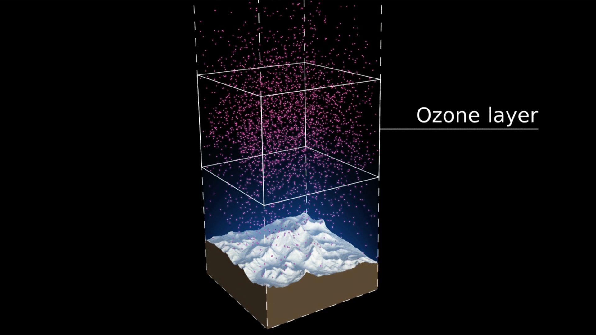
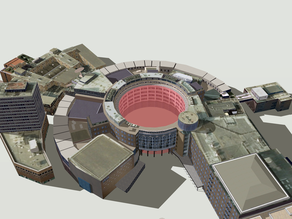
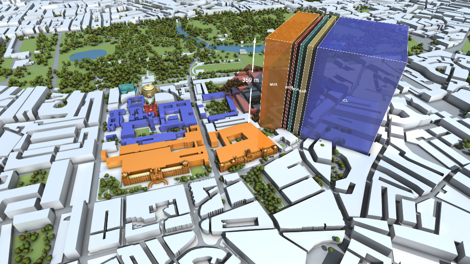
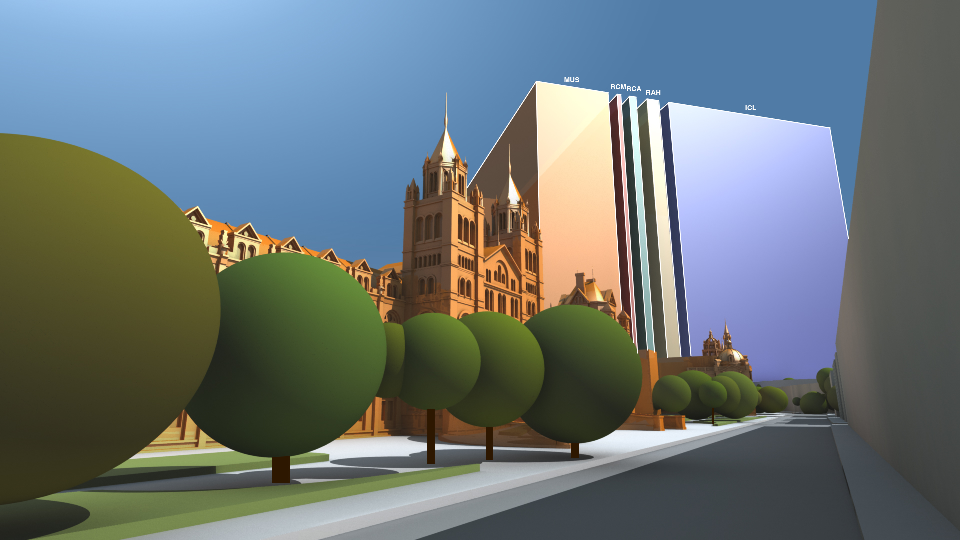
3D AIR MAP
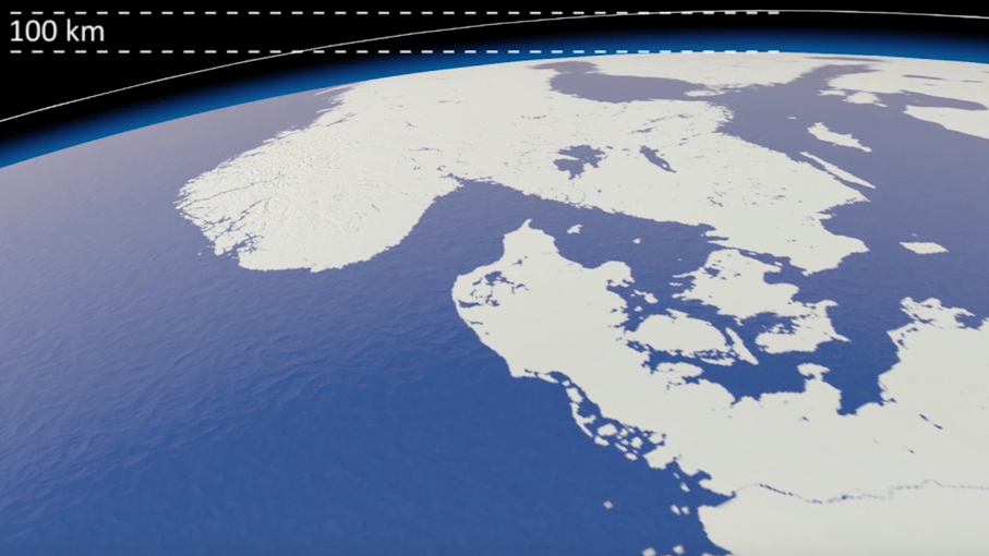
This 3D map of the ozone layer shows a 20 km x 20 km area of land (centered over the peak of Mount Everest) and all the air above it extending to an altitude of 100 km (the edge of space). More details here


THE OZONE SONG
A playful musical animation showing phytoplankton celebrating the 30th anniversary of the Vienna Convention with an underwater birthday party. More details here
SYNTHESIS REPORT DESIGN
An additional part of the campaign package was the graphic design and layout of the 2014 Synthesis Report. Download the report here.

The report was VERY well received. We got a lot of compliments not only on the content but also on the layout and readability. Thanks a million for your excellent work.
Professor A.R. Ravishankara, Report Lead Author
Departments of Chemistry and Atmospheric Science
Colorado State University
GLASS SCULPTURE MEMENTOES
We designed and supplied original sculptures depicting the ozone layer in the atmosphere for the chair, co-chair and hosts of the Meeting of the Parties 2-4th November in Dubai.

Photo credit: IISD
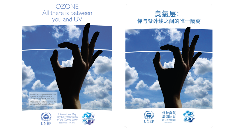
POSTERS, LOGO & SUPPORT
In addition to the films and interactives Carbon Visuals provided posters and logos in six languages as well as outreach support and evaluation.

All images are available under Creative Commons licence to download on our Flickr page.
UN Precious Ozone webpage: http://ozone.unep.org/en/precious-ozone