Giving data impact

UN ozone celebrations

CLIENT

United Nations Environment Programme

PURPOSE

To communicate and celebrate 30 years of international effort in protecting the ozone layer.

DESCRIPTION

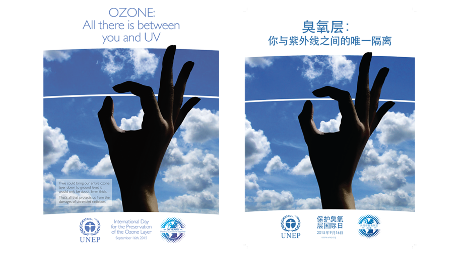
A campaign that includes a series of animations, visual images, print and online communication tools to help communicate what the ozone layer is, where it is in the atmosphere and what has been achieved under the ozone protection regime.

Thirty years ago the first images of the ozone hole created a media storm and helped lead to the Vienna Convention for the Protection of the Ozone Layer and the Montreal Protocol.

People only had to look at a picture to physically see atmospheric chemistry. It didn’t take much persuasion to convince the policy makers to take action. 

Pawan Bhartia, NASA atmospheric scientist

Carbon Visuals was honoured to be asked to create a digital campaign to communicate and celebrate the 30th anniversary of this event.  We did not want to ‘re-invent the wheel’ so we started by researching what we felt was missing from ozone communications to date.  

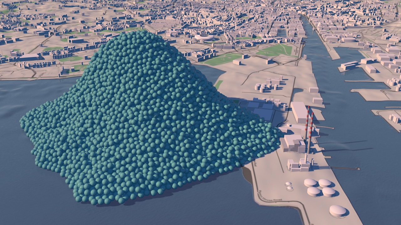
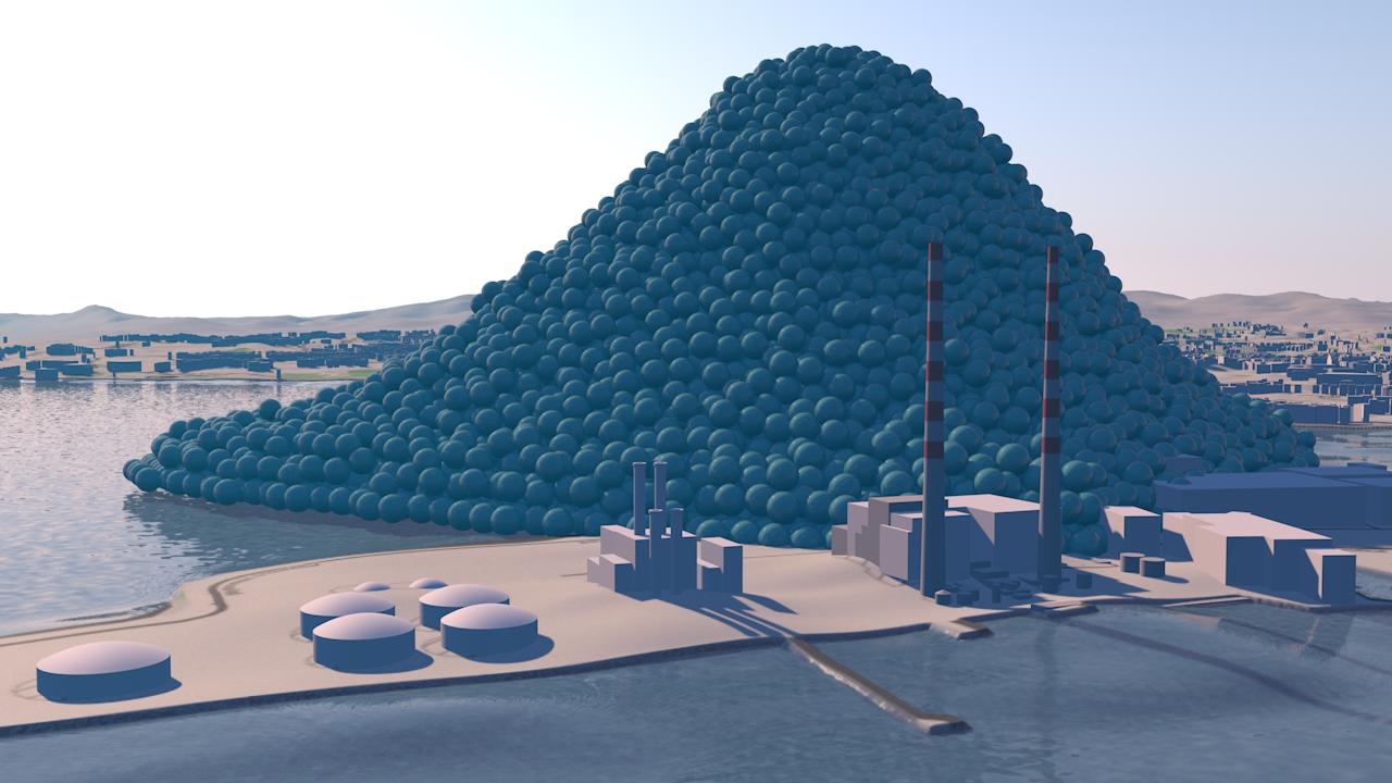
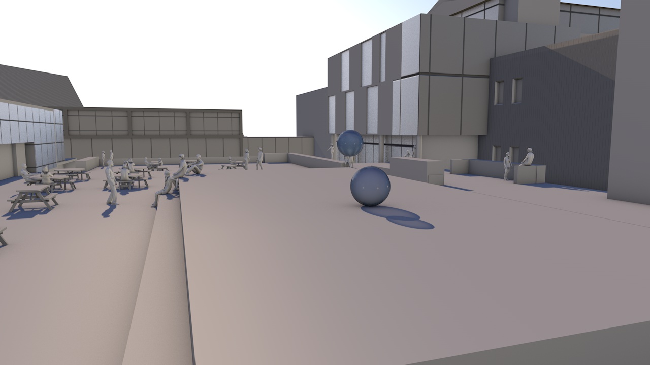
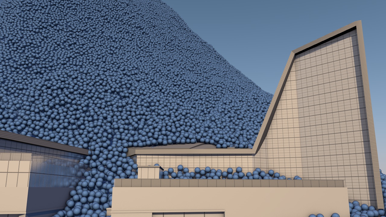
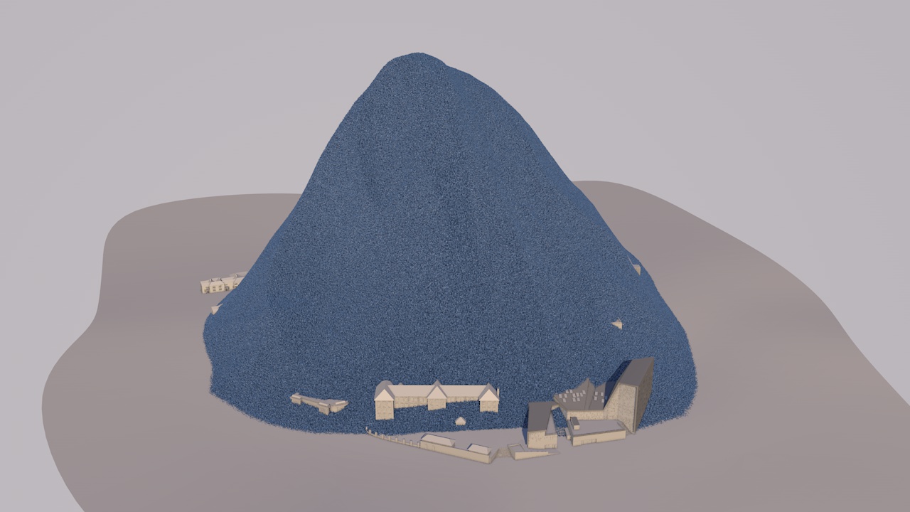
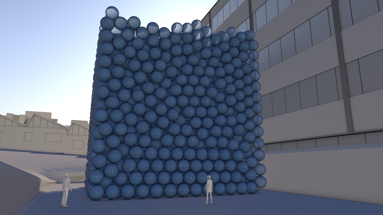
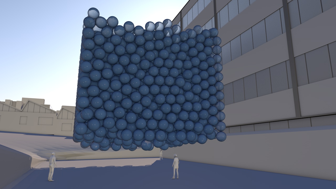
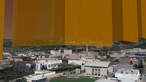
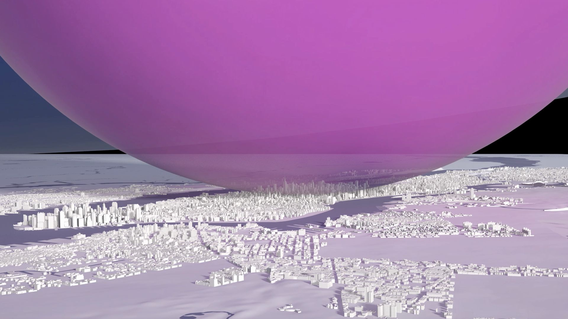
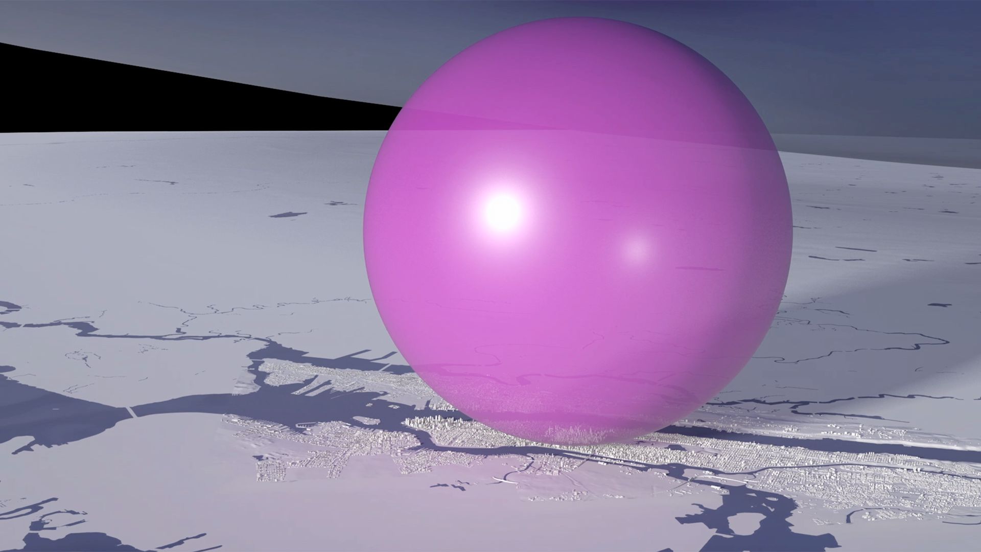
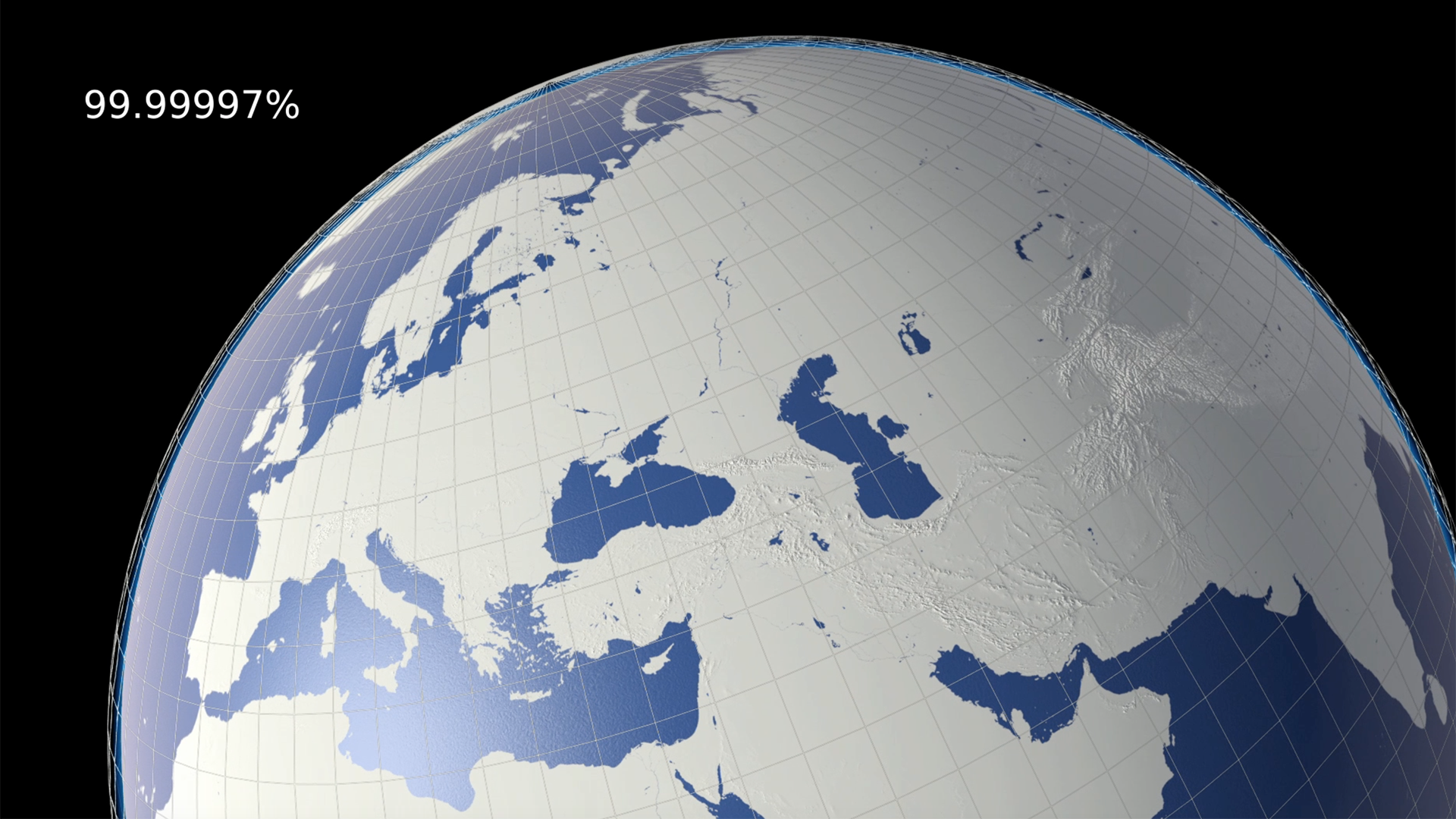
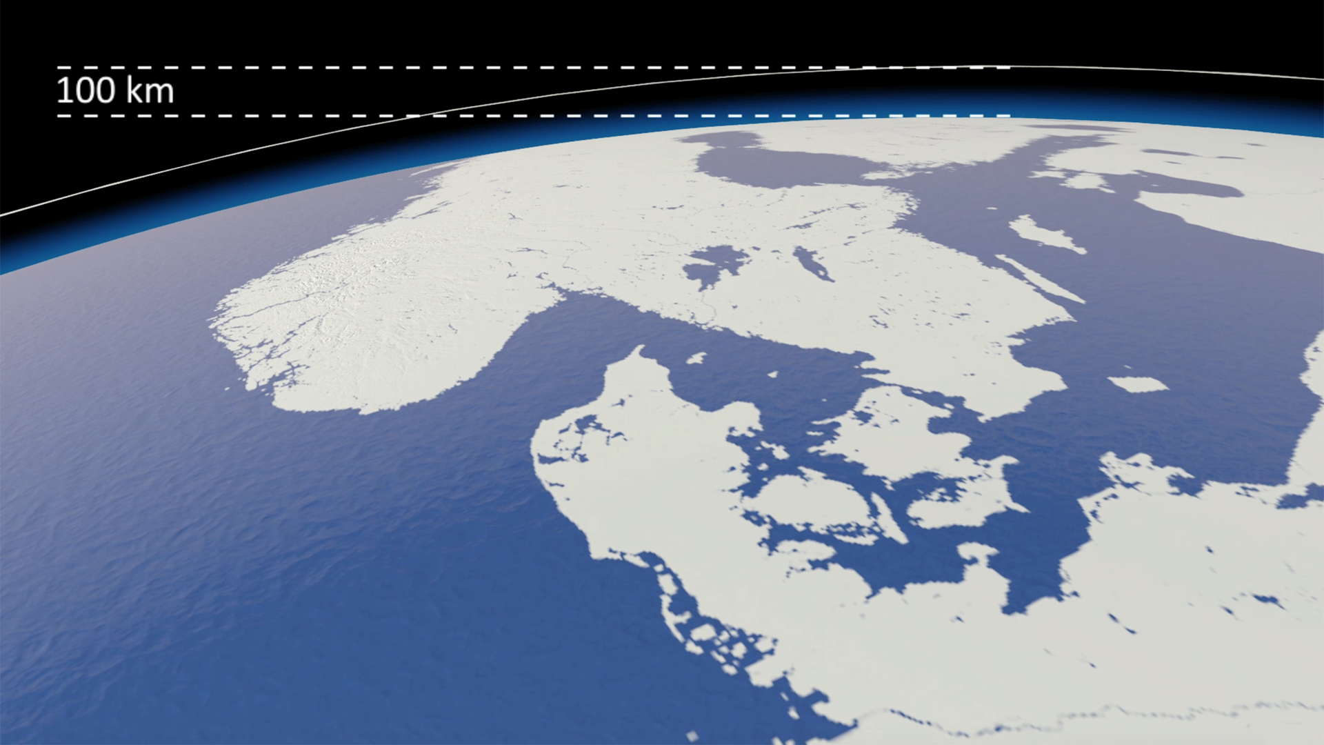
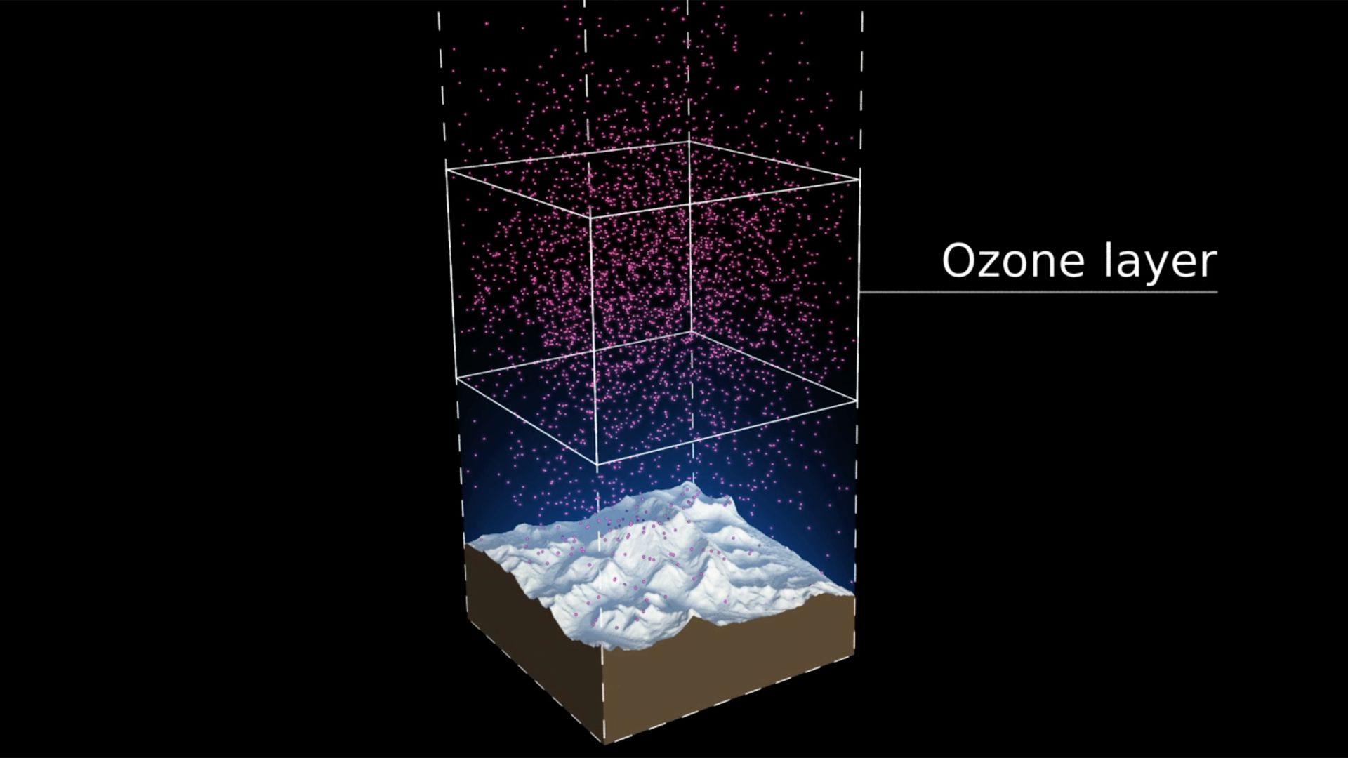
Our view was that few people have an intuitive sense of what the ozone hole is like, where it is, how much ozone there is, or how deep the atmosphere is.  So we have created a selection of visual images, animations and web-tools that help everyone from policymakers to children better understand these things.

Over the coming months different elements will be releasedalongside key events within the UNEP calendar.  This week, July 20-23, we are releasing two elements.

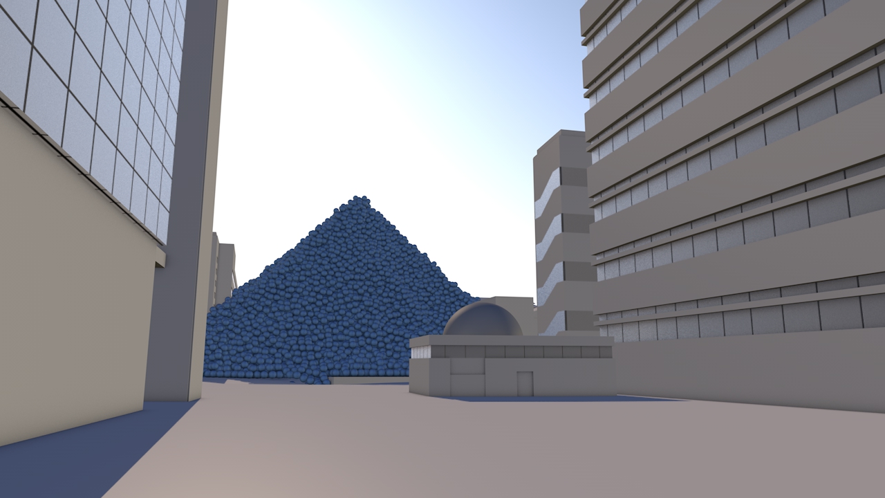
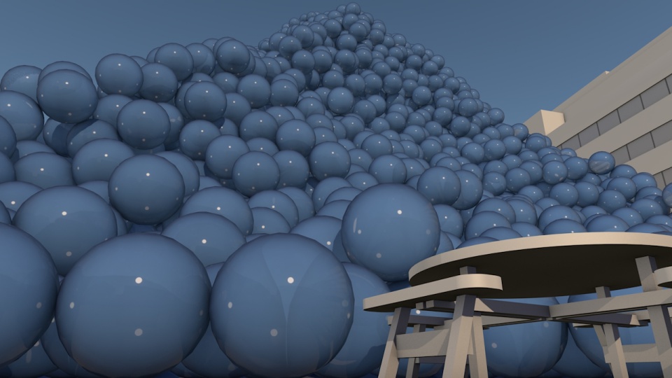
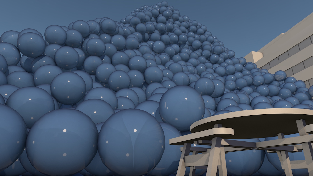
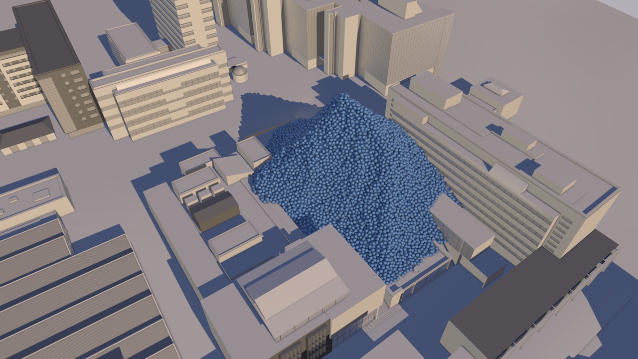
Precious ozone - the size of it

A short animation and a set of still images give viewers a sense of scale for how much air there is in the atmosphere and how much of it is ozone.  

Click here to view on Youtube.
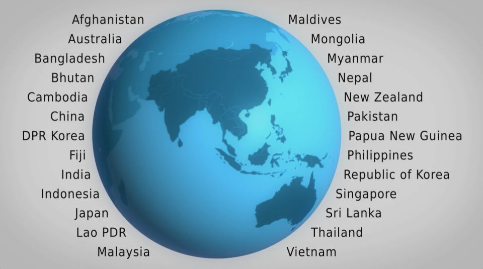
Ozone Globe

An interactive / self-running globe that displays current ozone distribution and also celebrates each country’s ratification of the Vienna Convention.

Click here to visit the interactive


All images are available under Creative Commons licence to download on our Flickr page

UN Ozone website: http://ozone.unep.org/en/infomaterials.php

Past, present and future - Oundle School

Water used in one minute

Water used in one minute

CLIENT

Oundle School

PURPOSE

To assist the environmental engagement of staff, pupils and others.

DESCRIPTION

Package including a report and 17 sketches.

Oundle School dates back to 1556 when Lord Mayor of London Sir William Laxton endowed and re-founded the original Oundle Grammar School, of which he was a former pupil.

Early in the 20th century, Oundle gained a reputation for science and engineering which has continued to this day with the development of SciTec, a major new science complex. As new and growing 21st century issues increasingly come to the fore, we were delighted to receive an enquiry about whether we could help with the engagement of staff, pupils and others to reduce environmental impacts and, potentially, utility bills too. This provided us with an opportunity to test how we could offer real value within the bounds of a limited budget.

Working with just five annual figures from the School – gas, electricity and water use, waste to landfill and the School population, we were able to provide a bespoke package. Our illustrated report Ways of seeing Oundle’s impact sets out calculations, reference sources, coefficients and assumptions, a compendium of facts, some surprising and memorable examples of energy equivalence and answers to a set of FAQs. Seventeen accurate volumetric sketches show emissions and water use over periods from a second to a year.

We got boarding house consumption of electricity down by 21% in March, and I am sure that a large part of that was through the visualisation, report and sketches.

Ian Clark, Oundle School

The materials have been used in a variety of ways in outreach, training for service providers, posters and in classes with changes in behaviour starting to be noticed straight away and helping Oundle School move forward on the path towards environmental sustainability.

Resource efficiency in Asia Pacific

CLIENT

United Nations Environment Programme

PURPOSE

To convey the scale and complexity of resource use in the Asia Pacific region at a conference of Environment Ministers and subsequently to other audiences.

DESCRIPTION

A high impact video and interactive web-tools to introduce and enable easy exploration of a database covering 26 Asia Pacific countries, 157 indicators and 40 years.

How much natural resources are used to earn one dollar in developing countries in the Asia Pacific region? How do you effectively show water, metal and biomass usage rates across 26 Asian countries - and make it personal and real? What is the best way to visualise a range of environmental resource indicators ‘per GDP’ across countries?

These were some of the challenges set for us by the United Nations Environment Programme (UNEP) in a project undertaken in conjunction with our not-for-profit partner CarbonSense Foundation.

This video has taken our communications to a higher level, and improved our ability to cut across a crowded policy landscape to really help decision makers reflect on resource efficiency.

Janet Salem, UNEP, Bangkok

The brief from the UNEP Bangkok office was to design and create a short, high impact video to convey the scale and complexity of resource use in the Asia Pacific region. In addition a set of interactive web-tools is being provided to complement the film and allow easy exploration of the data.

The film is supporting a database of resource efficiency data covering 26 Asia Pacific countries, 157 indicators and 40 years (1970-2010). The indicators are designed to inform policy development in the region based on the principles of circular economy, sustainable consumption and production principles.*

Resource efficiency is crucial for sustainability but how do you make it real and meaningful at a national and a personal level? To bring such a huge subject up front and personal, we combined live action film introducing very real piles of materials on a table-top with national and regional resource use and impacts made tangible with CGI graphics. And uniquely this project allowed us to explore ways that our creative techniques could be combined with economic data.

Because of the complexity of data and fast-track time schedule the project was carried out in a highly collaborative way, with UNEP staff in Bangkok supporting our creative team throughout the scoping, design and production phases.

The film was used to launch the UNEP Report at a conference on 19th May 2015 attended by Achim Steiner, Executive Director of UNEP, and Environment Ministers and policy makers from the Asia Pacific region.

See the UNEP webpage on project here

Finally - a very special thanks to Janet Salem of UNEP, Bangkok and our film presenter / narrator Patchari Raksawong.

*The database has been developed as a result of a three-year science-based consultative process mandated by countries in the region and coordinated by UNEP, the CSIRO and the Asia-Pacific Roundtable on Sustainable Consumption and Production (APRSCP), with support from the European Union's SWITCH-Asia Programme.

An important part of this project was the creation of an interactive web-tool (see above) allowing policymakers to explore the database in detail in an intuitive way. We created a 'heat map' that allows comparison between a wide range of economic indicators for different countries. Mousing over the countries reveals the actual data.

Carbon Visuals has shown us different techniques to visualize data in a way that can resonate on a meaningful human level, while still giving us creative space for collaboration. We had a lot of fun with the team and it's been a really wonderful partnership.

Janet Salem, UNEP, Bangkok

Ireland's carbon footprint

CLIENT

Environmental Protection Agency

PURPOSE

To help the EPA inform a range of audiences, from policymakers to the general public, about Ireland’s greenhouse gas emissions.

DESCRIPTION

A short animation showing Ireland’s daily emissions as a large pile of one tonne carbon dioxide bubbles beside the Poolbeg towers in Dublin bay.

How do you show the carbon footprint of a country? That was the task set by Ireland's Environmental Protection Agency (EPA). The EPA compiles Ireland's annual greenhouse gas emission inventories and projections, which allows the Government to assess progress against key targets, report to the European Commission and UNFCCC and informs policy development and mitigation measures. The EPA also aims to provide up-to-date scientific information to a wide range of audiences, from policymakers to the general public. A simple visual would help to get more people engaged in the issue.

Carbon Visuals created a short animation showing the daily emissions as a large pile of one tonne carbon dioxide bubbles - sitting next to the Poolbeg towers in Dublin bay.

See the EPA webpage here.

TECHNICAL NOTE

The data source for this visualisation is the EPA’s Greenhouse Gas Inventory for 2012 which calculates annual emissions from Agriculture, Energy, Transport, Industry and commercial, Residential and Waste sectors, and was released in 2014.

Each sphere represents one tonne of greenhouse gas as carbon dioxide equivalent - Co2(e). Greenhouse gases other than CO2 (i.e. methane, nitrous oxide and so-called F-gases) may be converted to CO2 equivalent using their global warming potentials.

For 2012, Ireland’s total national greenhouse gas emissions are estimated to be 58,531,238 tonnes or 160,359 tonnes per day.

Carbon dioxide gas at 15 °C and standard pressure has a density of 1.87 kg/m3. At standard pressure and 15 °C a metric ton of carbon dioxide gas would fill a sphere approximately 10 metres across.  The video shows a pile of 160,359 spheres 10 metres in diameter located near the Poolbeg Towers in Dublin Bay, with the city behind.

University of Plymouth - The Carbon Footprint

CLIENT

University of Plymouth

PURPOSE

To engage students, academics and staff, show emissions are real and that the University is endeavouring to achieve reductions.

DESCRIPTION

Animation showing the footprint using the campus itself for scale and including a success story where emissions have been reduced.

The University of Plymouth adds 11 thousand tonnes of carbon dioxide to the atmosphere every year. But what does that look like?

This animated film illustrates this footprint using the campus itself for scale and shows a ‘success’ story’ where emissions have been reduced.

The purpose of the video was to engage otherwise uninterested students, academics and staff, get them to realise that carbon emissions are real and show that the university is endeavouring to achieve measurable reductions. The intention is then to invite them to explore more detail through web-based energy and carbon dashboard.

The annual carbon reduction savings of 213,890 KgCO2e were achieved at the Babbage building after lighting and IT upgrade, installing voltage optimisation and connection to the Combined Heat & Power (CHP) plant. These savings are expected to equate to the annual emissions of the new Marine Building.


FURTHER INFORMATION

University of Plymouth Carbon Management Plan 2010 - 2015 here.

Sustainability pages for Plymouth University here.


UK 80% reduction target – in Piccadilly Circus

CLIENT

UK Department of Energy & Climate Change (DECC)

PURPOSE

Use social media to get young people interested in a 70 page report.

DESCRIPTION

An animated drama set in Piccadilly Circus – a popular and iconic gathering place for young and all. The scene is transformed into a memorable moving picture that shows the UK Government’s 2050 target on the scale of one person.

We are very happy with the film, and particularly thrilled that it was our first Vine and had 5000 loops in 5 days.

David Armstrong, Head of eCommunication & Digital Media, DECC

How do you create a stir on Twitter and other social media to get interest in a 70 page Report?

That was the task facing the UK Department of Energy & Climate Change (DECC) who wanted to commission a compelling image set and short animation to draw attention to a new Report - Paris 2015: Securing Our Prosperity Through a Global Climate Change Agreement.

A fast turn-round meant an immediate focus on a key compelling message that could be visualised. Fortunately the UK government has a particularly positive message on carbon - with an 80% reduction target for 2050 enshrined in law. So we set about clarifying the data and thinking through visualisation ideas.

The result: a visual drama set in Piccadilly Circus – a popular gathering place for young and all and itself a unique and iconic location. With captions and messaging appearing as adverts, this immediately recognisable scene is transformed into an eye-catching and memorable moving picture that shows the target on the scale of one person.

See Number 10 Storify page for these images in use.

See video on YouTube. See VINE version

Technical Notes

Raw numbers:

UK Population 1990: 57,237,500

UK Population 2050 (projection): 77,000,000

GHG Emissions 1990: 777.6 MtCO2e

Derived values:

2050 target emissions (80% reduction): 155.52 MtCO2e

Per capita emissions 1990: 13,586 kg

Per capita emissions target 2050: 2,020 kg

Per capita saving target (1990 to 2050): 11,566 kg

Population figures and projections come from Office for National Statistics (ONS); GHG emissions from DECC.

Animating the world's cars

A short animated film from Carbon Visuals is being used to engage managers around the world about the fundamentals of sustainability, how sustainability is relevant to their role and its importance to business success.Created for the University of Cambridge Institute for Sustainability Leadership (CISL), the film shows the current and expected resource use and parking space of all the world’s cars, as well as the CO2 emissions of cars today.

Carbon Visuals brings radical emissions data to life

The Carbon Majors report, launched November 2013, is accompanied by striking graphics from Carbon Visuals which show the extent to which corporations are responsible for the cumulative emissions causing climate change.

Key information from a huge array of data has been conveyed by Carbon Visuals in both conventional and novel ways to give a feel for the scale of the cumulative emissions involved.

Gasoline from tar sands is different

The Environmental Defense Fund asked us to explain the difference between gasoline from tar-sands and regular gasoline in terms everyone can relate to. We compared them in terms of a single gallon of gas and a typical car's annual emissions. 

What the EPA reduction plan looks like

Under President Obama’s Climate Action Plan, the Environmental Protection Agency (EPA) proposes a 30% reduction in carbon pollution from power plants by 2030. By any account this is a significant announcement. Inevitably with plans like this there is complex data behind the rationale. And the numbers are big.

A 30 percent reduction by 2030 amounts to about 730 million metric tons of carbon dioxide per year. Such a huge number can seem completely abstract to members of the public - so we wondered if we could show the actual volume of CO2 saved in a way that would be more meaningful for everyone.

The Plan puts our nation on track to cut carbon pollution from the power sector by 30 percent by 2030 - that’s about 730 million metric tons... 

U.S. Environmental Protection Agency (EPA)

It turns out that if you divide 730 million tons by the number of US households (132 million) you get almost 14,000 lbs. As 1lb bubbles of pure carbon dioxide, this would be a pile about 53 feet high. And what better place to illustrate this pile size than the White House, home to the most well-known US household.

We’re not saying this is the answer to the communication challenge. But we hope it helps the conversation.

Download images from Flickr here

EPA Fact Sheet here

Full EPA Proposal is here.

Household numbers from US Census Bureau here


It's important that people realize that the EPA plan relates to real ‘stuff’ – not just numbers.

Antony Turner CEO, Carbon Visuals

Do The Math - supporting a 350.org tour

In November and December 2012, Bill McKibben and 350.org's Do the Math Tour was a massive success, with sold out shows across the United States.

Carbon Visuals supported the tour by making the numerical argument visual - showing the actual volume of carbon dioxide gas represented by the numbers in the 'Do the math' argument.

New York's carbon emissions - in real time

In 2010 New York City added 54 million metric tons of carbon dioxide to the atmosphere, but that number means little to most people because few of us have a sense of scale for atmospheric pollution.

Carbon Visuals, supported by Environmental Defense Fund, have created a film that makes those emissions feel more real - the total emissions and the rate of emission. Designed to engage the ‘person on the street’, this version is exploratory and still work in progress.

Visualising the carbon footprint of all US power stations

We are keen to find existing carbon emission data sets that would benefit from the Carbon Visuals treatment. So when CEO Antony Turner was invited to participate in an “Energy Data Jam” at Google's New York offices in July 2012 he was quick to accept as the aim of the event was to “…brainstorm how publicly available US datasets might be put to use in the continuing transition to a clean energy future.”

One set that we thought would benefit from ‘becoming visible’ was the eGRID data collated by the US EPA. This gives annual generation and environmental characteristics of all large electric power generators in the US.

By using our Google Earth Visualiser tool we are able to create images for any location in the US that show nearby power stations and associated data.

If you would like to explore this data using Google Earth you can download the KMZ file here.

Showing the emissions of power stations in this way is experimental, and a first step. We would welcome ideas and proposals on how this could be developed.

If you have collaboration or funding ideas please contact Carbon Visuals CEO Antony Turner.

Sequestered carbon in innovative building panels

ModCell is a novel and innovative building system that brings the benefit of straw bale construction - exceptional levels of insulation - into the mainstream of the construction industry. Carbon Visuals was asked to provide images to show the sequestered carbon dioxide in panels and in a recently completed project - a school science centre in Bath.