A short animated film from Carbon Visuals is being used to engage managers around the world about the fundamentals of sustainability, how sustainability is relevant to their role and its importance to business success.Created for the University of Cambridge Institute for Sustainability Leadership (CISL), the film shows the current and expected resource use and parking space of all the world’s cars, as well as the CO2 emissions of cars today.
Illustrating low carbon farming
Carbon Visuals was asked by the Soil Association to provide a set of simple 3D image ‘sketches’ to show the carbon saving that can be achieved by using low carbon farming practices. The sketches are being used to help UK farmers have a better understanding of what would otherwise be meaningless numbers.
Carbon Visuals brings radical emissions data to life
The Carbon Majors report, launched November 2013, is accompanied by striking graphics from Carbon Visuals which show the extent to which corporations are responsible for the cumulative emissions causing climate change.
Key information from a huge array of data has been conveyed by Carbon Visuals in both conventional and novel ways to give a feel for the scale of the cumulative emissions involved.
Mapping local air pollution in New York
Visual images created by Carbon Visuals are being used to help New York property managers, building co-op boards and community groups reduce local air pollution from their buildings.
Around 8,000 buildings in New York City have been burning heavy heating oil. These contribute more soot pollution than all cars and trucks on the City’s roads. The NYC Clean Heat program seeks to improve air quality and save lives in New York by eliminating heavy oil use and accelerating the adoption of cleaner fuels
Gasoline from tar sands is different
Emissions saving of Coati House at Paignton Zoo
Carbon Visuals has created an image to illustrate the energy saving of the highly insulated Coati House at Paignton Zoo. The sustainable building uses recycled plastic, green oak sleepers, FSC timber and 150mm thick black mountain sheep wool insulation so that heating is not required.
Without this insulation the zoo would have installed a 4kW electric heater. The image shows the actual volume of CO₂ that would have been emitted every day or every hour by such a heater.
Paignton Zoo Environmental Park, is a combined zoo and botanic garden in the South West of England that welcomes over half a million visitors a year.
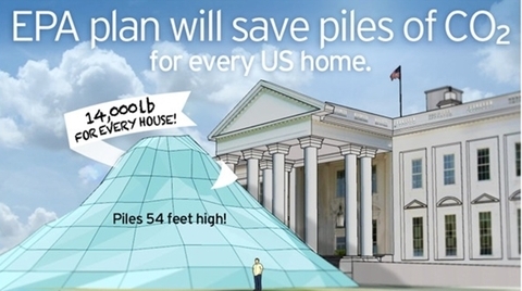
What the EPA reduction plan looks like
Under President Obama’s Climate Action Plan, the Environmental Protection Agency (EPA) proposes a 30% reduction in carbon pollution from power plants by 2030. By any account this is a significant announcement. Inevitably with plans like this there is complex data behind the rationale. And the numbers are big.
A 30 percent reduction by 2030 amounts to about 730 million metric tons of carbon dioxide per year. Such a huge number can seem completely abstract to members of the public - so we wondered if we could show the actual volume of CO2 saved in a way that would be more meaningful for everyone.
The Plan puts our nation on track to cut carbon pollution from the power sector by 30 percent by 2030 - that’s about 730 million metric tons...
U.S. Environmental Protection Agency (EPA)
It turns out that if you divide 730 million tons by the number of US households (132 million) you get almost 14,000 lbs. As 1lb bubbles of pure carbon dioxide, this would be a pile about 53 feet high. And what better place to illustrate this pile size than the White House, home to the most well-known US household.
We’re not saying this is the answer to the communication challenge. But we hope it helps the conversation.
Download images from Flickr here
EPA Fact Sheet here
Full EPA Proposal is here.
Household numbers from US Census Bureau here
It's important that people realize that the EPA plan relates to real ‘stuff’ – not just numbers.
Antony Turner CEO, Carbon Visuals
Do The Math - supporting a 350.org tour
In November and December 2012, Bill McKibben and 350.org's Do the Math Tour was a massive success, with sold out shows across the United States.
Carbon Visuals supported the tour by making the numerical argument visual - showing the actual volume of carbon dioxide gas represented by the numbers in the 'Do the math' argument.
New York's carbon emissions - in real time
In 2010 New York City added 54 million metric tons of carbon dioxide to the atmosphere, but that number means little to most people because few of us have a sense of scale for atmospheric pollution.
Carbon Visuals, supported by Environmental Defense Fund, have created a film that makes those emissions feel more real - the total emissions and the rate of emission. Designed to engage the ‘person on the street’, this version is exploratory and still work in progress.
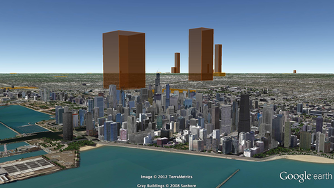
The carbon canyons of New York
Seventy five percent of New York City's greenhouse gas emissions come from the energy used by buildings. Reducing this energy is a goal of both building managers and the City of New York itself.
This visualisation takes data about the carbon emissions of municipal buildings in New York City and transforms it into a 3D map of the actual volume of carbon dioxide added to the atmosphere. It co-opts the city itself to serve as its own data visualisation.
Visualising the carbon footprint of all US power stations
We are keen to find existing carbon emission data sets that would benefit from the Carbon Visuals treatment. So when CEO Antony Turner was invited to participate in an “Energy Data Jam” at Google's New York offices in July 2012 he was quick to accept as the aim of the event was to “…brainstorm how publicly available US datasets might be put to use in the continuing transition to a clean energy future.”
One set that we thought would benefit from ‘becoming visible’ was the eGRID data collated by the US EPA. This gives annual generation and environmental characteristics of all large electric power generators in the US.
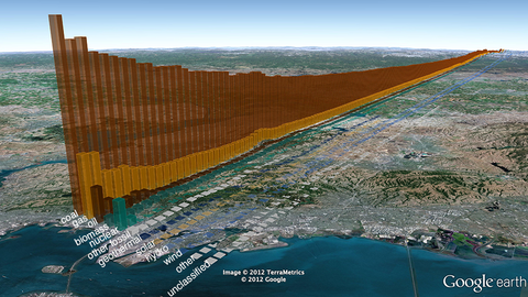
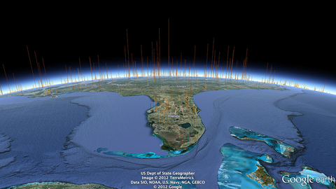
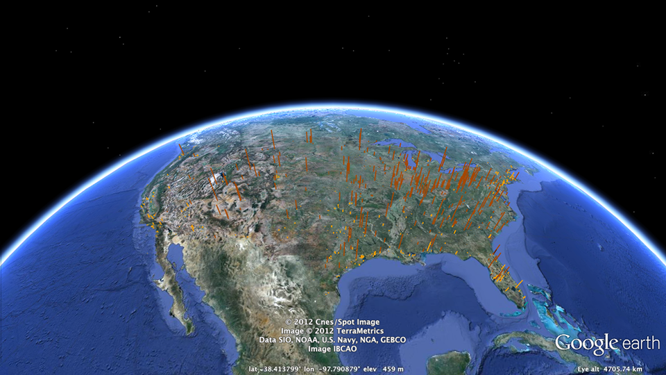
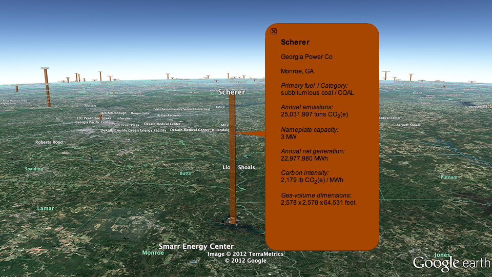
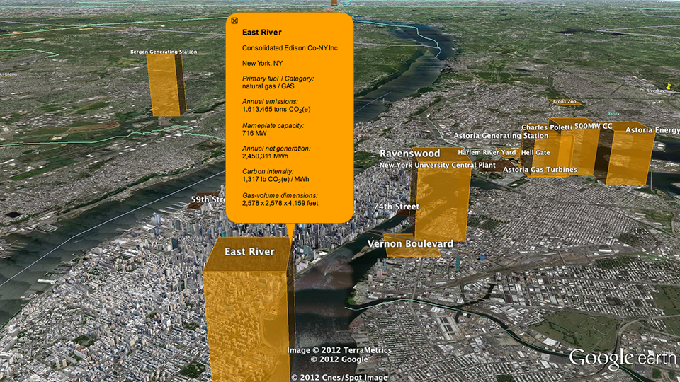
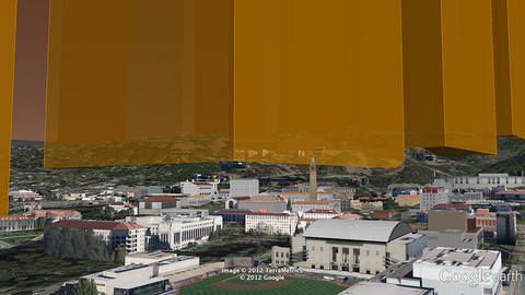
By using our Google Earth Visualiser tool we are able to create images for any location in the US that show nearby power stations and associated data.
If you would like to explore this data using Google Earth you can download the KMZ file here.
Showing the emissions of power stations in this way is experimental, and a first step. We would welcome ideas and proposals on how this could be developed.
If you have collaboration or funding ideas please contact Carbon Visuals CEO Antony Turner.
USA specific image set
Sequestered carbon in innovative building panels
ModCell is a novel and innovative building system that brings the benefit of straw bale construction - exceptional levels of insulation - into the mainstream of the construction industry. Carbon Visuals was asked to provide images to show the sequestered carbon dioxide in panels and in a recently completed project - a school science centre in Bath.
Building Confidence
The Building Confidence Project emerged from an energy 'data-jam' at the Google offices in New York to which Carbon Visuals was invited. It was organised by the White House to generate new approaches to energy efficiency.
The project idea, facilitated by Honest Buildings, was to create a database of energy efficiency projects that can inspire and facilitate similar initiatives elsewhere. Carbon Visuals' role was to consider the role data-graphics could play in reaching wider audiences.
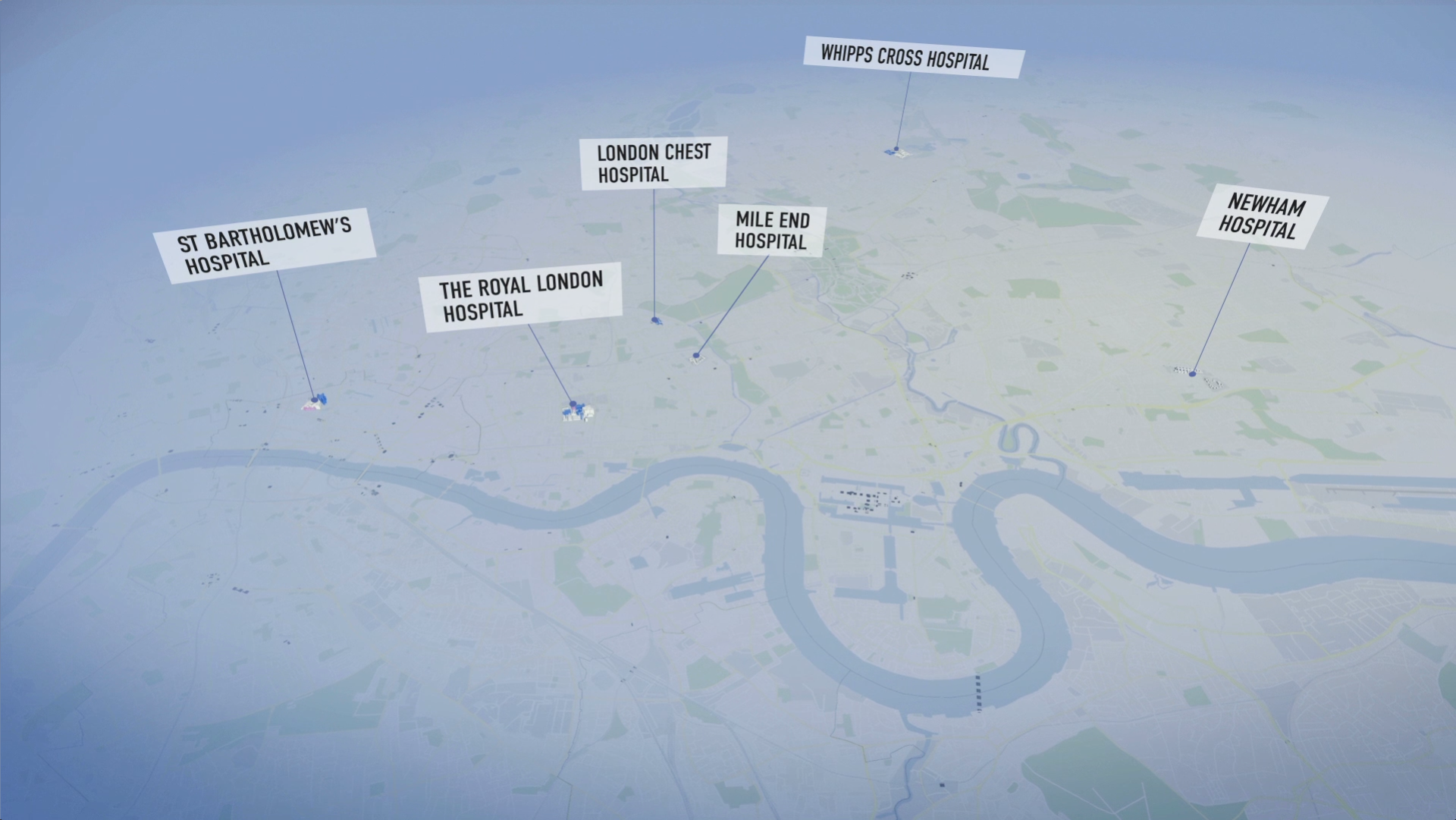
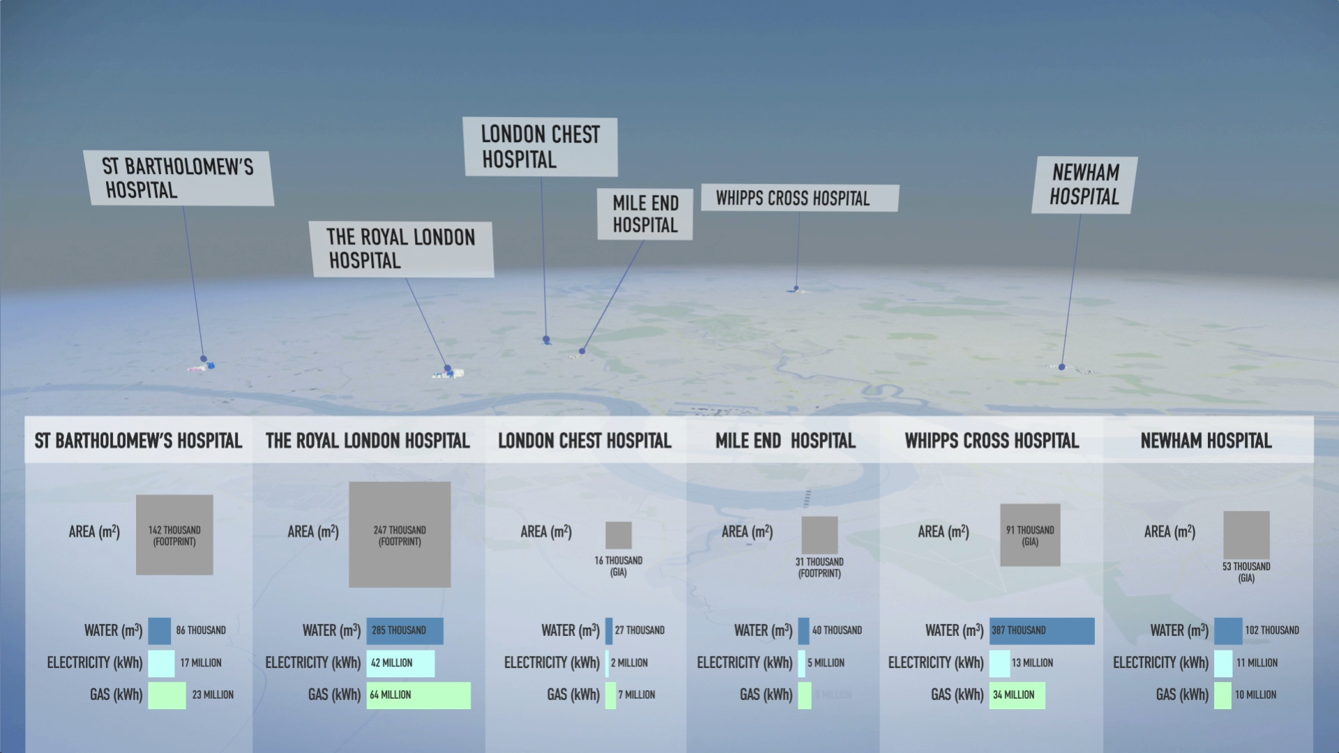
Barts NHS Trust Estates Strategy
Barts Health NHS Trust was formed in 2012. It is the largest in the country with multiple sites and major projects planned and underway. For presentation of the Estate Strategy we created 3D models and a map=based animation that showed, in simplified form, development and other planned changes over a five-year period, together with data for water, gas and electricity usage.
We also provided a set of images for use in other presentation formats and media.

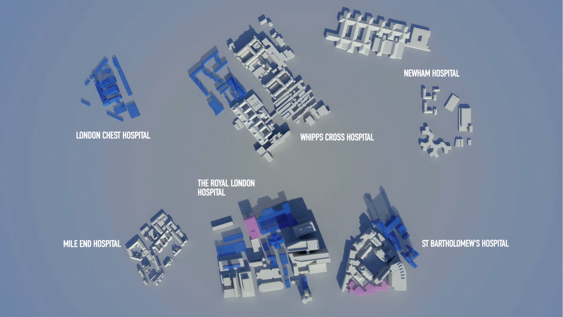
Visualising the greenhouse gas emissions for London’s Strategic Health Authority
Carbon Visuals was commissioned by UCLH (University College London Hospital), to create a set of images and a short animated film depicting the carbon footprint of all London's hospitals and NHS Trusts.
The visuals are used in conferences and workshops where facilities and energy personnel, as well as a wide range of other stakeholders, can get a better understanding of actual emissions, emissions reductions and the differences between different hospitals.