Google Earth

Mapping local air pollution in New York

Visual images created by Carbon Visuals are being used to help New York property managers, building co-op boards and community groups reduce local air pollution from their buildings.

Around 8,000 buildings in New York City have been burning heavy heating oil. These contribute more soot pollution than all cars and trucks on the City’s roads. The NYC Clean Heat program seeks to improve air quality and save lives in New York by eliminating heavy oil use and accelerating the adoption of cleaner fuels

The carbon canyons of New York

Seventy five percent of New York City's greenhouse gas emissions come from the energy used by buildings. Reducing this energy is a goal of both building managers and the City of New York itself.

This visualisation takes data about the carbon emissions of municipal buildings in New York City and transforms it into a 3D map of the actual volume of carbon dioxide added to the atmosphere. It co-opts the city itself to serve as its own data visualisation.

Visualising the carbon footprint of all US power stations

We are keen to find existing carbon emission data sets that would benefit from the Carbon Visuals treatment. So when CEO Antony Turner was invited to participate in an “Energy Data Jam” at Google's New York offices in July 2012 he was quick to accept as the aim of the event was to “…brainstorm how publicly available US datasets might be put to use in the continuing transition to a clean energy future.”

One set that we thought would benefit from ‘becoming visible’ was the eGRID data collated by the US EPA. This gives annual generation and environmental characteristics of all large electric power generators in the US.

By using our Google Earth Visualiser tool we are able to create images for any location in the US that show nearby power stations and associated data.

If you would like to explore this data using Google Earth you can download the KMZ file here.

Showing the emissions of power stations in this way is experimental, and a first step. We would welcome ideas and proposals on how this could be developed.

If you have collaboration or funding ideas please contact Carbon Visuals CEO Antony Turner.

Building Confidence

The Building Confidence Project emerged from an energy 'data-jam' at the Google offices in New York to which Carbon Visuals was invited. It was organised by the White House to generate new approaches to energy efficiency.

The project idea, facilitated by Honest Buildings, was to create a database of energy efficiency projects that can inspire and facilitate similar initiatives elsewhere. Carbon Visuals' role was to consider the role data-graphics could play in reaching wider audiences.

Visualising the greenhouse gas emissions for London’s Strategic Health Authority

Carbon Visuals was commissioned by UCLH (University College London Hospital), to create a set of images and a short animated film depicting the carbon footprint of all London's hospitals and NHS Trusts.

The visuals are used in conferences and workshops where facilities and energy personnel, as well as a wide range of other stakeholders, can get a better understanding of actual emissions, emissions reductions and the differences between different hospitals.

Carbon footprint of 40,000 UK public buildings


Carbon visuals specialises in providing a ‘feel’ for carbon data. Initially we focused on single statistics and small data-sets. Now we can use the same techniques to provide a sense of scale for tens of thousands of carbon footprints at the same time.

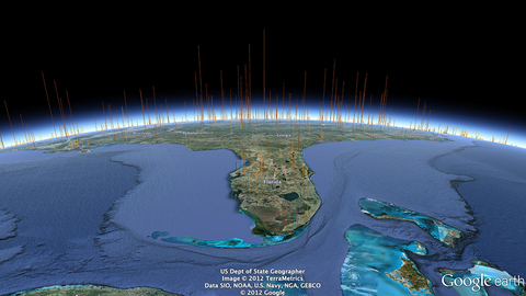
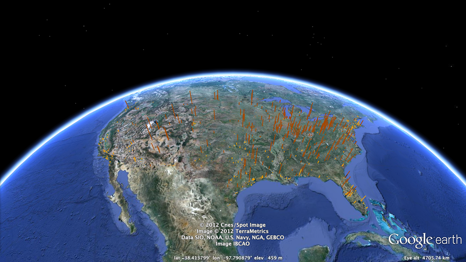
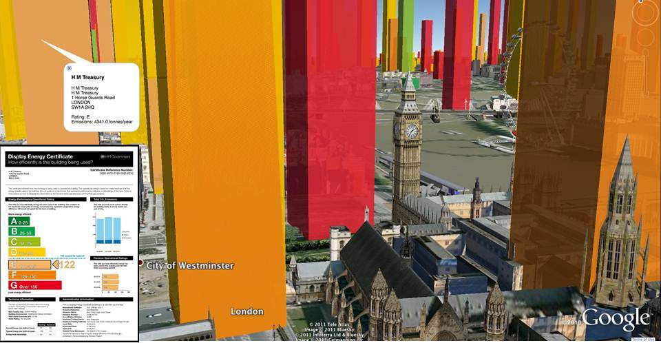
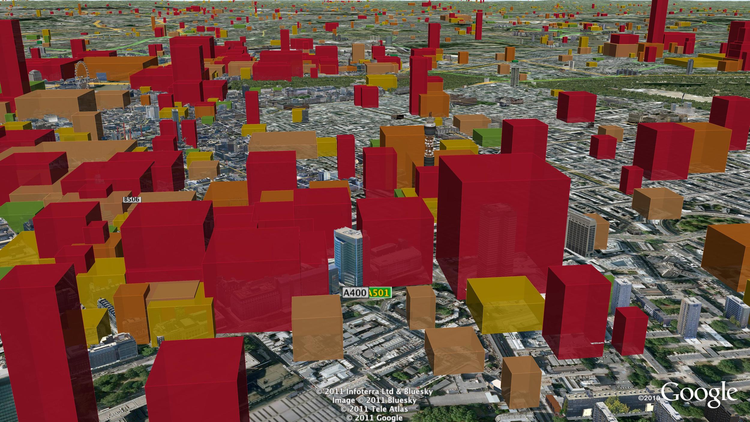
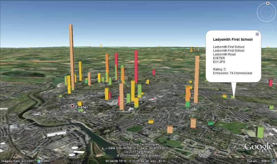
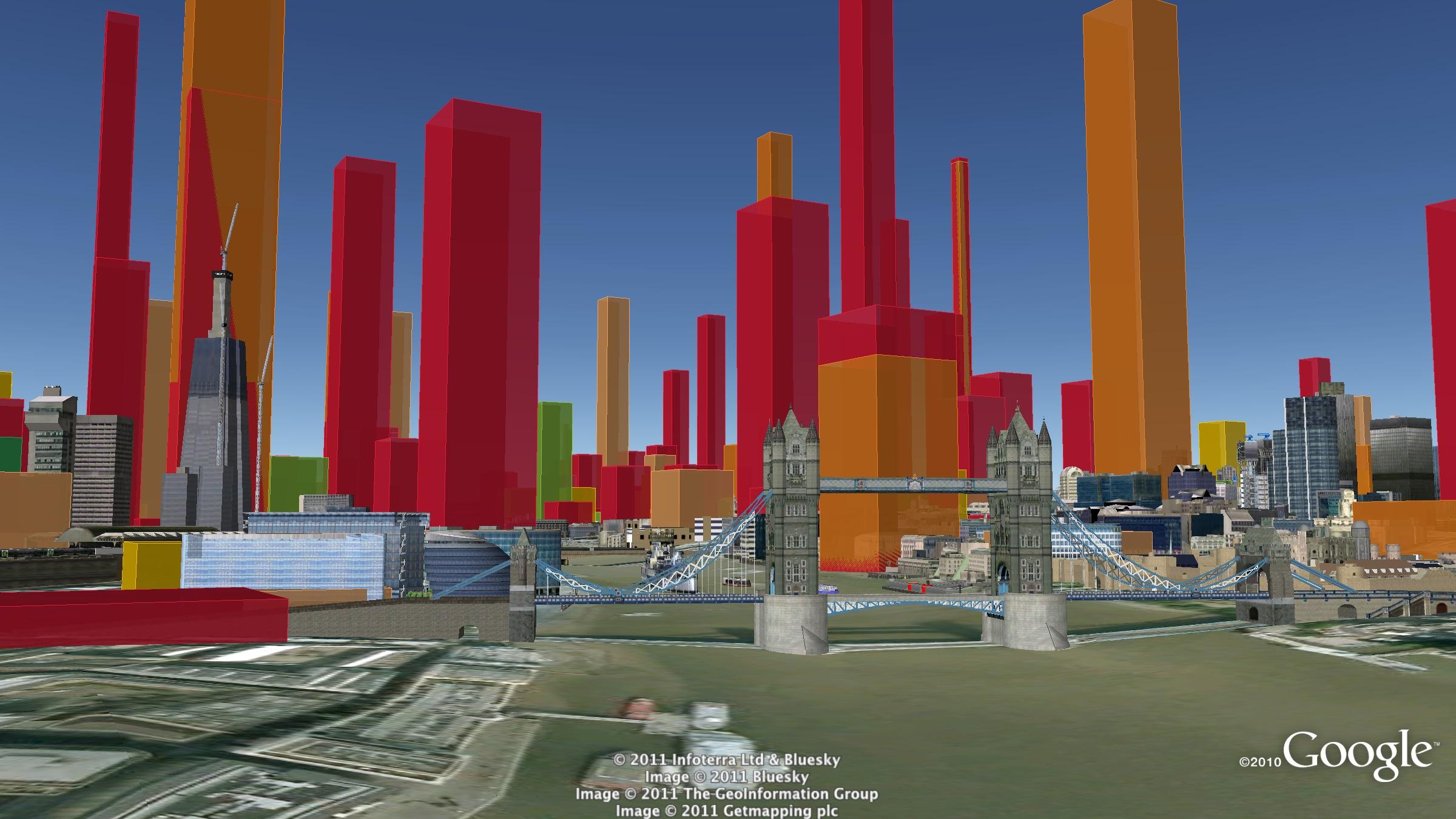
With a grant from the UK’s Technology Strategy Board we have been exploring real-time visualisation and the visualisation of large data-sets. One of the results is an interactive visualisation of the carbon footprint of every public building in England and Wales – 40 thousand of them!

http://uk-energy-ratings.carbonvisuals.com/ The visualisation works in any browser that can run the Google Earth plugin but because the dataset is large, the plugin may perform sluggishly on slow computers.

Or open in desktop version of Google Earth: http://uk-energy-ratings.carbonvisuals.com/kml/uk-emissions.kml

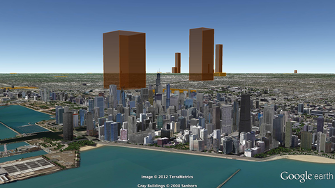
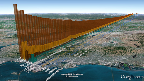
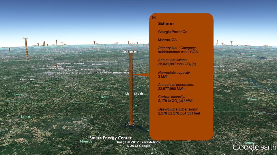
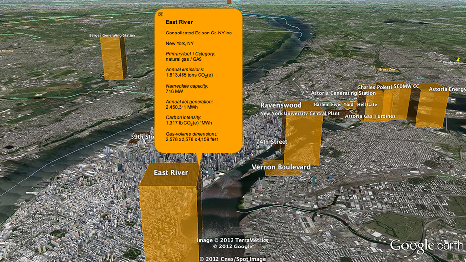
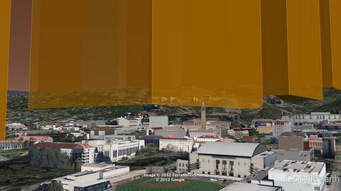
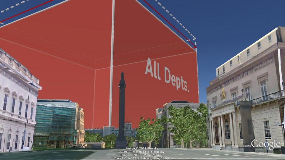
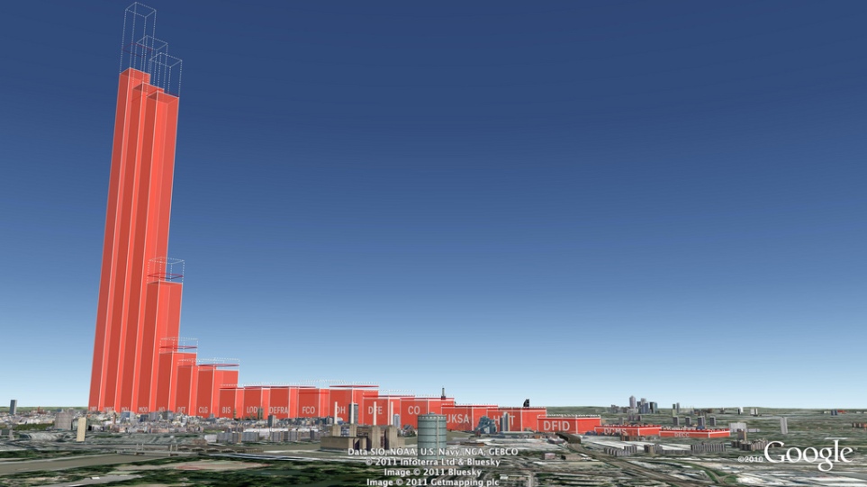
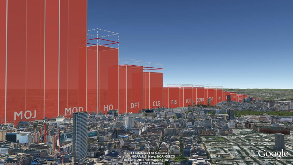
The visualisation uses a database of UK Display Energy Certificates – the energy ratings that all public buildings must display. Once we had geocoded these we displayed the buildings’ carbon footprint in 3D in Google Earth as actual volumes of carbon dioxide gas at the location of the building itself.

We can display the daily footprint as well as the annual footprint because a day’s emissions are sometimes easier to relate to activity. We can also display the footprint with reference to the floor-area of the building itself. Wide short footprints indicate buildings with smaller emissions per square metre than narrow tall footprints.

This application uses data obtained from the Department for Communities and Local Government by the Centre for Sustainable Energy.www.cse.org.uk/pages/resources/open-data

The visualisation works in a number of ways. It allows comparison with other comparable buildings at the same time as providing a sense of scale of emissions from buildings as a whole. Most importantly, it uses the world itself as part of its own explanation. Our familiarity with the real world – with buildings we work in and cities we travel through – is an underused resource in data visualisation. With Google Earth we can put that experience to work.

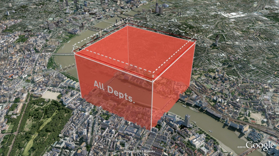
We can use the same techniques for any geocoded emissions data and create visualisations that can be explored interactively in Google Earth on the desktop or the web. We can also create stand-alone fly-through animations that present the data efficiently to any non-technical audience.

Bird's eye view of Westminster

UK Government departments exceed their 10% CO2 reduction targets


Carbon Visuals was commissioned by DECC to produce a set of high-resolution Google Earth images to illustrate Government department carbon footprints and reduction targets. The total carbon dioxide emissions between May 2010 and May 2011 amounted to 646,231 tonnes, which is 13.8% less than the previous year. This is what that looks like.

The actual volume of carbon dioxide gas emitted by the UK Government in 2010/11 (red volume). The saving on 2009/10 - the gas that didn't enter the atmosphere - is shown as the dashed volume. The target is shown as a red band.

See the Government press release here:www.decc.gov.uk/en/content/cms/news/pn11059/pn11059.aspx

Download the PDF with more info