Communicating strategy

Visualising water use for AGM

CLIENT

South West Water

PURPOSE


Film to provide shareholders with an engaging view of the business, highlight the challenge of managing a finite resource, and demonstrate the company's competence.

DESCRIPTION

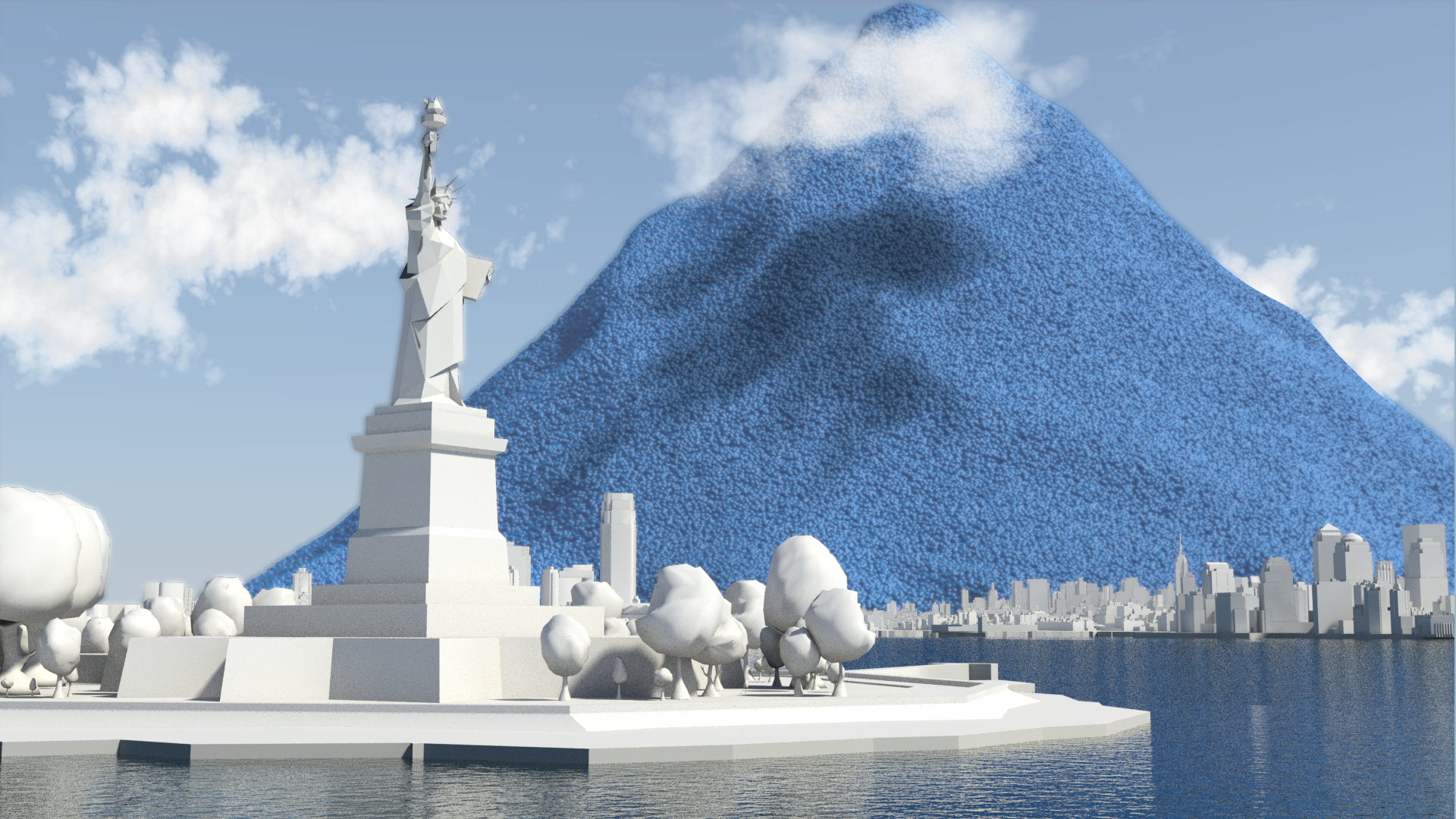
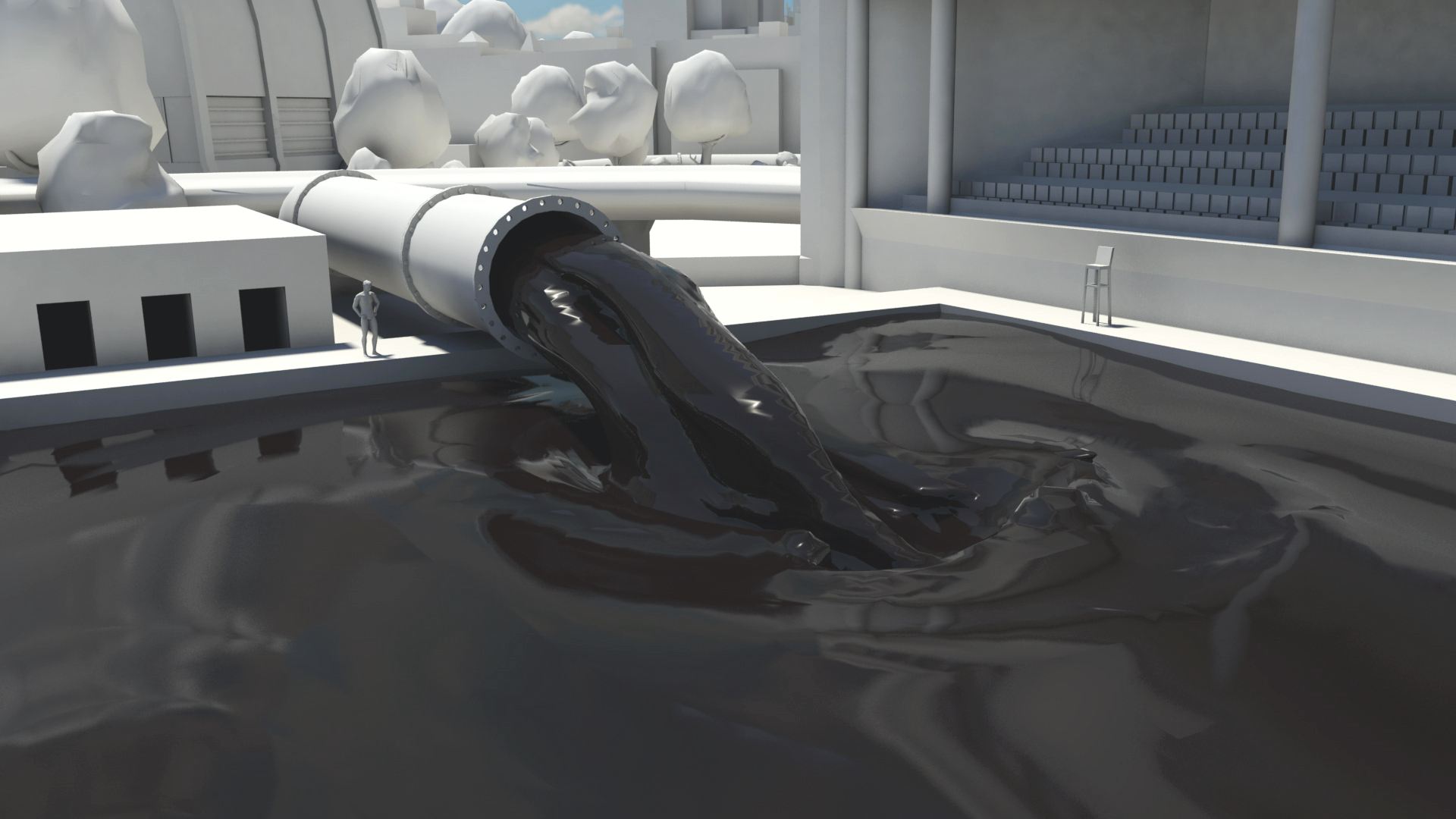
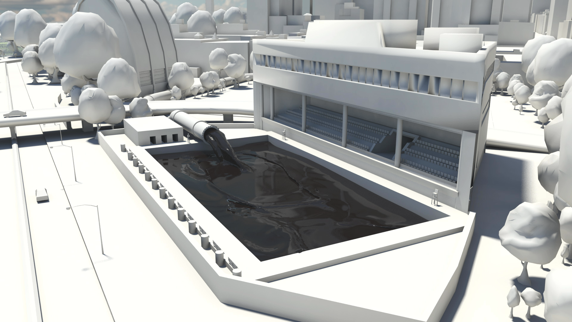
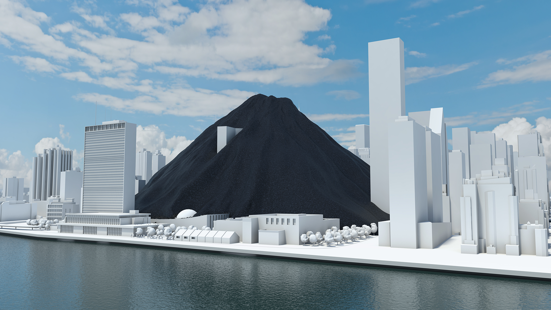
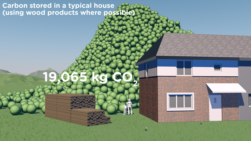
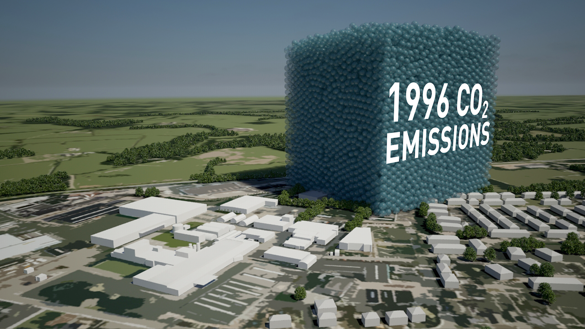
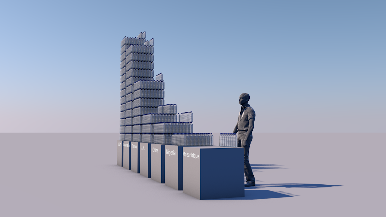
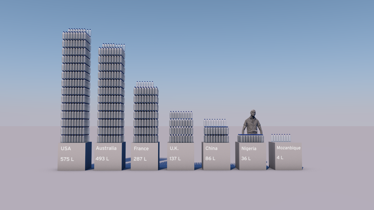
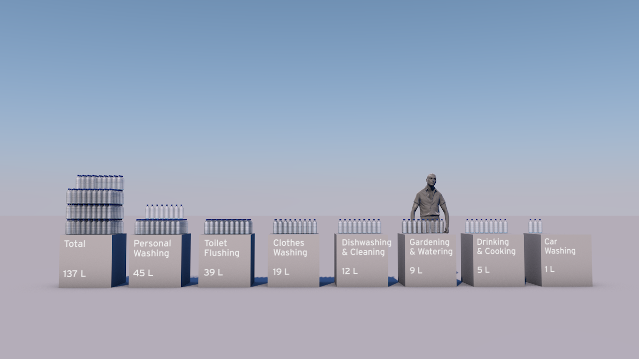
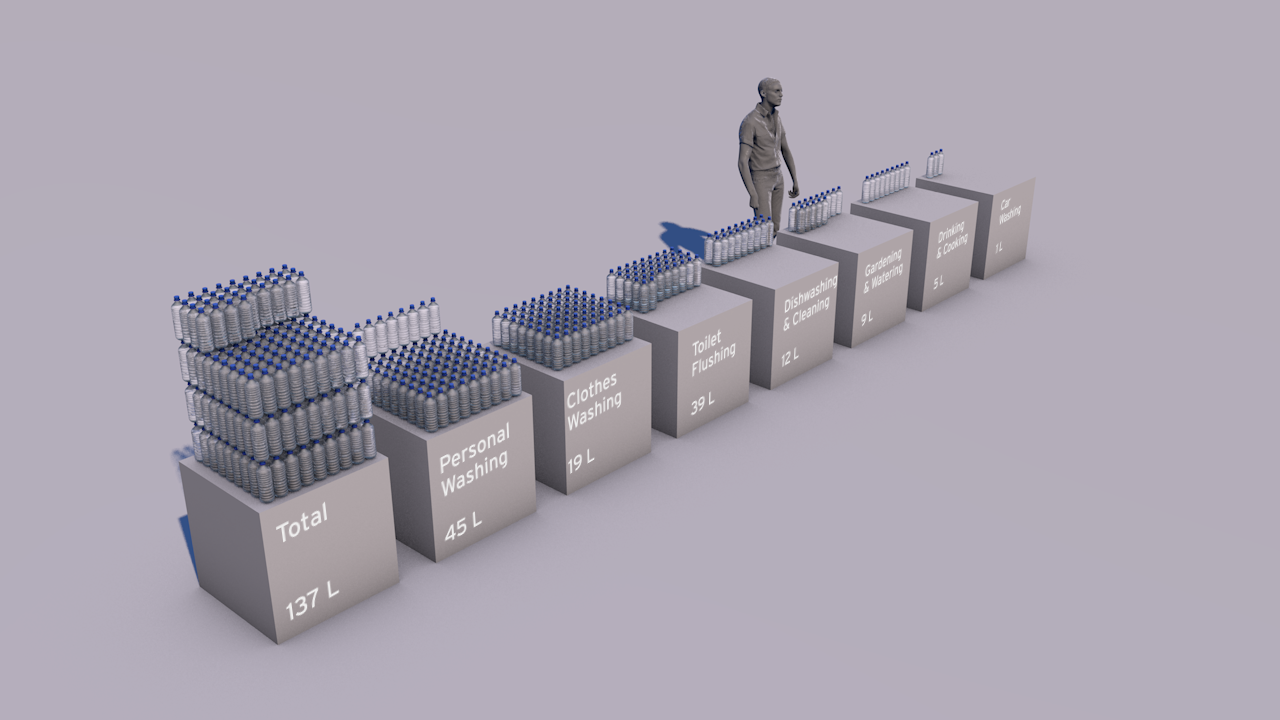
Animation showing the volume of the world's drinking water and real-time water use by the business. Also, images showing UK water use per head, comparison with other countries and the breakdown of how 137 litres per person is used.

South West Water, a utility business supplying drinking water and waste water services in the south west of England, wanted a short film for the 2014 Annual General Meeting (AGM) of their parent company Pennon Group Plc.

The aim was to provide shareholders who attended the meeting with a different and engaging view of the business, highlighting the challenge of managing a finite resource, and demonstrating the company's competence.

We created a short animation showing the volume of the world's drinking water, and a view of the actual water use of the business in real-time. In addition we created several still images showing UK water use per head compared to other countries, and the breakdown of how the 137 litres per person is used.

Finally we incorporated some video footage from the Space Station as well as some of the client's own photos into the film as a backdrop for key messages.

See Creative Director Adam Nieman's blog on visualising water here.

The case for Carbon Capture & Storage

CLIENT

World Business Council for Sustainable Development

PURPOSE

To engage world leaders, industry experts, campaigners and scientists at the UN Climate Summit, New York, September 2014 and to catalyse and inform conversations about reducing carbon emissions.

DESCRIPTION

Film showing actual quantities of global fossil fuel consumption and carbon emissions, and the part that carbon capture and storage can play in limiting global climate change to 2 degrees.

Among all of the documents, reports and images being released around the UN summit, we hope that this film will stand out and benefit all participants, as well as anyone who watches it around the world.

Peter Bakker President, WBCSD

A coal pile buries the UN General Assembly, gas races down 42nd Street and then New York is lost under a blue mountain. These dramatic CGI scenes, depicting actual quantities, create an immersive journey that brings home the scale of global carbon emissions and fossil fuel consumption.

This dynamic four-minute film, being launched at the UN Climate Change Summit in New York September 2014, shows the part that carbon capture and storage can play in limiting global climate change to 2 degrees.

Commissioned by WBCSD and produced by Carbon Visuals, the animation is being shown to world leaders, industry experts, campaigners and scientists at the Summit to help catalyse and inform conversations about reducing carbon emissions.


Key messages of the film:

  • use of renewables is increasing
  • but energy use is rising faster
  • fossil fuel use is increasing not decreasing
  • if carbon stored in fossil fuel reserves is burnt we exceed 2 degrees warming by 2055
  • carbon capture & storage (CCS) is an essential part of the 2 degrees solution

Technical note
The volumes of coal, oil, gas and CO2 shown in the film are accurate volumes based on best available data. A detailed Technical Data Methodology document has been produced to accompany the film. This shows all data sources, assumptions on future global renewable and non-renewable energy requirements and the potential of carbon capture and storage technology.

See the Methodology Document for more details

In 2012 we added over 39 billion metric tons of carbon dioxide to the atmosphere. That’s 1,237 metric tons a second. 

It is like a ‘bubble’ of carbon dioxide gas 108 metres across entering the atmosphere every second of every day. We could fill a volume the size of the UN Secretariat Building with our carbon dioxide emissions in less than half a second. We could fill it 133 times a minute.

The pile of one metric ton spheres in the film, which represents one day’s emissions, is 3.7 km high (2.3 miles) and 7.4 km across (4.6 miles).

The world gets through a lot of fossil fuels:

  • 7,896.4 million metric tons of coal a year (21.6 million metric tons per day, 250 metric tons per second)

  • 91,330,895 barrels of oil per day (168 m3 per second)

  • 3,347.63 billion m3 of natural gas per year (9.2 km3 per day, 106,082 m3 per second)

This film tries to make those numbers physically meaningful – to make the quantities real; more than ‘just numbers’.

The coal we use each day would form a pile 192 metres high and 546 metres across. We could fill a volume the size of the UN Secretariat Building with coal every 17 minutes.   At the rate we use oil, we could fill an Olympic swimming pool every 15 seconds.

This would fill a volume the size of the UN Secretariat Building with oil every 30 minutes.

The rate at which we use natural gas is equivalent to gas travelling along a pipe with an internal diameter of 60 metres at hurricane speeds (135 km/h / 84 mph). We could fill a volume the size of the UN Secretariat Building with natural gas in under 3 seconds.

We use a cubic kilometre of gas every 2 hours 37 minutes and a cubic mile of the stuff every 10 hours 54 minutes.

A set of shorter clips has also been released, featuring some of the most impactful scenes of the main film. These are intended for use by everyone, from industry through to educators and campaigners. Get in touch if you would like hi-res versions.

Main film and extract films can be viewed on YouTube:

Whole film

Fossil Fuels Extract

Carbon Dioxide Extract

Natural Gas Extract

Oil Extract

Coal Extract

All images are available under Creative Commons licence to download on our Flickr page

See blog background story.

Making sense of carbon, trees and timber

CLIENT

Wood for Good

PURPOSE

To find a new way to communicate the carbon benefits of using wood and timber in the UK construction sector.

DESCRIPTION

A series of short animated films and case study images using Wood for Good’s data to reach construction professionals, policy makers and the public.

The competence and skill you have in handling large data sets is absolutely fantastic. And you still delivered a wonderful set of visuals for us that we can continue to use for a long time to come.

Craig White Chairman, Wood for Good

How much carbon is stored in a tree? How does that translate into cut timber and wood products? And how much carbon can be ‘banked’ by using timber for building houses in the UK?

These questions are raised and answered in a communication project that includes a series of short animated films and set of case study images created by Carbon Visuals for Wood for Good, the UK's wood promotion campaign.

The aim was to find a new way to communicate the positive carbon benefits of using wood and timber in the UK construction sector not just to construction professionals but also policy makers and the public.

Given the wide nature of the brief we agreed with the client to start the project with a scoping phase. During this, it was decided to split the film into three separate sections that could each work as short stand-alone films, rather than only as one single complex narrative. In addition we agreed to create a set of case study best practice images showing the carbon ‘banked’ in high profile buildings and timber products.

It has been very satisfying to shape and create a project which has both a business focus and important educational potential. I would like to see us working with more trade bodies and campaigns that have an important carbon message to get across.

Antony Turner, CEO Carbon Visuals

By liaising closely with the client in this initial phase we were able to spend time working up a communications plan, sourcing and examining appropriate data and creating draft film storyboards. This established a sound basis for the production schedule, culminating in all visual materials being ready for the campaign launch.

Data Sheet with methodology, data and references available here.

See Wood for Good website page here.

See our post-production video (giving insight from our clients on the project) here.

Visualising a 90% carbon reduction

CLIENT

Interface

PURPOSE

To show the 90% carbon reduction achieved since 1996 at the European manufacturing facility in the Netherlands.

DESCRIPTION

Short animation that can be used on social media together with before and after images showing the Scherpenzeel factory and surroundings with the dramatic reduction in emissions.

In the past three years we have taken huge strides towards our Mission Zero goal.
To put it in context, we are now operating our European factories with a 90% reduction in greenhouse gas emissions compared to 1996 while the EU Commission has set an EU carbon reduction target of 40% by 2030.

Rob Boogaard, CEO Interface Europe

Carbon Visuals has helped Interface, the carpet tile manufacturer and pioneer in corporate sustainability, show the impressive 90% carbon reduction achieved since 1996 at its European manufacturing facility in the Netherlands.

We created a 3D model of the Scherpenzeel factory and surrounding area and populated it with our trademark ‘carbon bubbles’. Deliverables included volumetrically accurate ‘before’ and ‘after’ images as well as a short animation that can be used on social media or as part of a longer video.

See this animation on YouTube

Interface info on achieving 90 carbon reduction

Infographic illustrating how the emissions reduction has been achieved.

Video: A better way - Interface Europe achieves 90% CO2 reduction

Mapping local air pollution in New York

Visual images created by Carbon Visuals are being used to help New York property managers, building co-op boards and community groups reduce local air pollution from their buildings.

Around 8,000 buildings in New York City have been burning heavy heating oil. These contribute more soot pollution than all cars and trucks on the City’s roads. The NYC Clean Heat program seeks to improve air quality and save lives in New York by eliminating heavy oil use and accelerating the adoption of cleaner fuels

Barts NHS Trust Estates Strategy

Barts Health NHS Trust was formed in 2012. It is the largest in the country with multiple sites and major projects planned and underway. For presentation of the Estate Strategy we created 3D models and a map=based animation that showed, in simplified form, development and other planned changes over a five-year period, together with data for water, gas and electricity usage.

We also provided a set of images for use in other presentation formats and media.

Supporting carbon literacy at Plymouth University

Carbon Visuals was invited to provide a set of images to illustrate the daily and annual carbon footprint of greenhouse gas emissions from selected buildings on the University of Plymouth campus.

The purpose of the project was to support carbon and energy-reduction activities by staff from the Estates Department. In addition the University is planning research to determine the effectiveness of this kind of communication with students, academics and staff.

Illustrating carbon reduction potential for South Kensington 1851 Estate

CLIENT

Natural History Museum, Science Museum, V&A, Imperial College and Royal Albert Hall

PURPOSE

To illustrate the carbon reduction potential for the South Kensington 1851 Estate.

DESCRIPTION

Striking image set, to illustrate the Carbon Reduction Masterplan launched by the Minister of State for Energy and Climate Change.

Carbon Visuals has created a set of striking images to illustrate the carbon reduction potential for the South Kensington 1851 Estate. Organisations involved include the Natural History Museum, the Science Museum, the Victoria and Albert Museum, Imperial College, the Royal Albert Hall, the Royal College of Music and the Royal College of Arts.

These prestigious institutions came together in 2005 to embark on an inspirational long-term carbon reduction plan. Phase One involved laying the foundations and creating a realistic strategy. The Masterplan, launched in November 2011, marks the conclusion of that phase and the commencement of its realisation.

Carbon Visuals aided communication amongst the parties and with external stakeholders by creating striking imagese at various stages of the project.

Creating a computer generated model of the Estate enabled a wide range of different images to be created - wide angle, close-up, aerial and ground level.

To see the context in which the images were used feel free to download the PDF of the overview brochure.

Carbon footprint of 40,000 UK public buildings


Carbon visuals specialises in providing a ‘feel’ for carbon data. Initially we focused on single statistics and small data-sets. Now we can use the same techniques to provide a sense of scale for tens of thousands of carbon footprints at the same time.

With a grant from the UK’s Technology Strategy Board we have been exploring real-time visualisation and the visualisation of large data-sets. One of the results is an interactive visualisation of the carbon footprint of every public building in England and Wales – 40 thousand of them!

http://uk-energy-ratings.carbonvisuals.com/ The visualisation works in any browser that can run the Google Earth plugin but because the dataset is large, the plugin may perform sluggishly on slow computers.

Or open in desktop version of Google Earth: http://uk-energy-ratings.carbonvisuals.com/kml/uk-emissions.kml

The visualisation uses a database of UK Display Energy Certificates – the energy ratings that all public buildings must display. Once we had geocoded these we displayed the buildings’ carbon footprint in 3D in Google Earth as actual volumes of carbon dioxide gas at the location of the building itself.

We can display the daily footprint as well as the annual footprint because a day’s emissions are sometimes easier to relate to activity. We can also display the footprint with reference to the floor-area of the building itself. Wide short footprints indicate buildings with smaller emissions per square metre than narrow tall footprints.

This application uses data obtained from the Department for Communities and Local Government by the Centre for Sustainable Energy.www.cse.org.uk/pages/resources/open-data

The visualisation works in a number of ways. It allows comparison with other comparable buildings at the same time as providing a sense of scale of emissions from buildings as a whole. Most importantly, it uses the world itself as part of its own explanation. Our familiarity with the real world – with buildings we work in and cities we travel through – is an underused resource in data visualisation. With Google Earth we can put that experience to work.

We can use the same techniques for any geocoded emissions data and create visualisations that can be explored interactively in Google Earth on the desktop or the web. We can also create stand-alone fly-through animations that present the data efficiently to any non-technical audience.

Bird's eye view of Westminster