All the available freshwater is an animation I have wanted to make for years. We were delighted when South West Water wanted to make it too. It is nice also to combine the view of this limited resource with a representation of how daily use of water varies between countries. This blog post explains some of the history.
Way back in 2003 I made picture of all the water in the world. I was curious to see it all together and a bit surprised when I’d done the calculation to see how small it looked. Many other people were surprised too. “That can’t be all the water” they’d tell me confidently, “That’s just the fresh water”. But no – all the water in the world could fit into a sphere 1,391 km across (864 miles). The image won a ‘Visions of Science’ award and is still popular in social media.
All the water in the world was one of my first ‘concrete visualisations’. A concrete visualisation turns the usual process of visualisation on its head – instead of providing insight into data through abstraction, it provides insight by illustrating data as actual stuff. By some standards of data visualisation All the water in the world is pretty poor!
Edward Tufte, one of the heroes of data visualisation, came up with a metric for evaluating data graphics: the ‘data to ink ratio’. The more data represented and the less ink used to do it, the better. Well, the data to ink ratio in All the water in the world is tiny – there is only one datum illustrated: 1,408.7 million cubic kilometres – and yet the image gives us insight that the number alone cannot.

One of the key aspects of concrete visualisation is using people’s actual experience of the world to help them make sense of quantitative data. Part of the reason All the water in the world works as data visualisation is because viewers know what it’s like to travel across the area the huge sphere shades – viewers know what it is like to drive a car or sit in a train and move across a distance like that and that physical experience gives them quantitative insight.
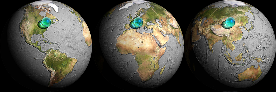
I originally located the sphere in Europe, but I realised it would only work properly for viewers if they could relate the sphere to a part of the world they actually know. The European one works for Africa too, but people at other longitudes would not be able to see their own area, so I made two more: one for the Americas and one for Asia and Australasia.
1,391 km is a good scale to compare against the whole globe – I only needed 3 images to for it to work for everyone. All the accessible freshwater is a more difficult scale. For the best insight you really need to know the region. It works fine for me because I live in the South West of England, but it won’t work so well for American or Chinese viewers, or indeed other Europeans.
The only solution is to make more animations. If you would like us to make one tailored for another population of viewers, we are well up for it.
See more information on the South West Water project here.
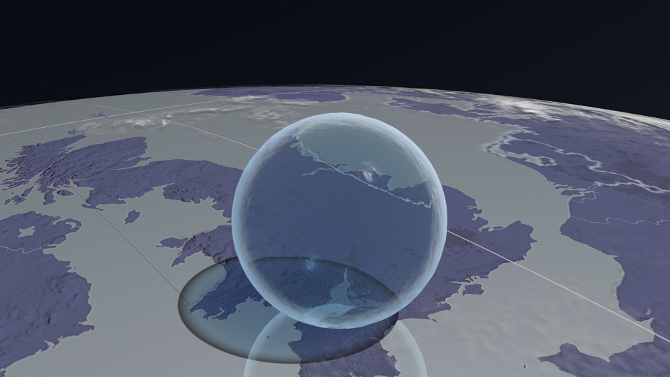
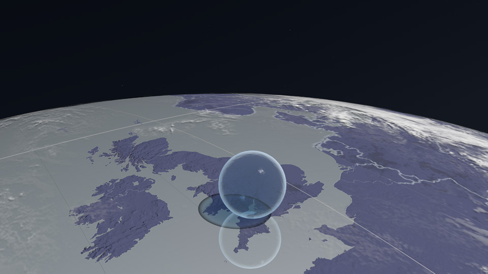
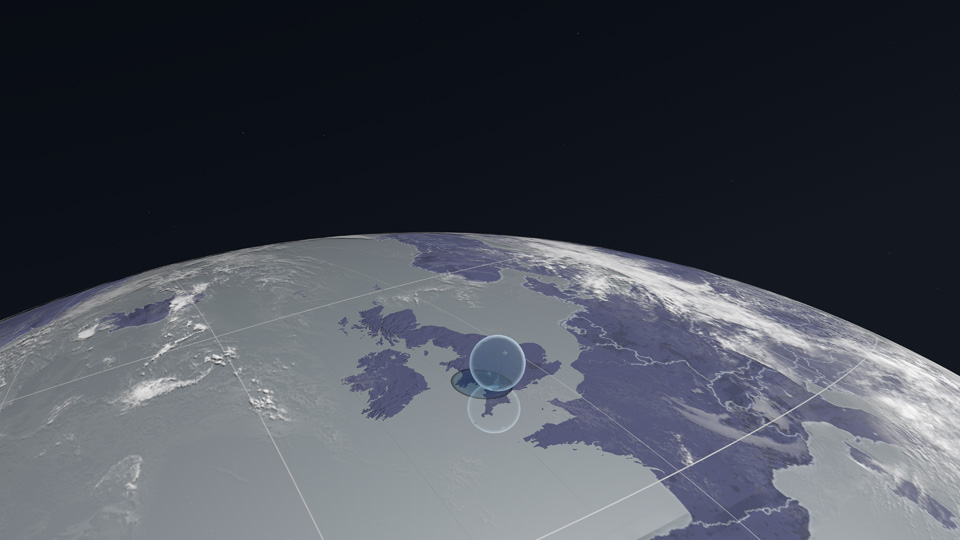
Much of world’s freshwater is locked up as ice or is buried deep underground. The water illustrated here is the water in rivers and lakes, in soil-moisture and shallow ground-water (up to 750 metres underground). It makes up 11.35% of all non-ocean water and just 0.31% of all water.
There is 4.3917 million cubic kilometres of this accessible fresh water. If you brought it all together in a single drop, it would form a sphere 203 km across. In this animation the sphere is located in Devon, England.

In total, there is 38.7 million cubic kilometres of non-ocean water:
Ice caps and glaciers: 74.93%
Deep groundwater (750-4,000 metres): 13.69%
Shallow groundwater (<750 metres): 10.85%
Lakes: 0.32%
Soil moisture: 0.17%
Atmosphere: 0.034%
Rivers: 0.0044%
Biosphere: 0.0016%
There are high resolution stills in a Flickr Album