Energy use in buildings accounts for around 40% of global carbon emissions. Yet normally only buildings and energy managers - ‘engaged’ people are aware or concerned about this energy use. But ‘non-engaged’ building users can help energy reduction by changing their own behaviours if they become engaged in the challenge.
To illustrate the idea we have created this prototype showing a small number of buildings in Bristol city centre. The tool can show average real-time emissions based on historic data, but alternatively live data can be used.
It is envisaged that the tool would be kiosk-based with app and web-page versions too. The tool can be used for any buildings estate, university campus or group of buildings. This is just a simple prototype - here are some possible additional features we could incorporate:
- Using a 3D model of the estate or campus and incorporate familiar landmarks for scale.
- Showing data from multiple sites. Allow user to toggle between maps using buttons at top.
- Include more tabs in the popup window to show more information e.g. tab showing building's energy performance certificate, or a tab showing yearly emissions.
- Include energy savings advice specific to each building.
- Use pre-rendered animated videos for realtime emissions / daily emissions for some or all buildings (higher quality visual).
Engaged and Non-engaged audiences
We specialise in reaching ‘non-engaged’ audiences. People who do not feel ownership of the data you present and do not come to the data with prior questions of their own are what we call ‘non-engaged’ audiences. They have very different needs from other audiences for data visualisation, but the distinction is often ignored. Most data visualisation is created as if the audience already understands the significance of the data and are keen to explore it.
Engaged audiences include building managers and people charged with reducing environmental impact or cutting costs. To present energy data or emissions data to these audiences, graphs and other ‘abstract’ representations are appropriate. These audiences already know what they are looking at – they just want to scrutinise it for any trends that can provide insight or hints for improvement.

The dashboard of a building management system – efficiently displaying multiple key performance indicators – is the data display platform of choice for these audiences.
Whilst building users will be aware that buildings use energy and that greenhouse gas emissions are an issue, their awareness remains on an intellectual level – distant from their everyday experience. Most will have very little sense of scale for power, emissions or even water use.
Presenting building users with a really clear graph (e.g. a histogram of kWh per day over the past year) will have little impact on most of them. Where a building manager would see energy, the target audience would just see a graph. That is, for the target audience, energy and emissions would remain as pure abstractions.
Some context - making it real
This interactive can enable building users to engage with building data. To do that they first need a strong sense that there is something real to engage with. Once that is established questions will arise spontaneously (Is that a lot or a little? What causes the emissions? What is my share of the emissions?). Building users will then be in a position to make use of more detailed information.
Therefore, the vital first step in engaging with data is developing a sense of its reality. The target audience for this interactive knows that emissions are real but while they remain invisible emissions don’t really feel real. Engaged audiences already have a sense of reality because they own the data, or they pay for the energy or maintain the plant that generates the emissions, but the rest of us need a nudge before we will take notice.
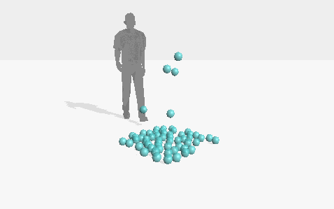
A simple approach that Carbon Visuals has honed over many years is to show the actual volume of carbon dioxide gas attributable to a building’s energy use and waste management. This simple act of visualisation turns an abstract number into a concrete volume that viewers can relate to on a physical basis. The easier it is to relate to the number physically, the stronger the sense of reality. Ideally we would represent the volume in real space but this is rarely possible.
To help a viewer relate to a visual representation of volume it is preferable to provide a visual context that the viewer knows intimately. The space that the viewer is currently occupying is ideal, but buildings and areas that people walk through are very effective scaling objects.

Contributions to 2009/10 emissions from individual institutions of the Kensington 1851 estate. From this project.
Time is also a very important factor in establishing the reality of data’s referents. In general we are communicating ‘rates’ rather than simple quantities – how much over how long. From a carbon accounting point of view units of tonnes per year are useful, but these units bring little insight to non-engaged audiences. Unlike a year, which is a period we understand intellectually, a day is a period we actually ‘inhabit’. We can feel a day passing, but the passage of a year we understand intellectually rather than feeling. The here and now is a particularly powerful period of time to illustrate. Showing rates of emissions in ‘real-time’ makes those emissions seem particularly real. This does not necessarily mean showing current instantaneous values for the rates (which we call ‘live’ data). If the data we are working with is a single annual figure we can show this in real-time as an average rate.
So emissions per second or emissions per day are units that provide more insight than annual emissions, but the units are still problematic. Carbon dioxide is a gas but it is accounted for in units of mass. Because, for many people, mass is so closely associated with weight, and because gases have buoyancy, mass is a counterintuitive measure of ‘how much stuff’ there is. That is, units of mass, which are perfectly appropriate for accountancy purposes, create a barrier to developing a feel for emissions or a sense of scale.
Illustrating volume does provide an intuitive sense of scale. Illustrating volume as a collection of unit volumes corresponding to unit masses goes even further. One advantage of this approach is that human perception makes us quite good at intuiting value by ‘counting’ multiple objects, but very bad at judging volume visually. Breaking volumes into units helps us judge scale visually. Another advantage of this approach is that it allows us to link abstract accounting units (kg, tonnes, etc.) with an intuitive picture of ‘stuff’.
See also: Data, dashboards and detours - a blog post about changing behaviour with data.