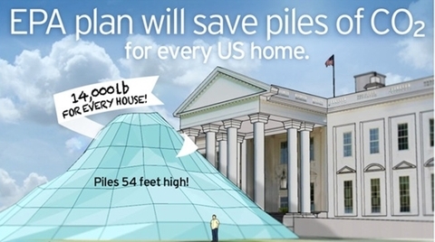
Giving Data Impact
We love to turn data into visuals that intuitively make sense; that enable people to grasp a reality that might otherwise remain abstract, remote or invisible. Direct responses from clients and audiences tell us that presenting the facts visually can grab attention, prompt insights and sometimes even completely change the way a person responds to the issues before them.


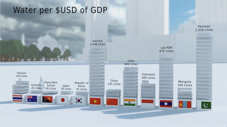



A short animated film from Carbon Visuals is being used to engage managers around the world about the fundamentals of sustainability, how sustainability is relevant to their role and its importance to business success.Created for the University of Cambridge Institute for Sustainability Leadership (CISL), the film shows the current and expected resource use and parking space of all the world’s cars, as well as the CO2 emissions of cars today.

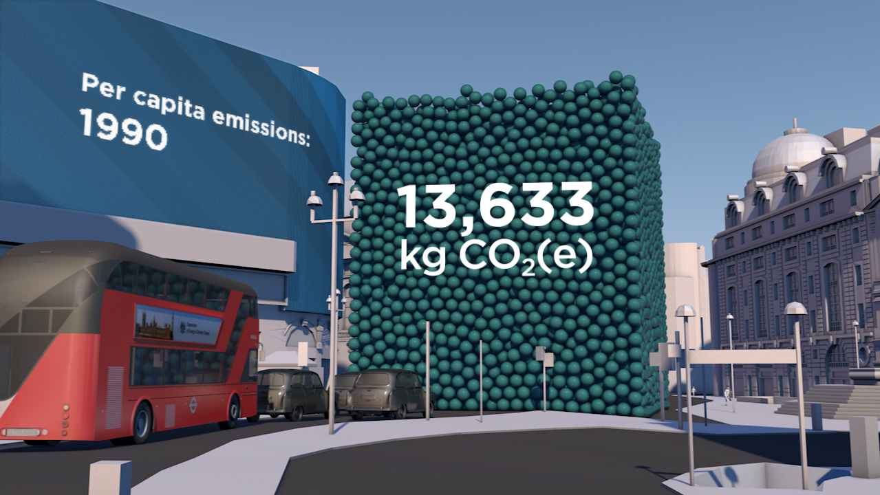
The Carbon Majors report, launched November 2013, is accompanied by striking graphics from Carbon Visuals which show the extent to which corporations are responsible for the cumulative emissions causing climate change.
Key information from a huge array of data has been conveyed by Carbon Visuals in both conventional and novel ways to give a feel for the scale of the cumulative emissions involved.
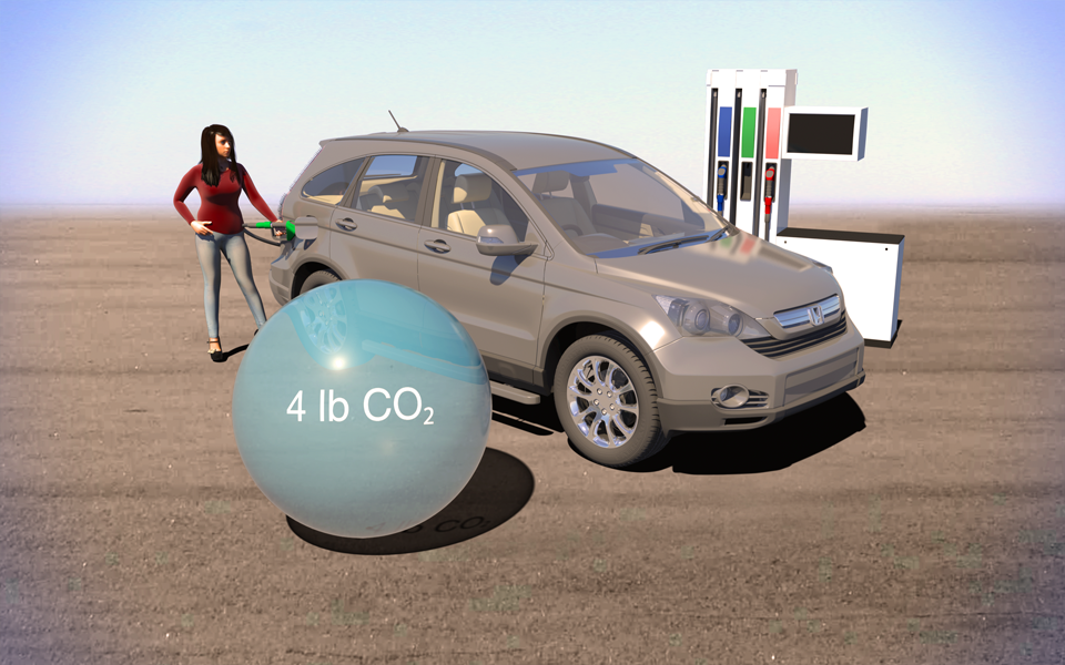
The Environmental Defense Fund asked us to explain the difference between gasoline from tar-sands and regular gasoline in terms everyone can relate to. We compared them in terms of a single gallon of gas and a typical car's annual emissions.