
If all the carbon dioxide in the atmosphere were shared equally amongst every person on the planet (7 billion of us) this is how much we'd have each - 446 tonnes of it. See larger image on Flickr.
On Thursday 9 May 2013 the daily average concentration of carbon dioxide in the atmosphere as measured at Mauna Loa in Hawaii reached the unsettling milestone of 400 parts per million. A concentration of 400 ppm means that for every million air particles, 400 of them are carbon dioxide molecules (0.04%). We wanted to know what that looks like.
Over the past million years of the Earth’s history, the concentration has not exceeded 300 parts per million - until now. Before industrialisation, the concentration was 280 parts per million, which means 3 out of every 10 carbon dioxide molecules in the atmosphere now is there as a result of human activity. We have added much more than that, but so far, about half of the carbon dioxide we add to the air has been absorbed by the oceans and by plants.
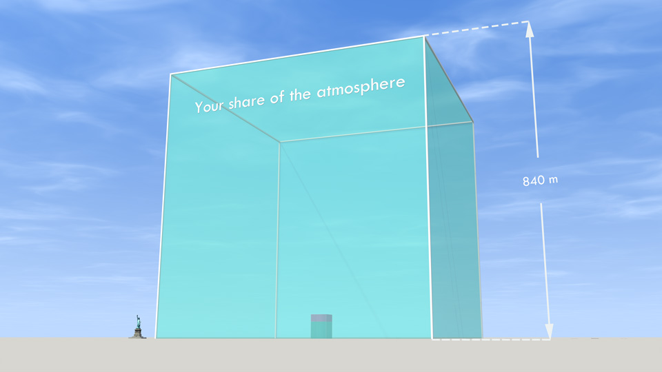
If we shared all the air in the atmosphere between every person on Earth (7 billion of us) this is how much we'd each have - 735 thousand tonnes. The smaller volume inside the cube is your share of the carbon dioxide in the atmosphere (see separate image above). There is a larger version on Flickr.
The ice core record shows that the atmospheric carbon dioxide concentration varied between 180–210 parts per million during ice ages, increasing to 280–300 ppm during warmer ‘interglacials’ at least back to 650,000 years before the present. (DOI: 10.1126/science.1120130). Less direct methods of measurement suggest this was true as far back as 1 million years. The concentration has not been as high as 400 ppm for 4 or 5 million years. 400 ppm really is exceptional. That’s the story in numbers, but there’s also the story of the science.
Daily average concentrations exceeded 400 ppm in Arctic stations as far back as last year, but the Mauna Loa measurement has more historic significance. There have been continuous measurements at the Mauna Loa Observatory in Hawaii since 1958, when Charles David Keeling developed a way to measure CO2 in the atmosphere and began collecting air daily in specially prepared bottles. The record of measurements is now known as the ‘Keeling Curve’.
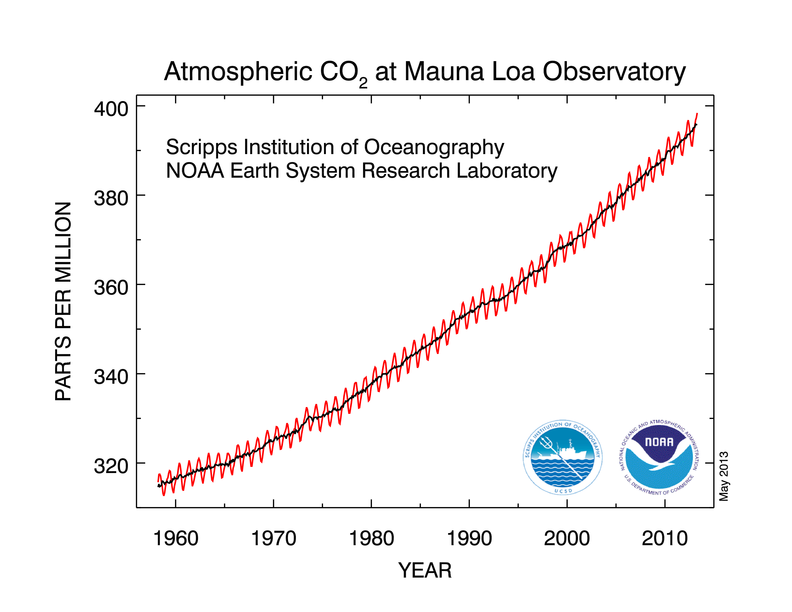
The NOAA has a nice animated version of the curve that also places it in historical context (past 800,000 years).
The Keeling Curve has long been the poster child of climate change – unequivocally revealing human impact on the atmosphere. Yet it only ‘works’ for some viewers. It takes a degree of mathematical and geophysical sophistication to relate to what the Keeling Curve tells us about the air.
At Carbon Visuals, we eschew sophistication. We go for direct, vulgar, in-your-face facts whenever we can. Even so, we find that you almost always need to look at a number from different directions to really make sense of it. Here are some of the ways we think about the concentration of carbon dioxide in the atmosphere.
This animation shows not 400 ppm but 392 ppm (it is over two years old). Seeing air like this makes the proportion of CO2 seem small, which it is. The point is, it doesn't take very much - carbon dioxide is potent. Without the blue-circled particles, all plants would die and the surface of the Earth would be frozen. The red-circled particles are changing the global climate.
See the animation on YouTube.
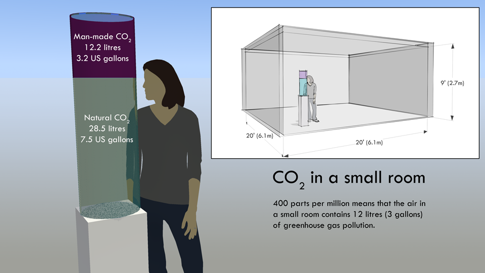
400 ppm sounds like a tiny amount, but it means that in every small room there is 12 litres of atmospheric pollution - as this quick sketch shows. There is a high resolution version of this diagram on Flickr.
At Carbon Visuals we have noticed very powerful numerical misconception that prevents many people understanding the impact we have on the atmosphere. The misconception is this: CO2 makes up less than half of one tenth of one percent of the gases in the atmosphere. Expressed like this, the number sounds tiny. Many people (including many senators and congressmen who should know better) believe something so dilute can have little impact.
This is a wrong conclusion for many reasons, but the reason it sounds plausible at all is because people are not good at relating to small concentrations. If we talk about absolute quantities instead of concentrations, carbon dioxide no longer seems insignificant, and one way to do that is to (conceptually) extract it from the air and show the actual volume it would take up as concentrated gas.
Take a typical room 20 feet x 20 feet x 9 feet. Only 400 parts per million of the air in the room is carbon dioxide, which doesn't sound like a lot. However, it is nearly 41 litres of carbon dioxide (11 US gallons) and 28.5 litres of that (3.2 US gallons) came from burning fossil fuels. If you show people that in every small room there is 30 litres (about 3 US gallons) of greenhouse gas pollution they can see human impact on the atmosphere for themselves.